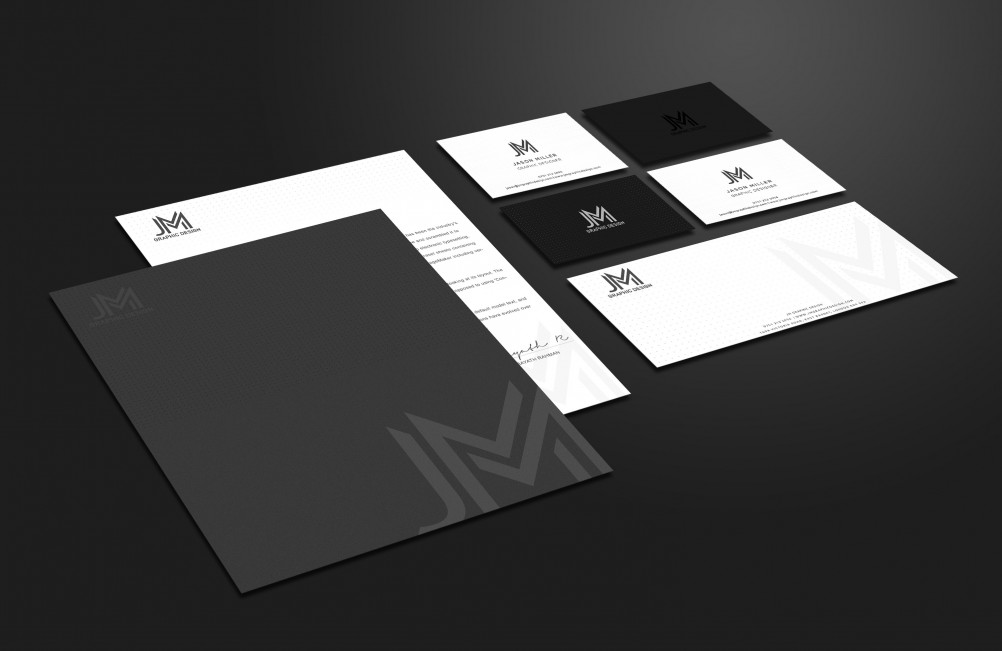
As of 21st May 2017… We’ve updated our Branding Gone is the Red & Black colour scheme & thumbprint logo – replaced by a more refined Monogram logo along with a black and white colour palette. Why? To better reflect my approach; simple, clear design which attracts the right kind of attention. The Red logo had been used since 2013, and …
Tag Archive
Below you'll find a list of all posts that have been tagged as “JM Graphic Design”

