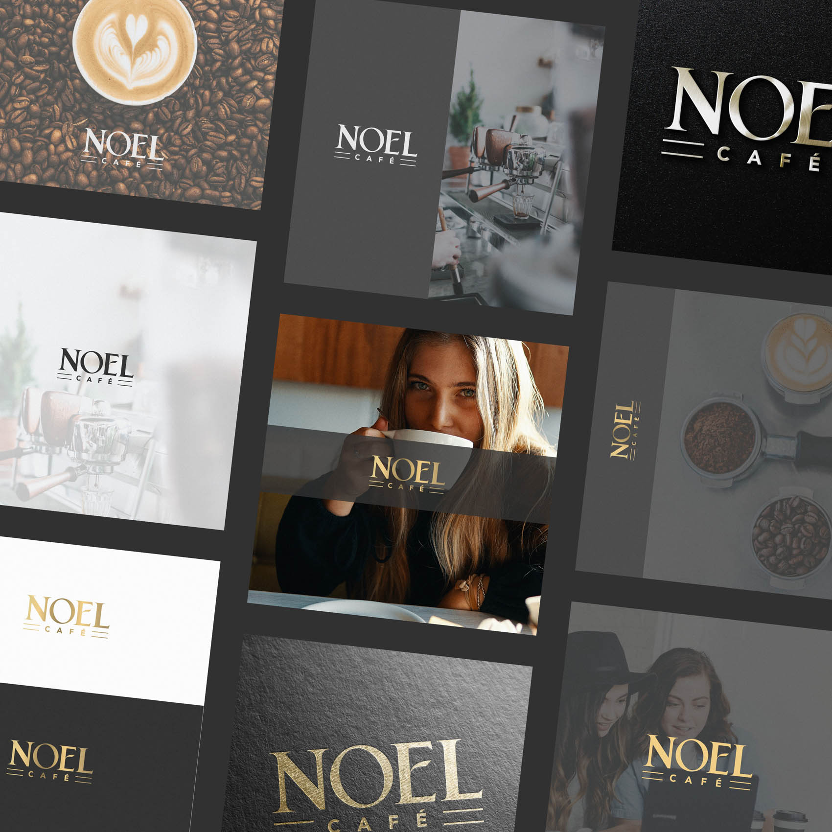
If you live locally to Barnet in North London (as I have for over 10 years now), be sure to look out for Noel Café; a high end coffee shop which will be occupying the space just opposite the large Sainsburys, across from New Barnet rail station.
It’s always a pleasure to work with local businesses, and I was delighted when Xhoana reached out to me and described her vision for the new coffee shop; a classy, family owned business (the name ‘NOEL’ literally takes initials from family members names!) that could serve as a meeting point for the growing number of professionals working from home, and of course lovers of great coffee.
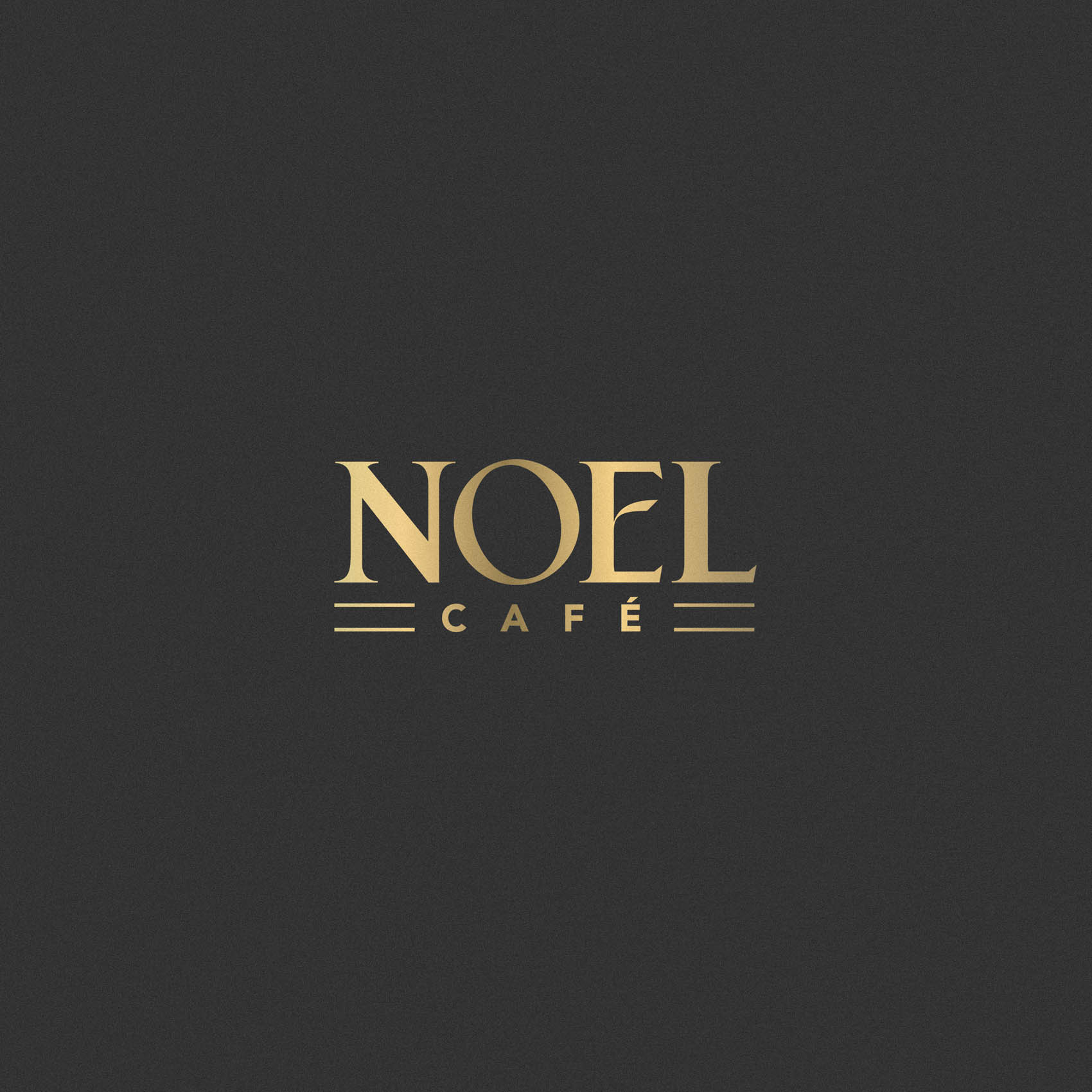
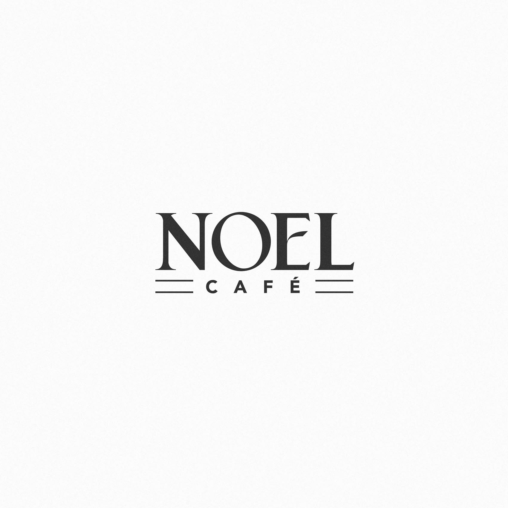
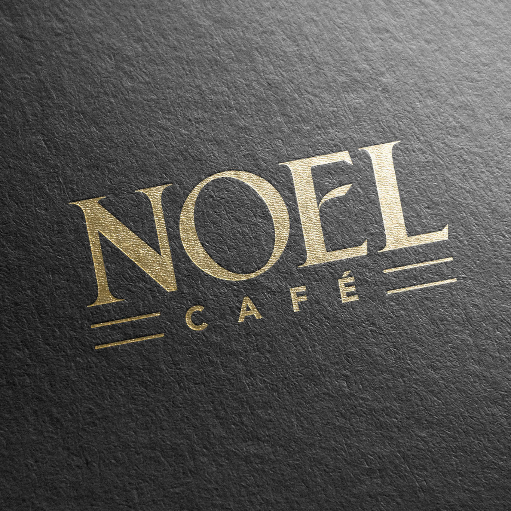
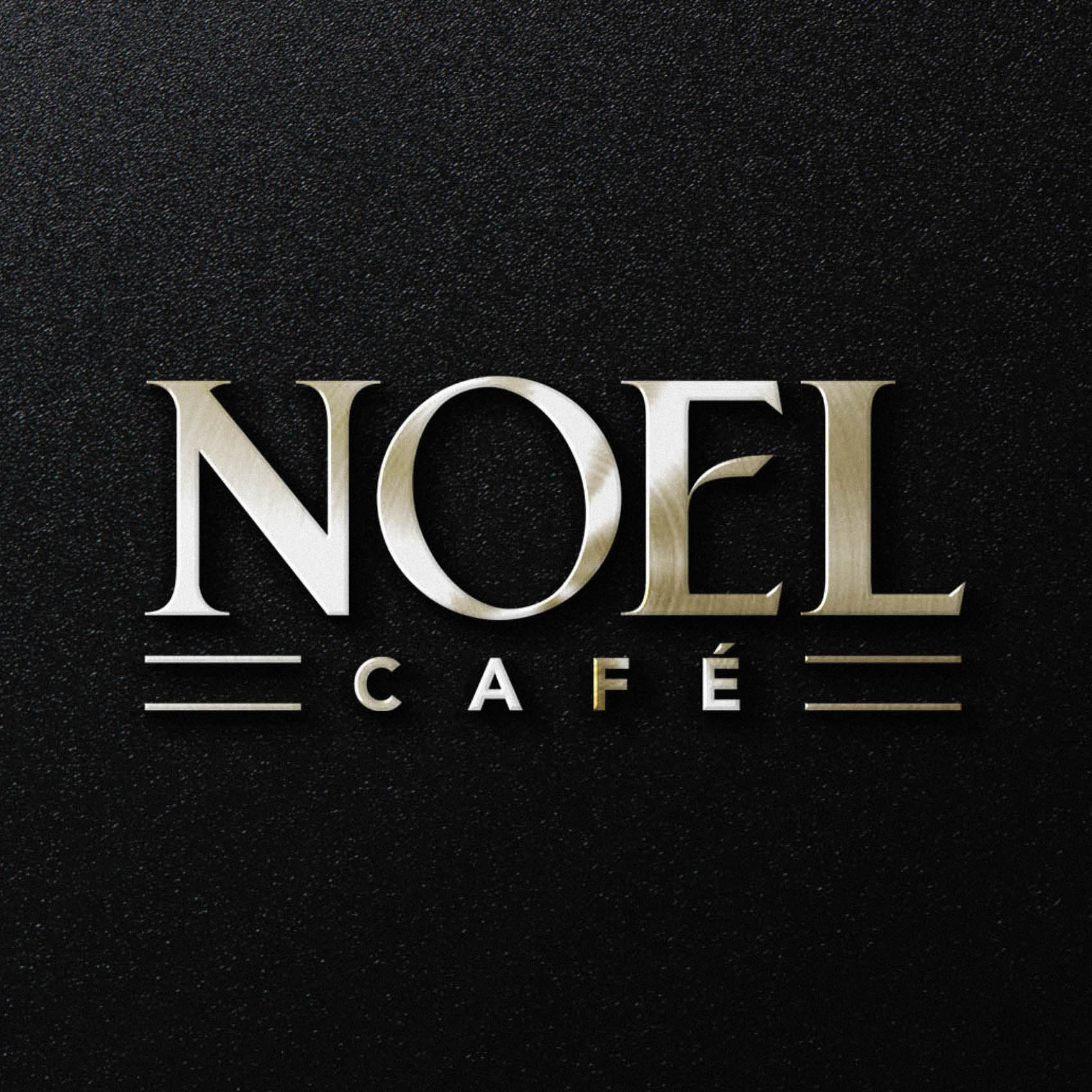
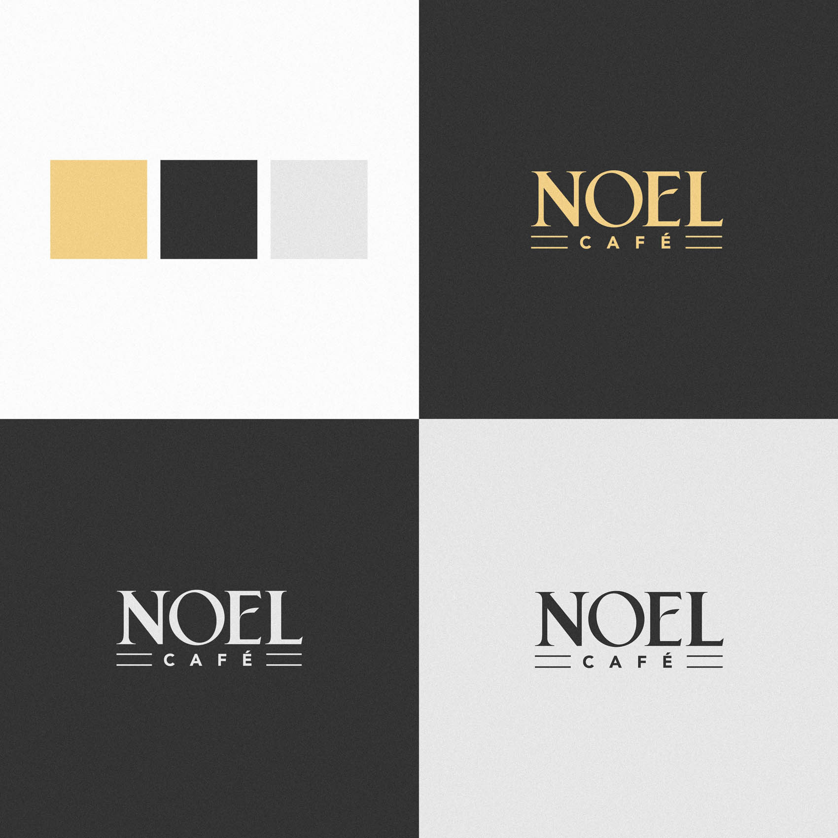
We wanted the logo to have high end, luxurious feel to it – but also a warm, welcoming tone. This was achieved by highly customising type to create a unique typeface for the 4 letters in Noel – much chunkier (and therefore friendly) than a traditional serif font, with a stylised center bar on the ‘E’. ‘Cafe’ has then been treated in a modern, minimalist font to provide a pleasing contrast. To ensure the overall shape of the logo and alignment looked balanced, without forcing us to enlarge the word ‘cafe’, duel keylines have been used on either side.
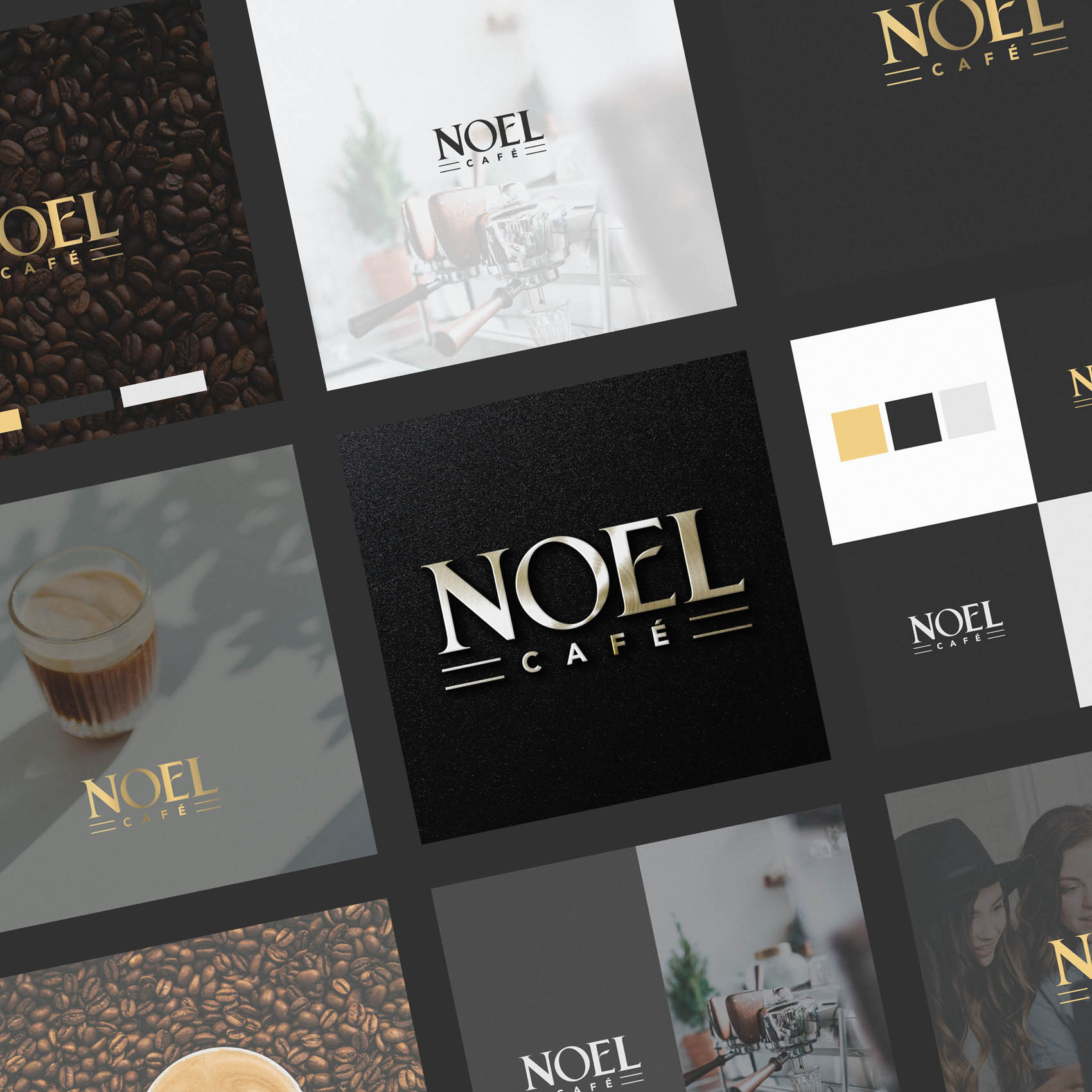
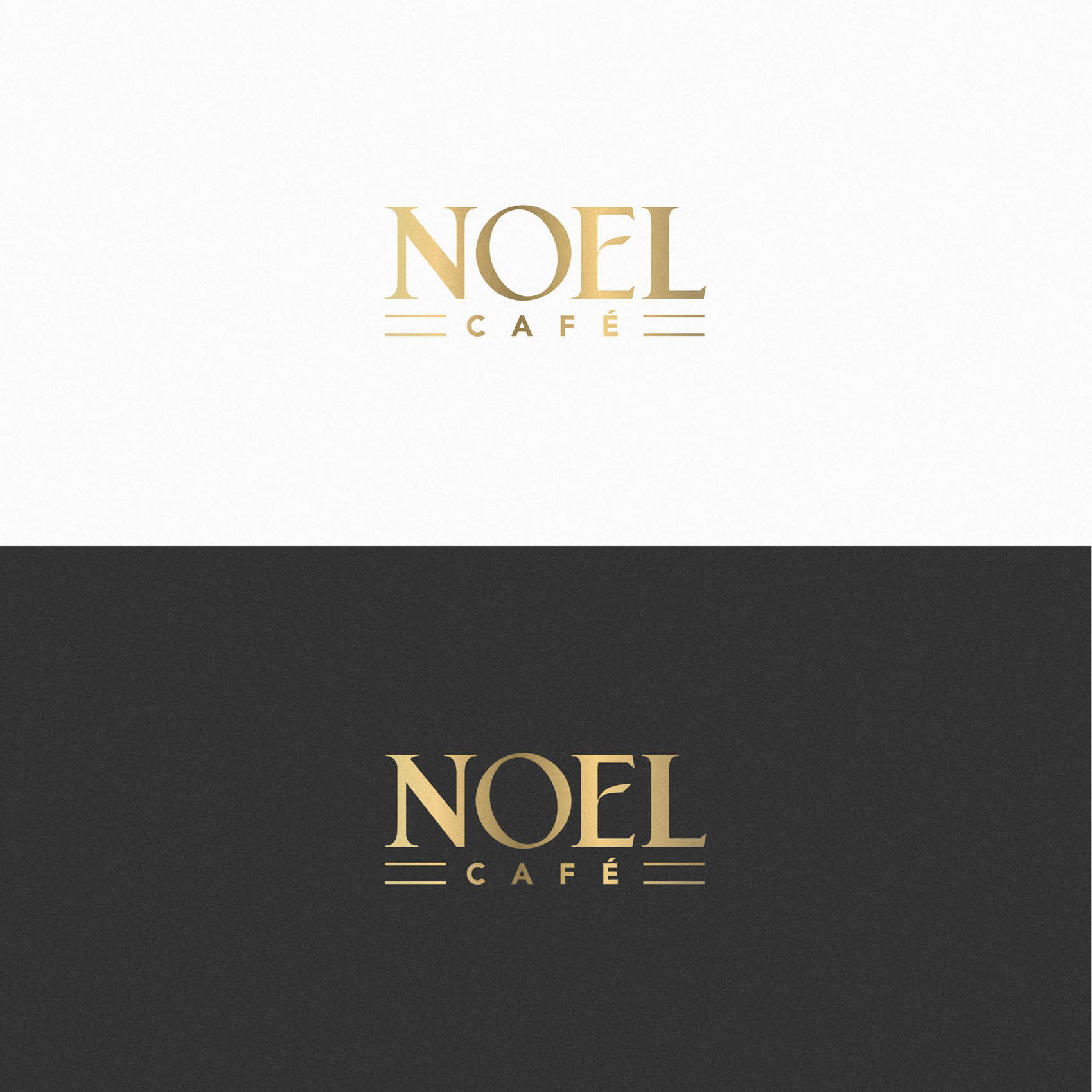
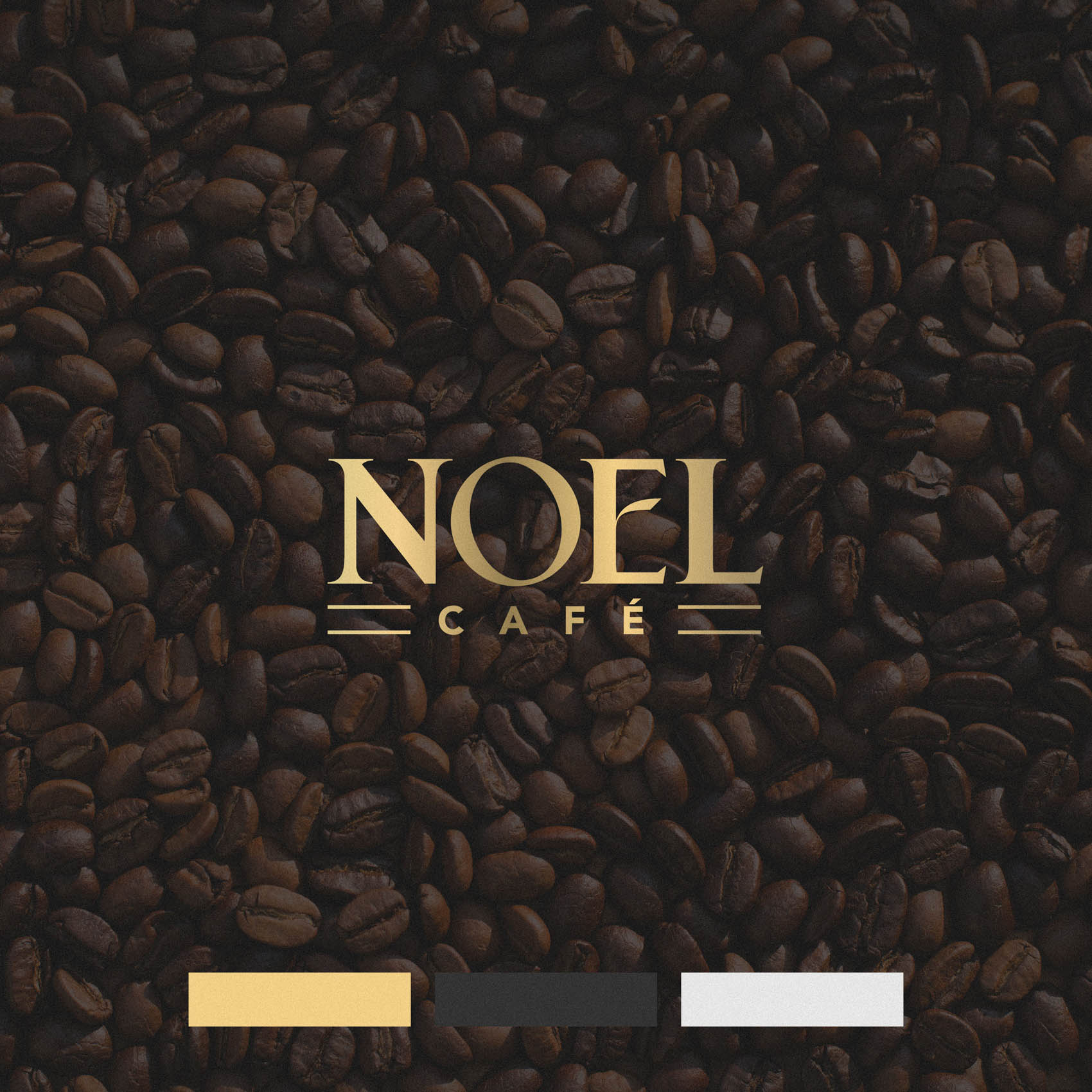
Finally, while the intention was always for the logo to be physically printed in gold on a black background for the shop sign (another reason the chunkier lettering for Noel was essential – as this will make it far easier to laser cut), we wanted to provide a range of colour treatments for various needs and situations. These include a rich, gradient-gold version for full colour printing, a flat gold for more limited printing situations, and a plain black or plain white version which can be subtracted from various backgrounds.
The result is a rich Logo Suite that can be applied to a wide range of situations.
If you live in or around Barnet (EN4) be sure to pop in for a coffee once Noel Cafe opens in the Spring / Summer!


