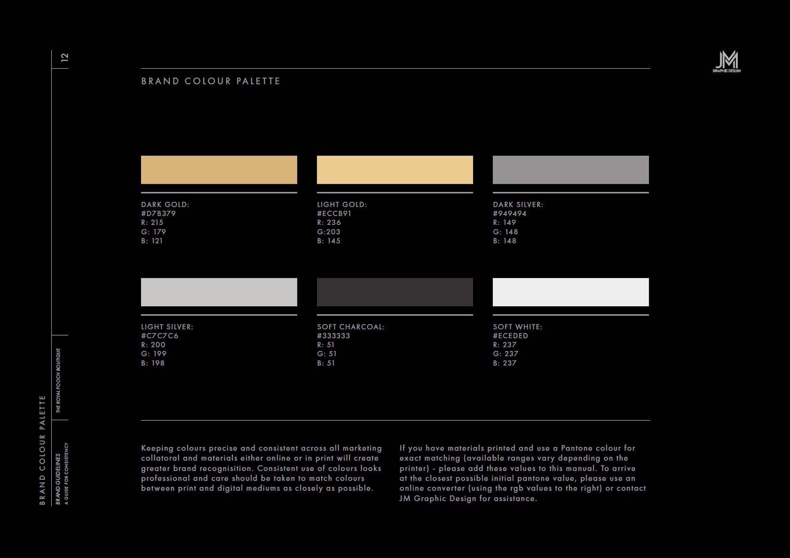
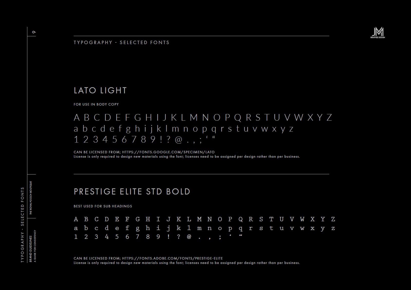
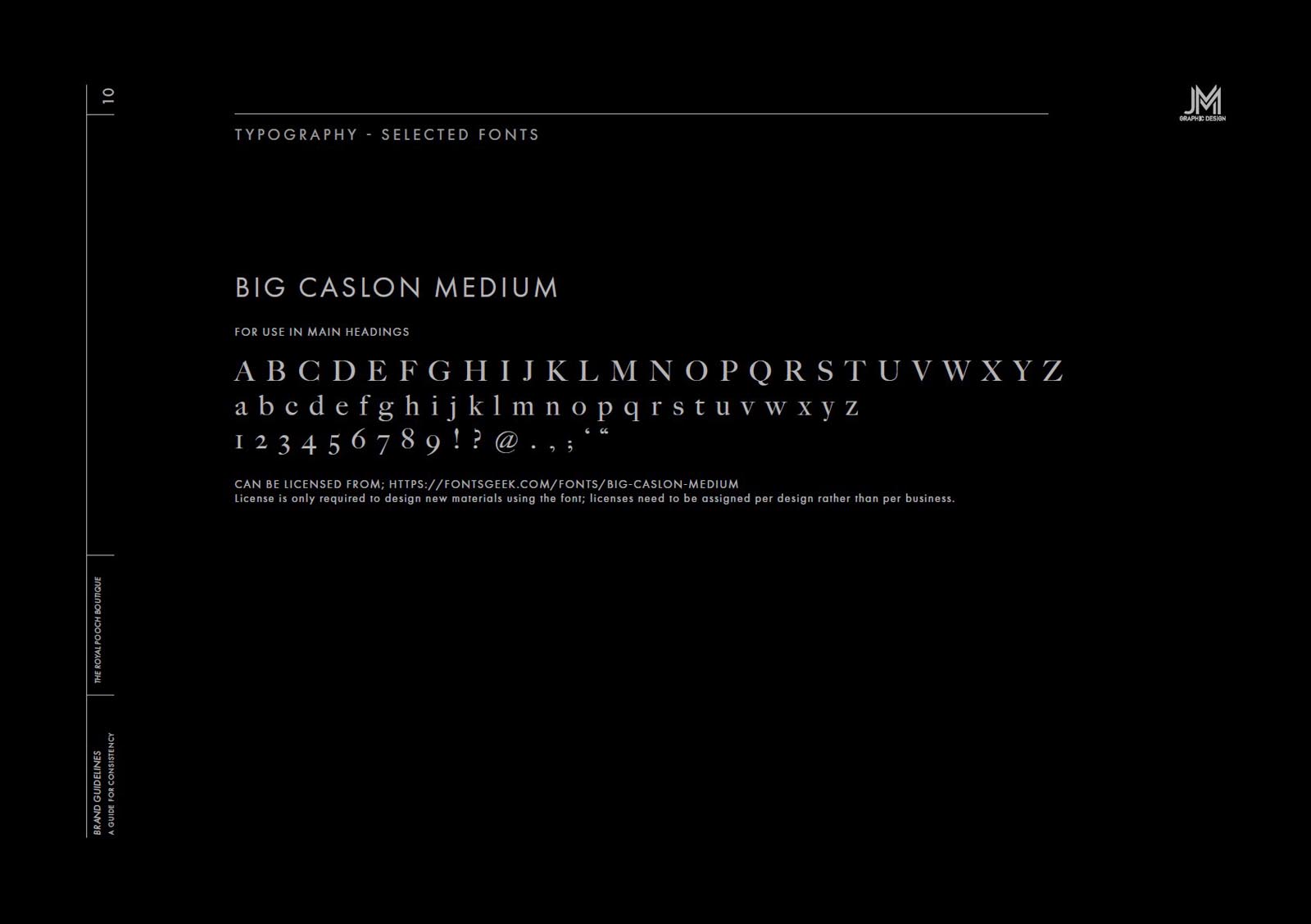
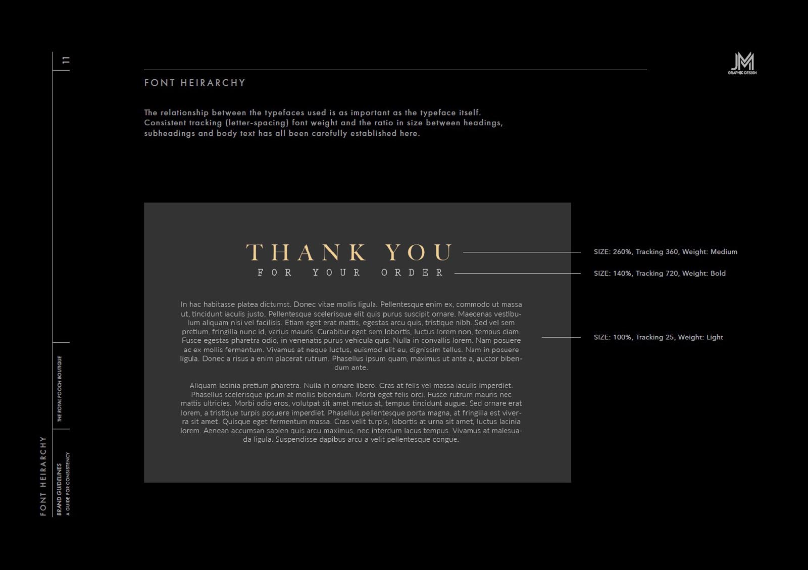
It was truly a pleasure to work with The Royal Pooch Boutique to develop their new brand identity. Offering a range of clothing and accessories for 4 legged friends at a standard and level of quality equal to leading human fashion labels, the goal was to convey this and create the correct expectation through the presentation and brand identity design. Using a gold, platinum and charcoal colour palette immediately helps to position a brand as luxurious, but the subtle details are what really make the difference.
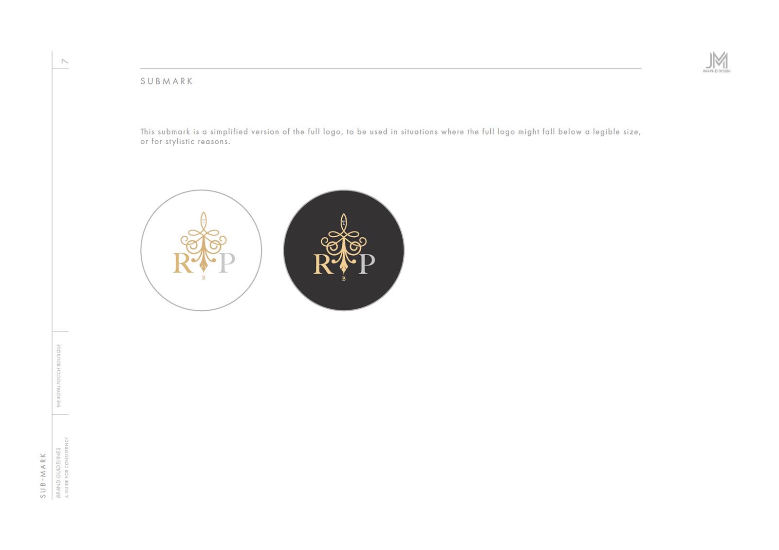
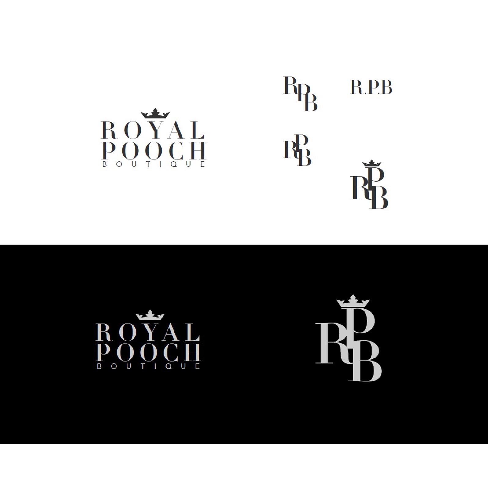
An ornate, abstract, lacy flourish serves as the brandmark, with a stunning sub-mark version created for situations where the brand needs to be identified at very small sizes.
Beautifully detailed, yet simple enough to be sewed on clothing.
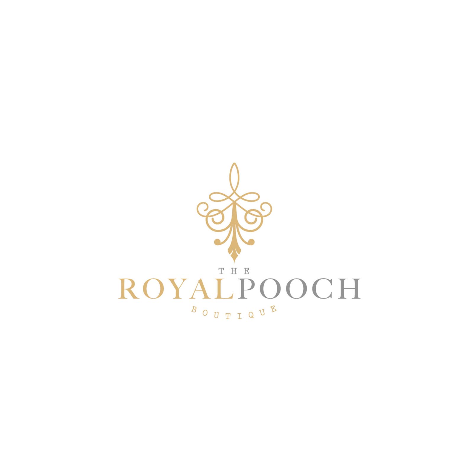
We wanted to write the words ‘Royal’ and ‘Pooch’ on the same line, however if written with a gap between them, it created an unbalanced feel to the logo. To solve this we two different colours to differentiate one word from the other, and ensure the logo can be read correctly. (Even in black and white, one word would be displayed in a darker tone than the other).
At the very bottom I’ve included at look at some of the ‘runner-up’ concepts, which were strong, but we ultimately discarded in favour of the selected concept.

