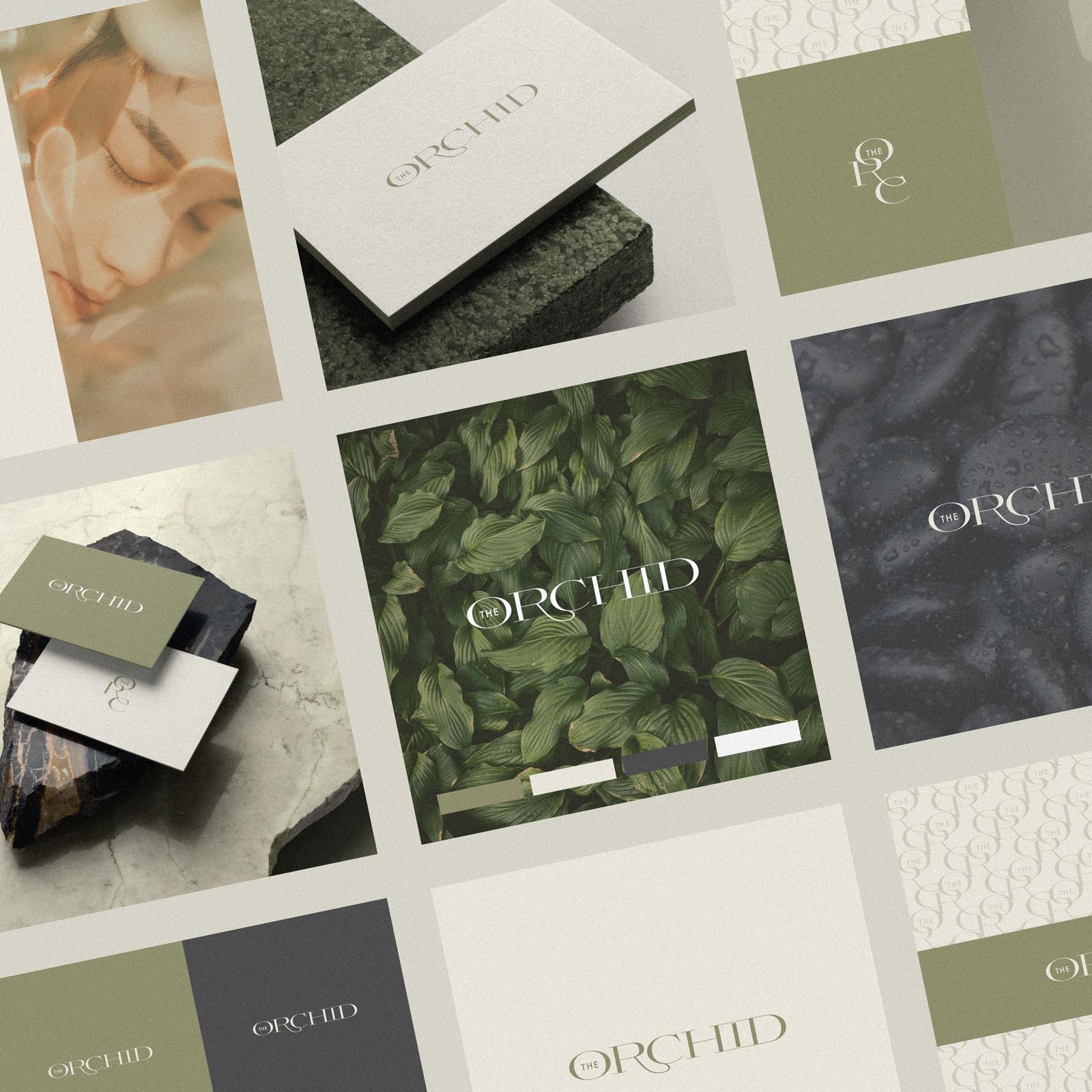
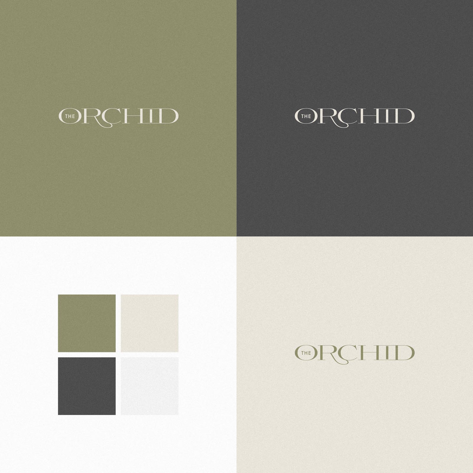
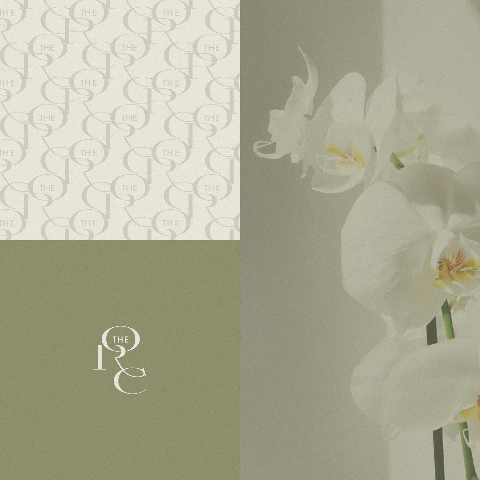
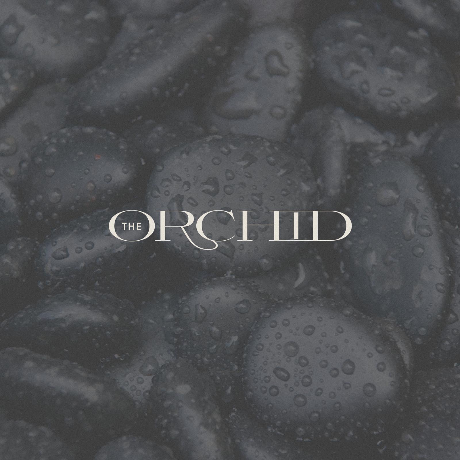
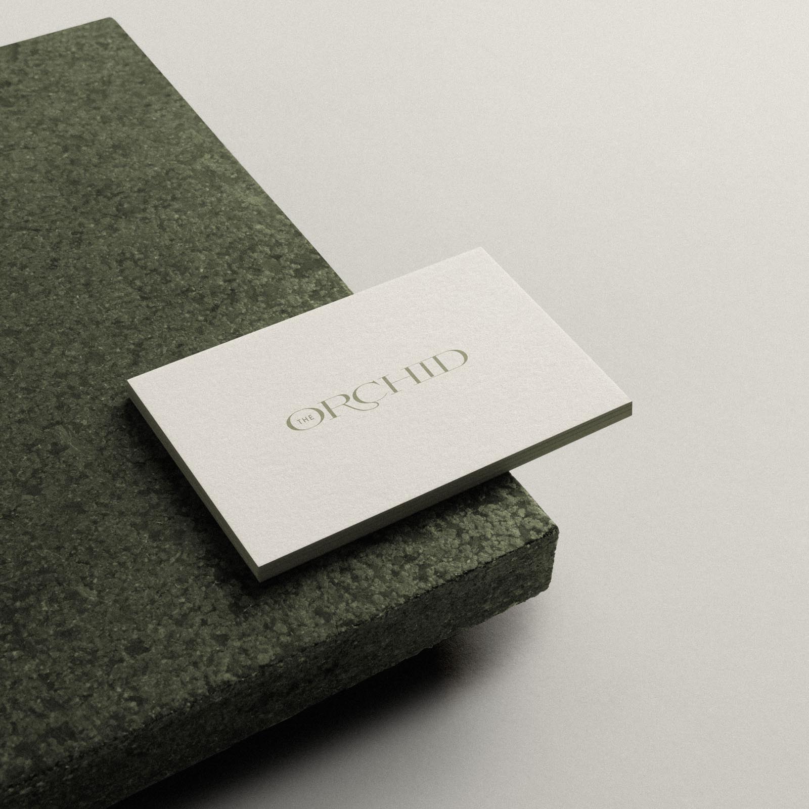
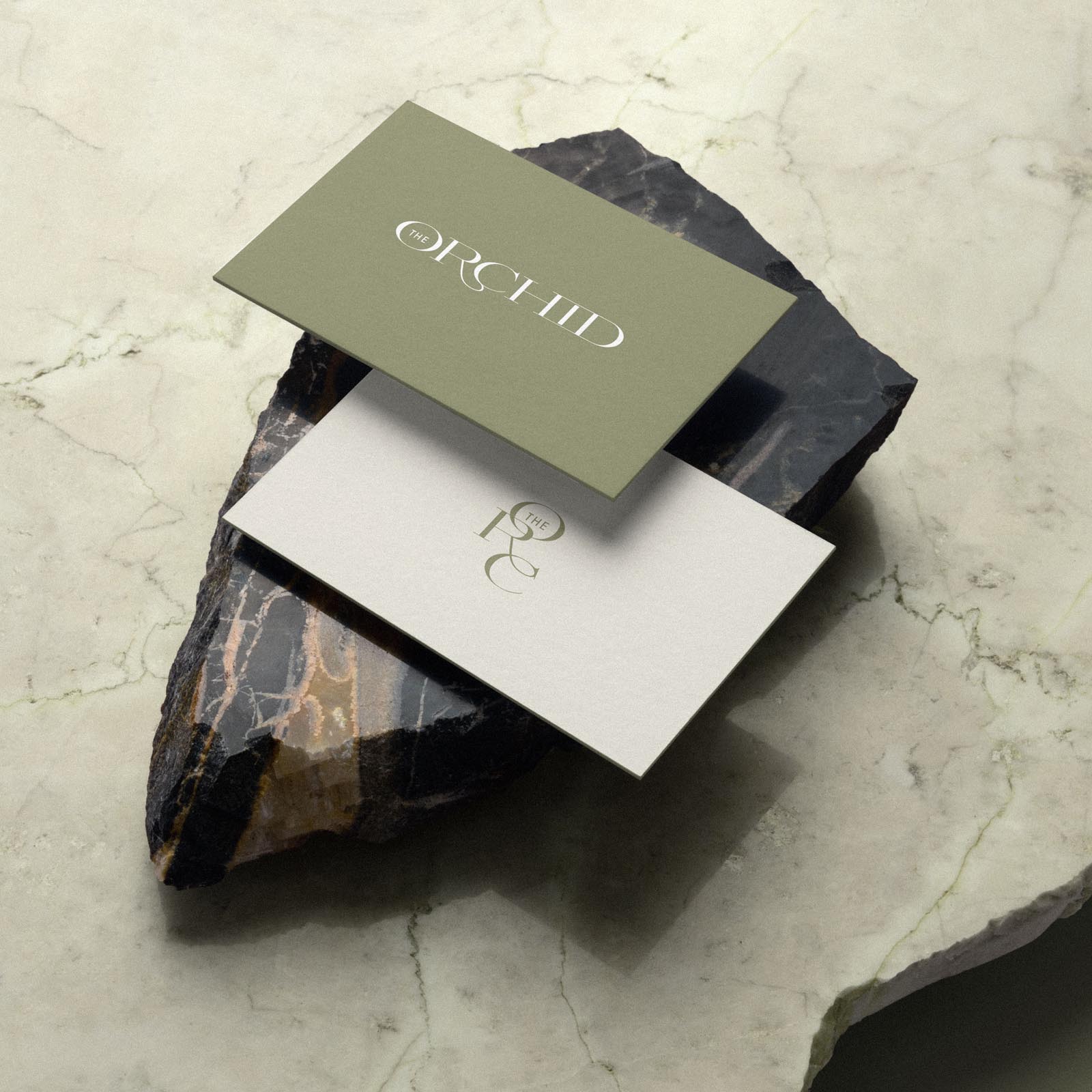
Brand Identity Design for The Orchid – a natural spa and wellness center. The spa features a botanical garden and hot stone treatments, which both provided fitting inspiration for the colour palette and tone we wanted to convey, with natural green, sand, ivory and slate grey.
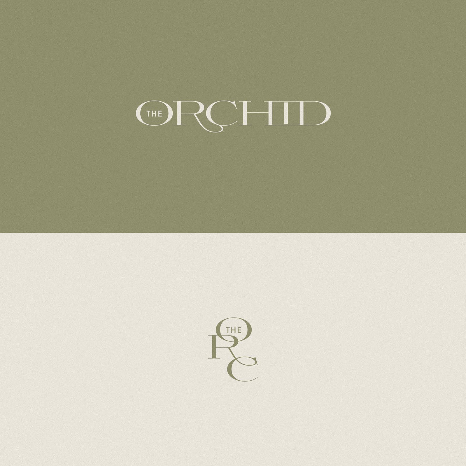
Tucking ‘The’ inside the ‘O’ of Orchid ensures attention is not focused on the word ‘the’, and ensured the aesthetic balance of the logo wasn’t thrown off in efforts to include it. A flowing ligature between the ‘R’ and ‘C’ softens the logo, while a stylised treatment for the ‘H’ ‘I’ and ‘D’ ensures these characters interact with each other in an interesting way.
The submark combines the first 3 letters to form an abreviated version of the brandname, which provides a versatile option for a range of situations where the primary logo could be replaced by the submark. We also created a repeating pattern based on the submark.

