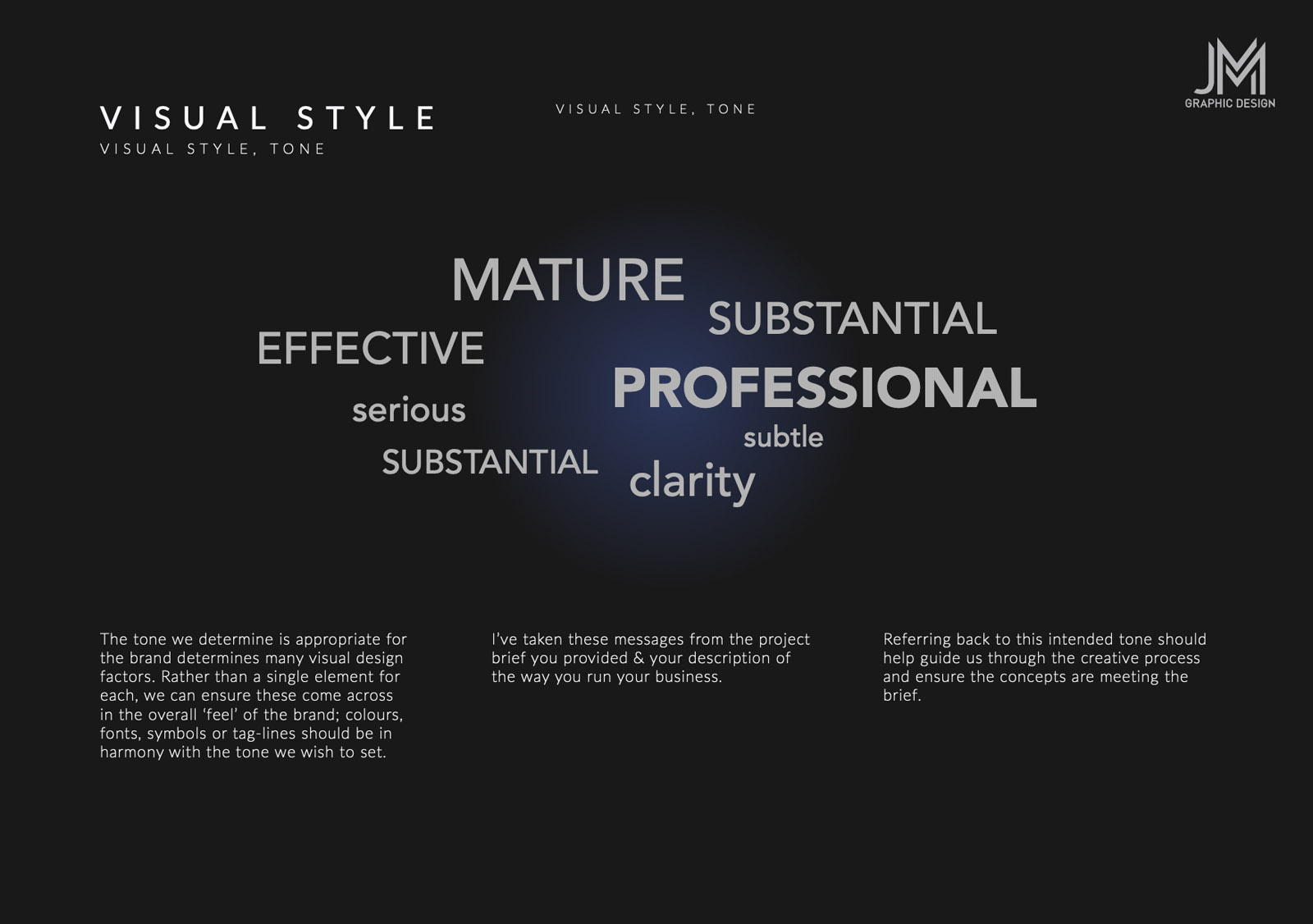
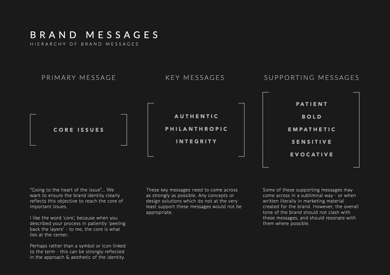
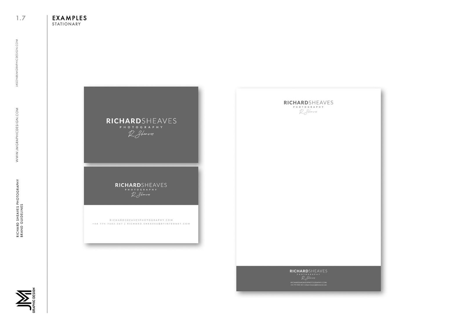
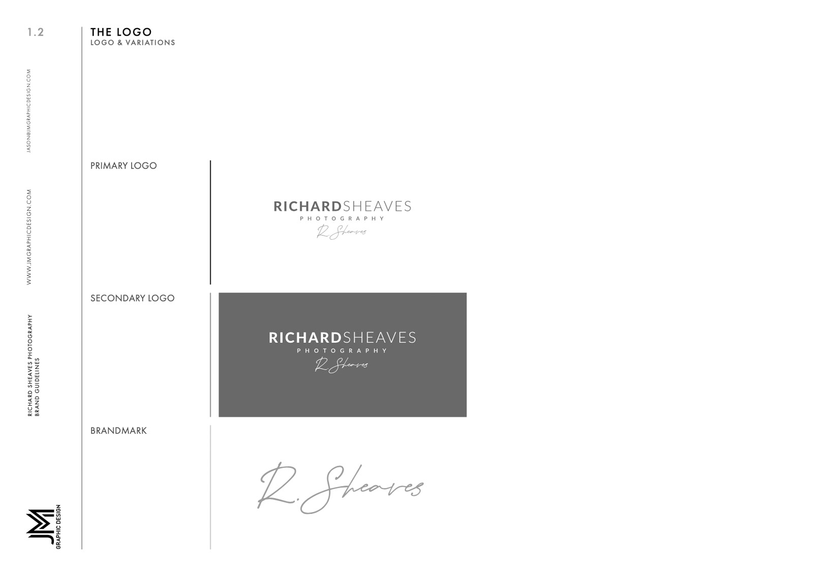
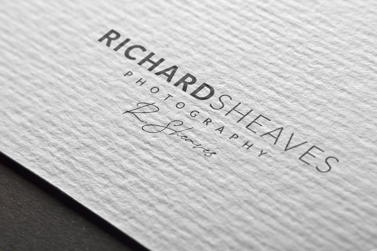
I was commissioned to create a new brand identity for Richard Sheaves, a successful documentary photographer. The branding needed to reflect a personal touch, authenticity, dignity and the serious nature of the subjects Richard captures. The font chosen for the top line of the logotype ‘Richard Sheaves’ is balanced to create an aesthetically pleasing contrast, allow the two words to sit together with no space, while being clearly legible, and to reflect the desired tone and brand messaging.
The signature is great way to indicate personal touch and authenticity.
Richard Sheaves is a photographer who travels the journey alongside his subjects. Slowly and imperceptibly, Richard’s uniqueness lies in his empathy and ability to-develop trust. He allows the characters to lead their own journey, to reveal raw and authentic emotions. As a documentary storyteller his tenacity, patience and sensitive approach enables his images to explode into a rich tableau of multi-layered emotions. Richard’s world takes him to places where others may be hesitant to venture. He will go into that little non-descriptive hut and emerge with a powerful story that goes beyond the obvious. Sensual and explorative, Richard’s raison d’être is to peel the layers and to encapsulate the moment that defines the subject.

