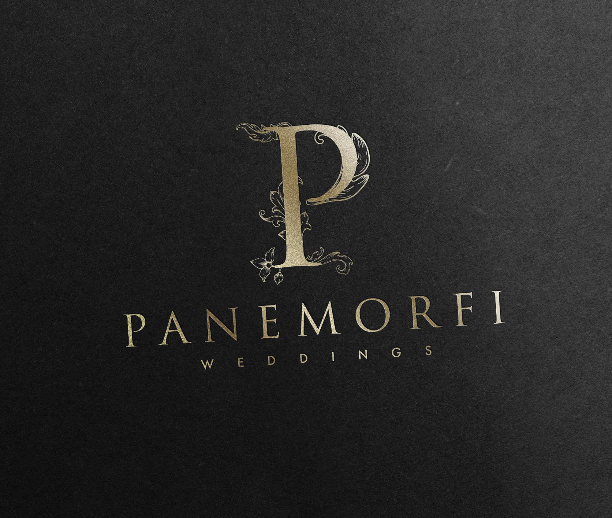
Panemorfi studios is a Canada based video production studio, specialising in wedding videography and a wide range of commercial film – with a signature cinematic style. Part of the brief included the need to create two faces to the brand, while ensuring they felt unified as a whole. One face would be the wedding division of the business – the other would be for commercial and corporate work.
We explored the idea of a different colour palette for each division, as this can work well – but instead we developed two strong concepts based around a P symbol. The wedding version featured ornate, elegant floral flourishes sprouting from the P; reflecting the highly artistic and beautiful work produced by the wedding division of Panemorfi Studios. The corporate version featured an identical P, yet this time framed within a simple, elegant diamond keyline.
The result is a strong brand, unified, but able to proudly attract it’s ideal clientele on two fronts.


