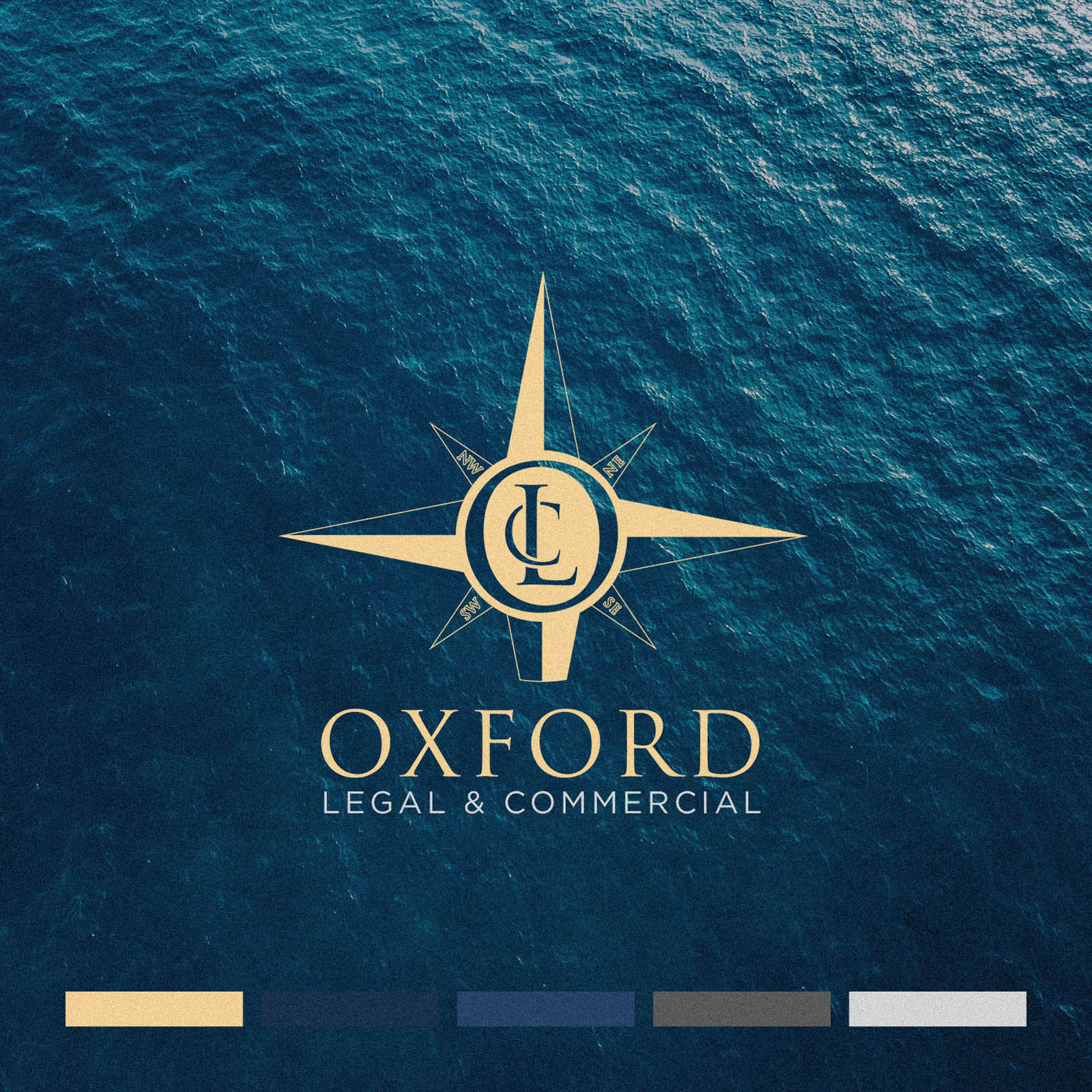
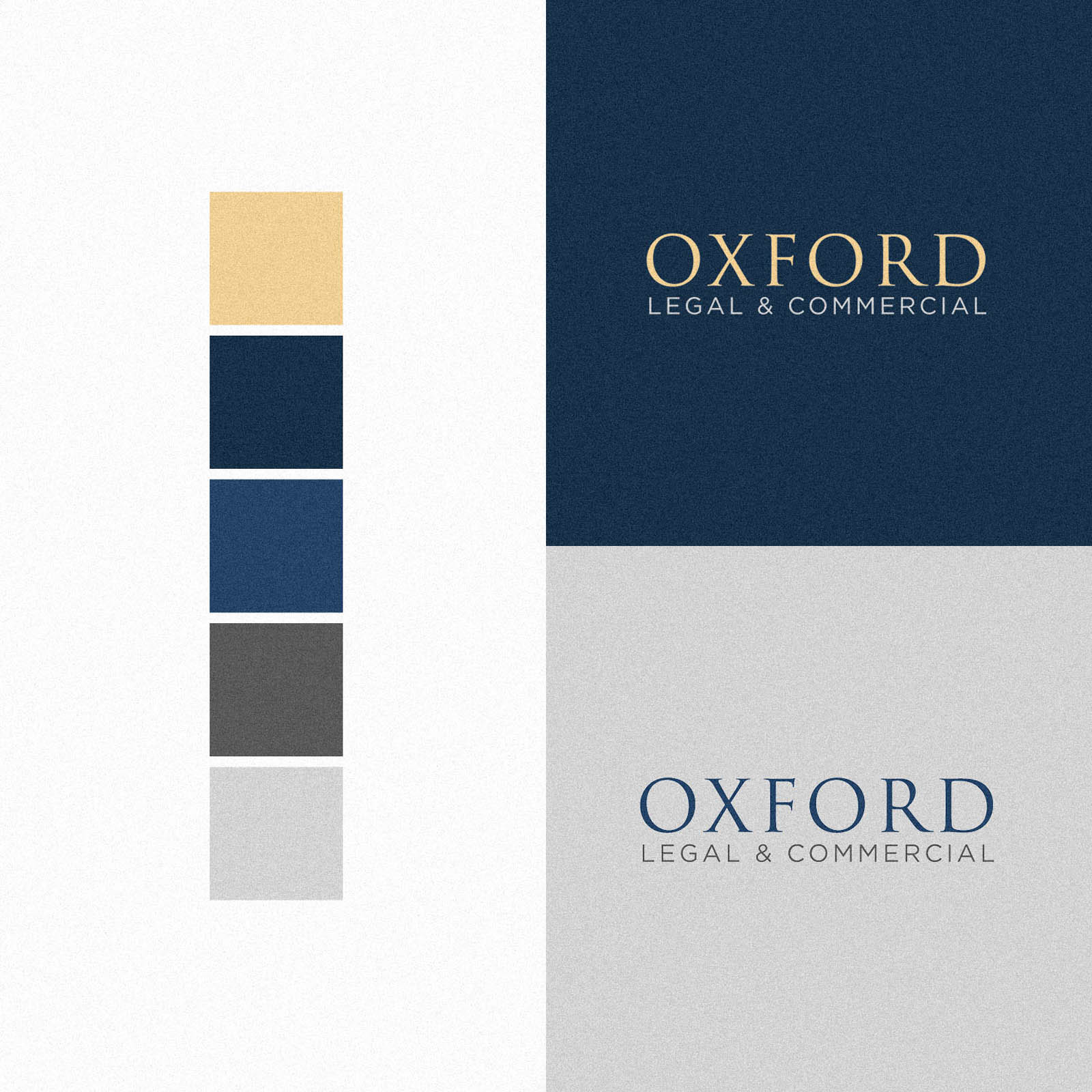
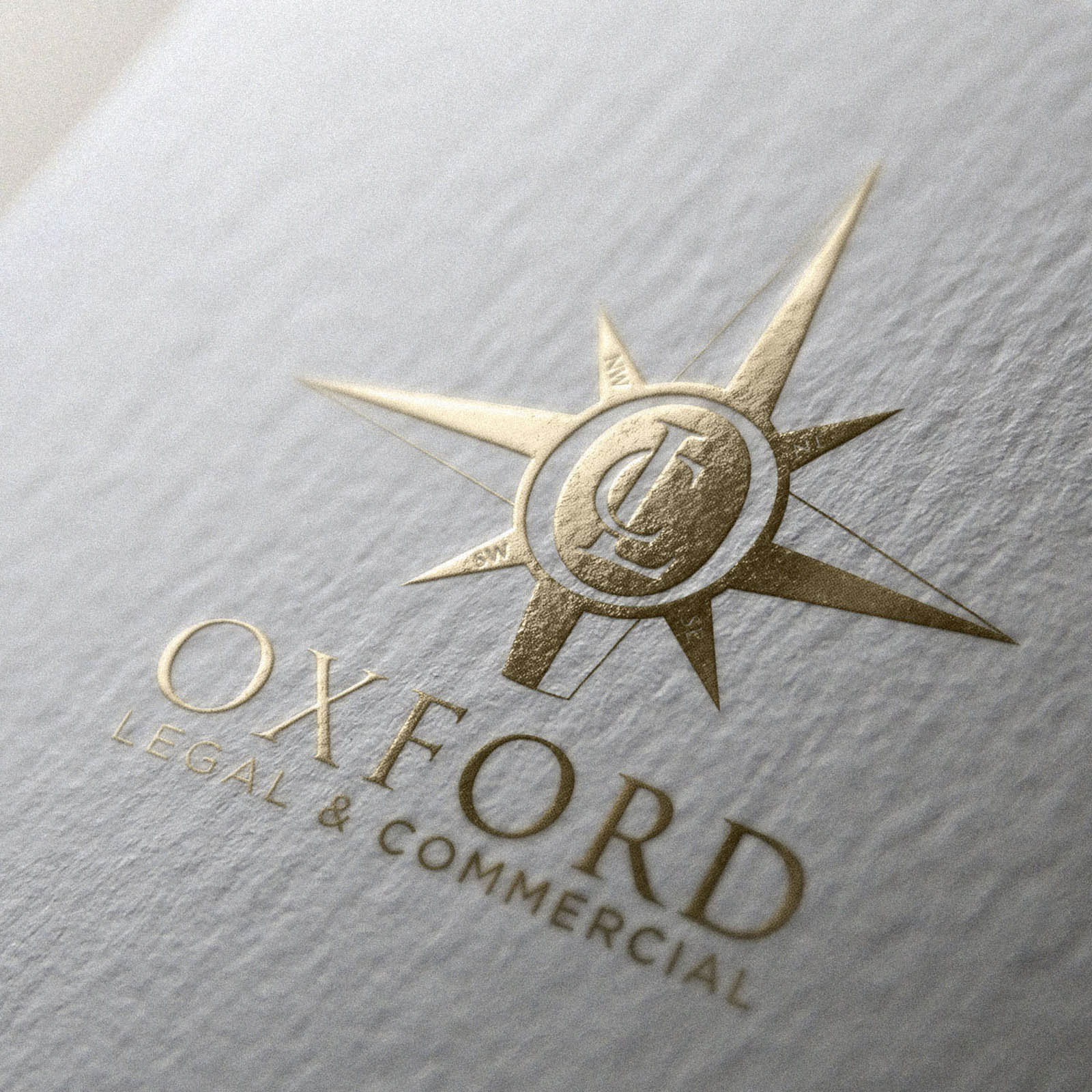
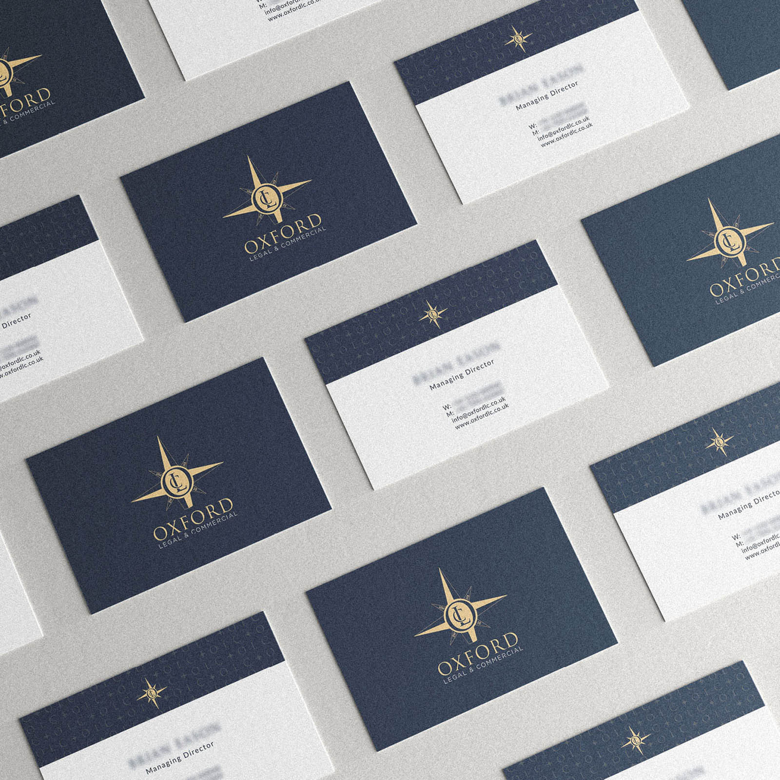
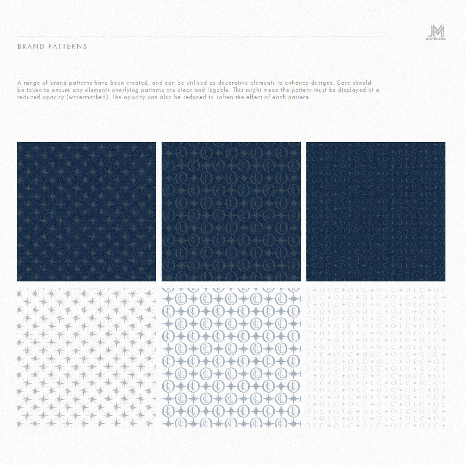
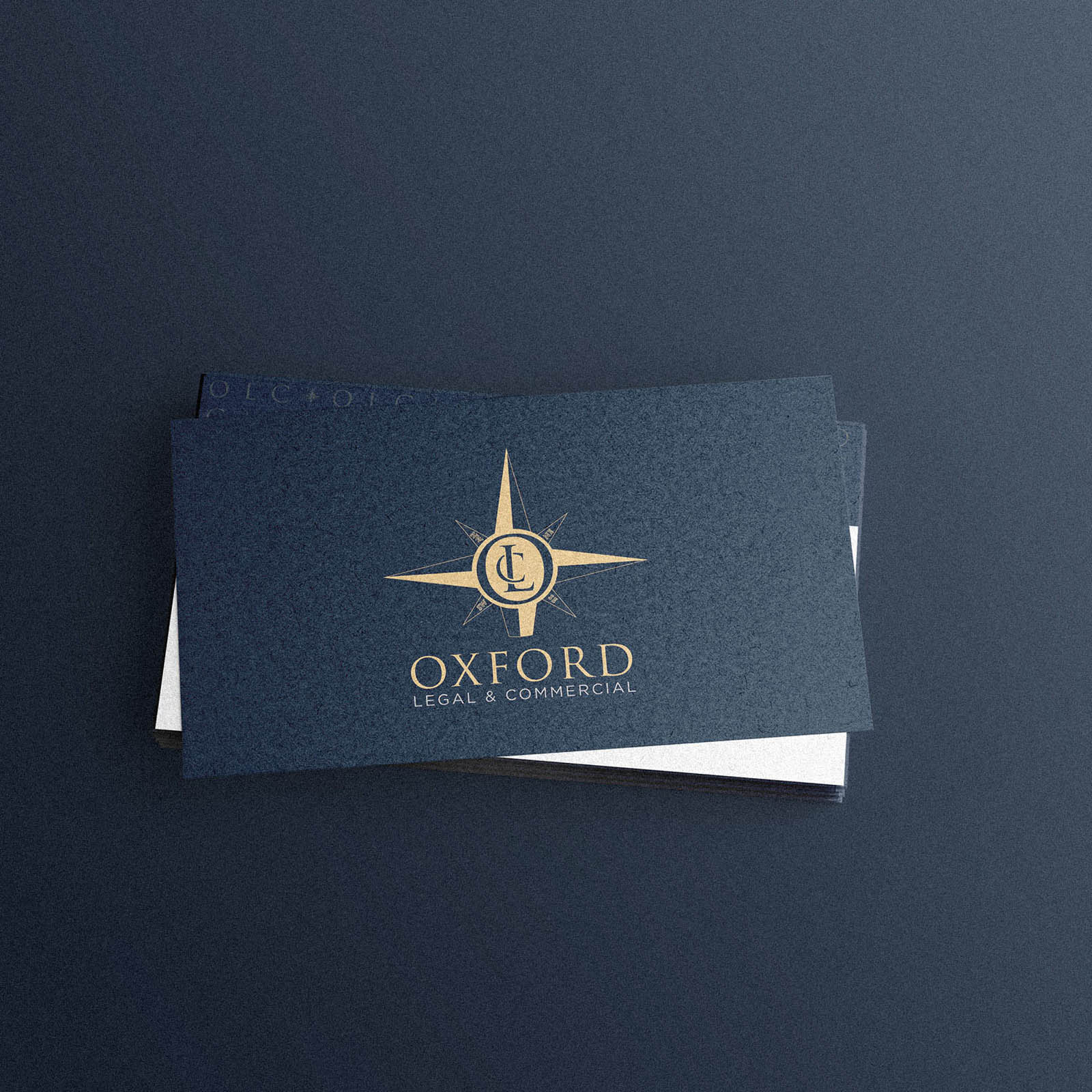
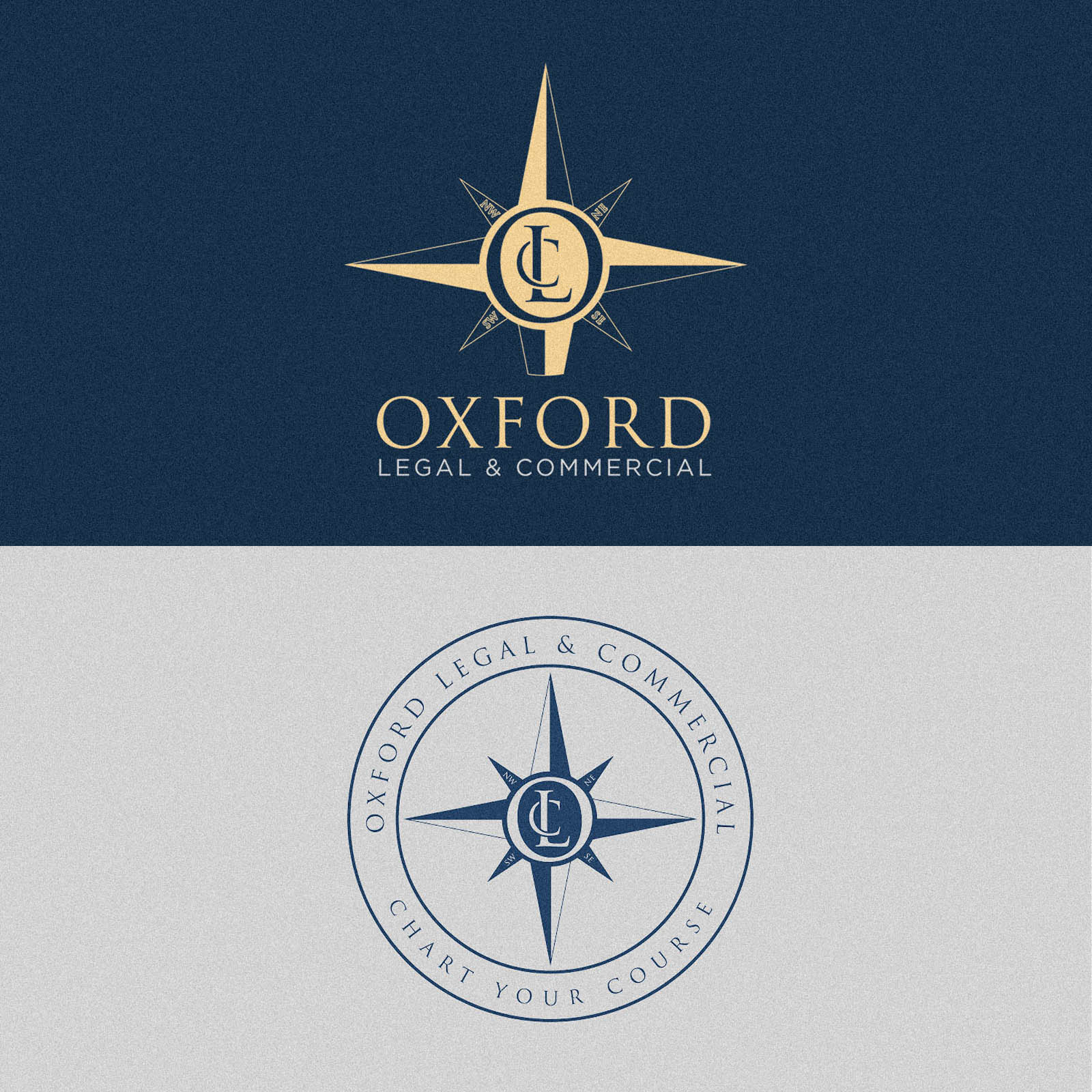
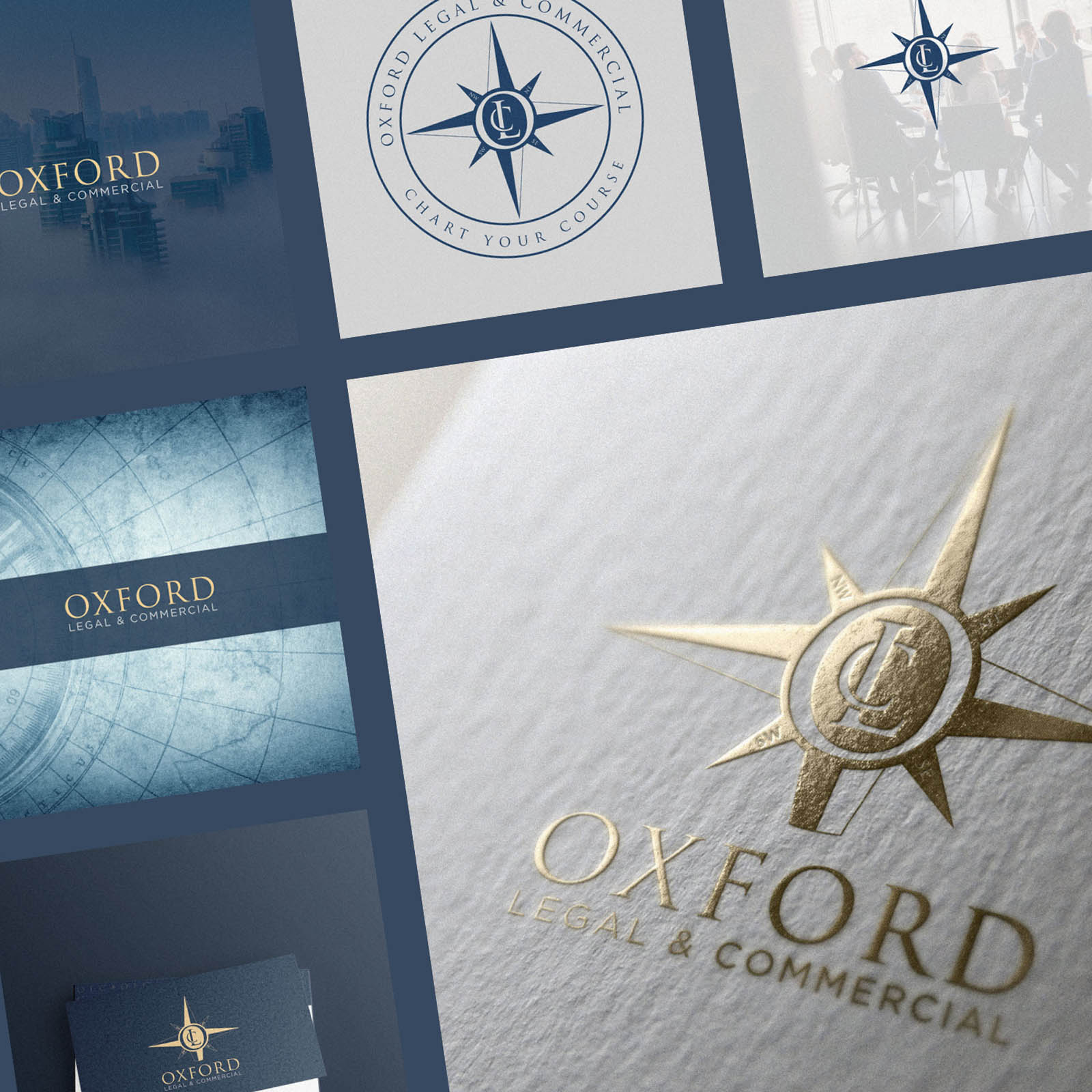
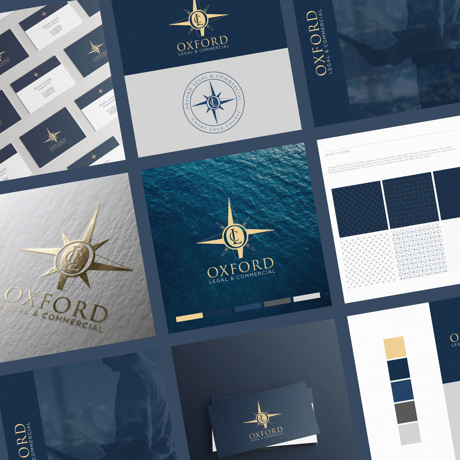
Oxford Legal & Commercial commissioned me to create their new brand identity, to include a logo, submark, logotype, badge mark, monogram and brand patterns; full scope. It was a real pleasure working with their team, who had a clear vision we were able to colaboratively bring to life.
As Oxford LC help their clients navigate various legal and practical matters related to the efficient and successful running of a business, they wanted to a compass as the brand symbol, to play on this analogy. We decided the compass would be the perfect place to house a custom monogram; therefore transforming it from a generic symbol to something ownable with a clear link to the brand. Part of the process included determining how each seperate element would work together, and which situations each is best used in.
The natical theme evolved as we considered imagery and a complimentary colour palette, with gold used as an accent to ensure the correct positioning as a premium, high end brand.
Be sure to check out the latest generation WordPress Website I design and developed for them using the new brand identity here; Oxford LC Website Design.


