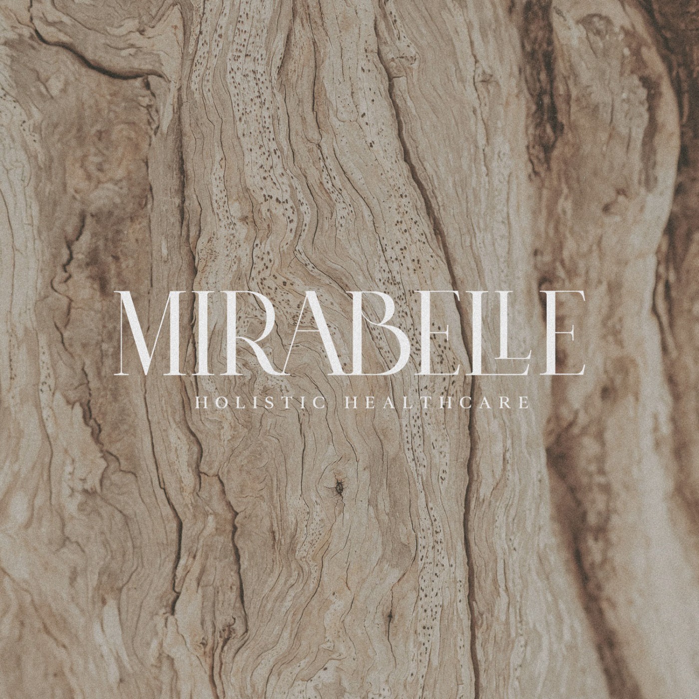
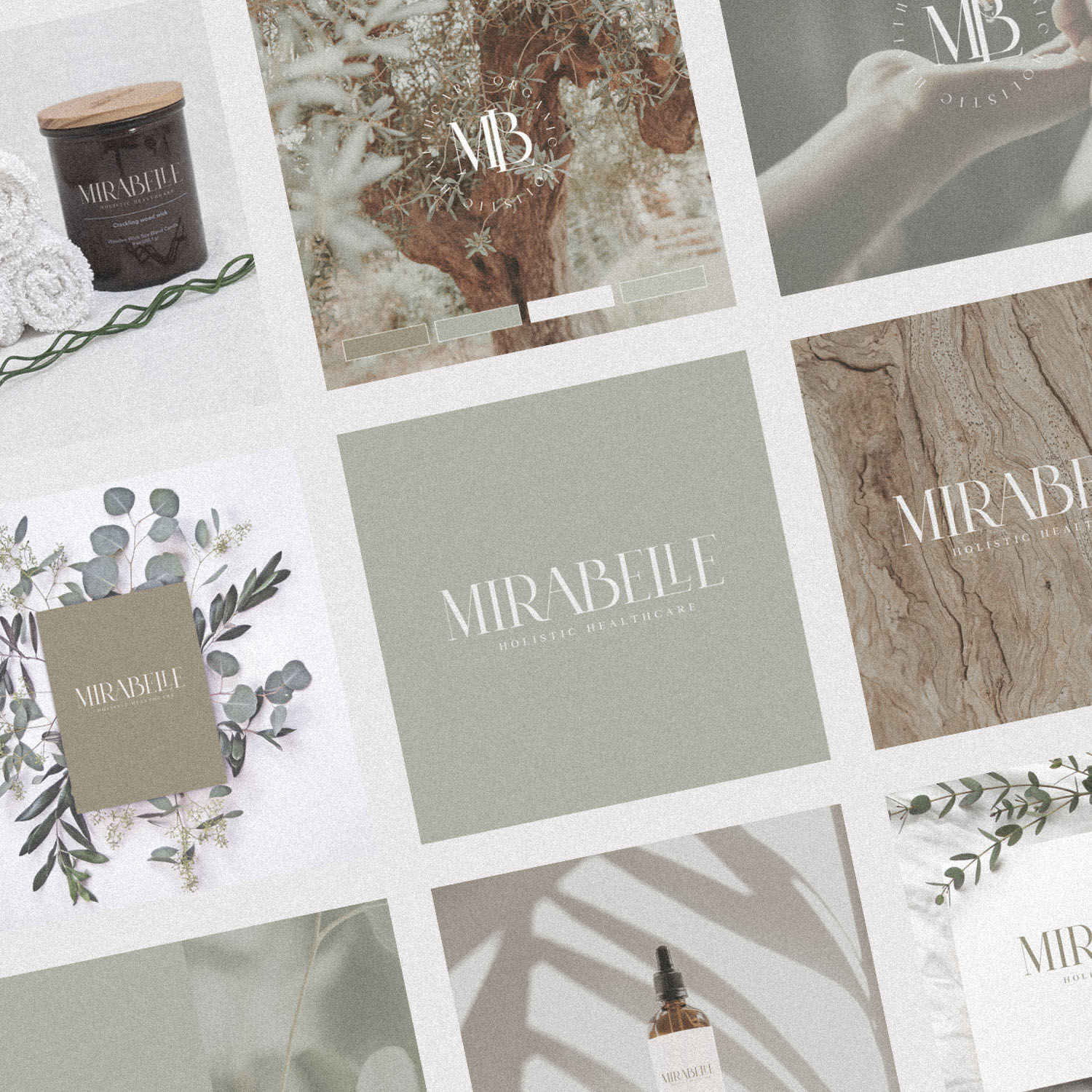
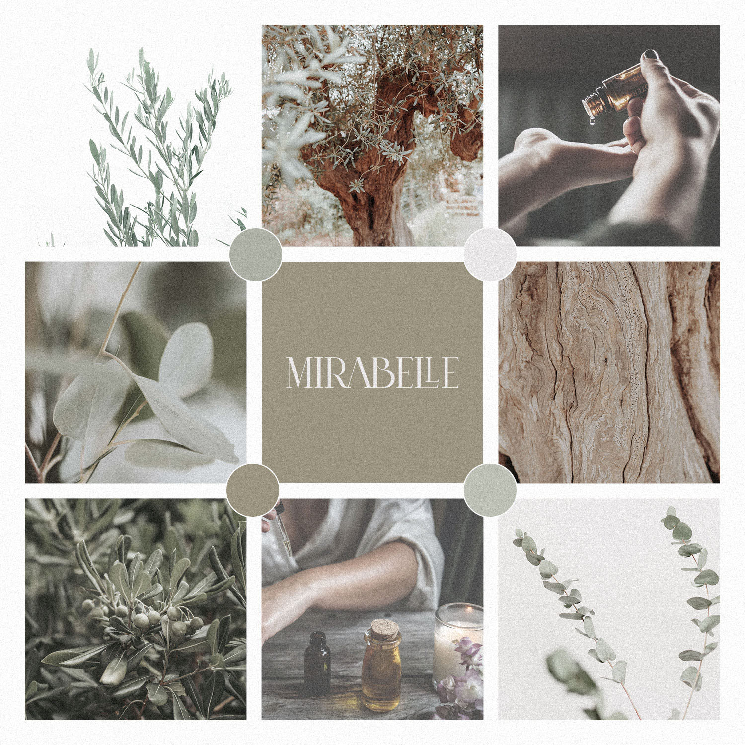
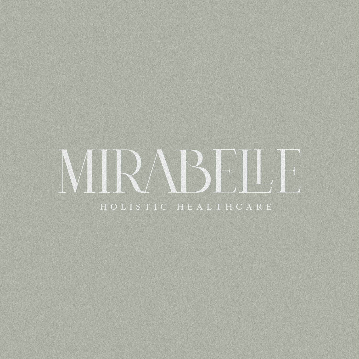
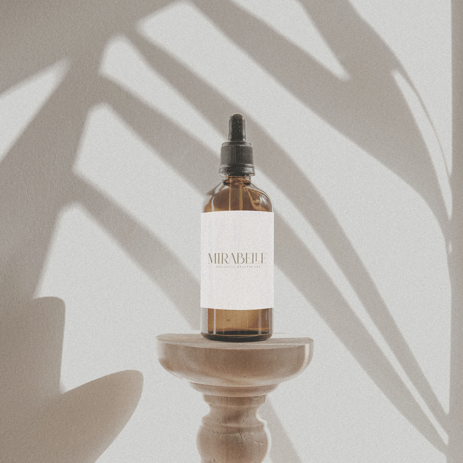
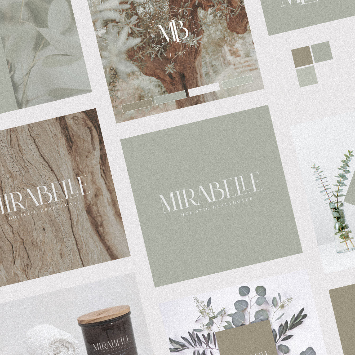
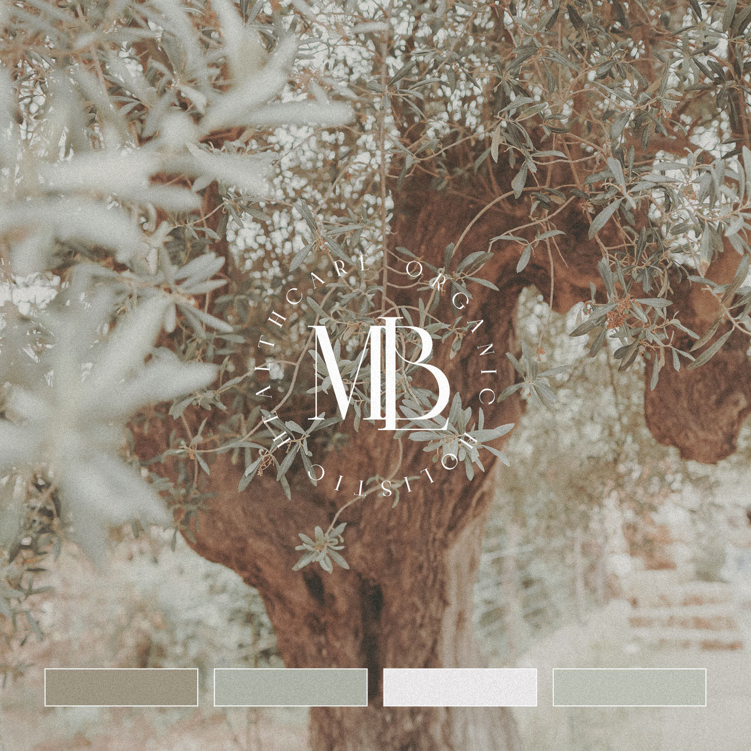
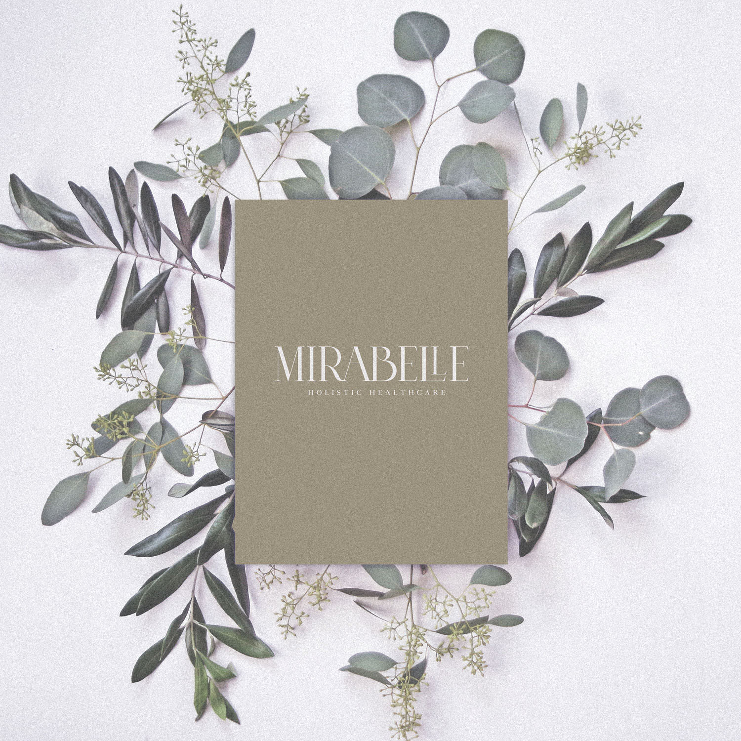
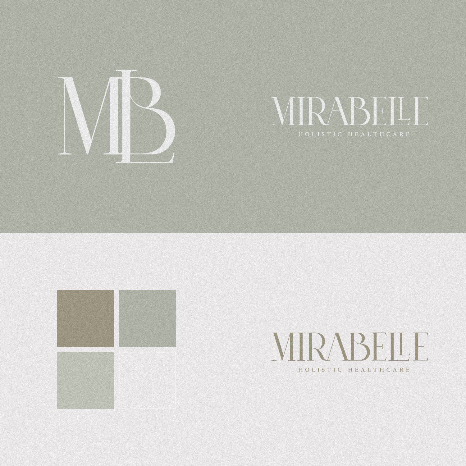
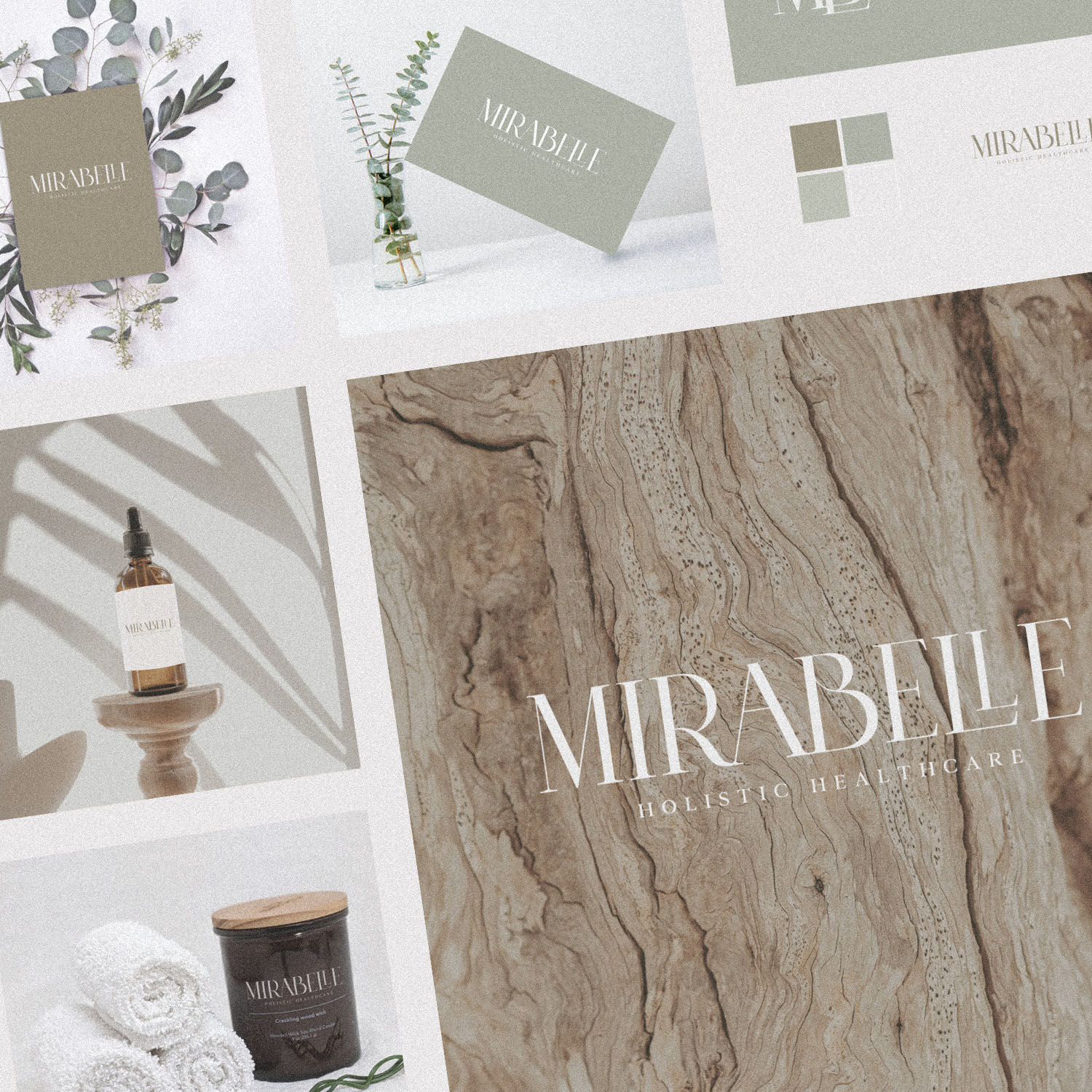
Brand Identity Design for Mirabelle – a holistic healthcare brand featuring a wide range of organic and vegan products. The colour palette was inspired by earthy neutrals, including olive & eucalyptus – and conveys a real sense of natural wellbeing.
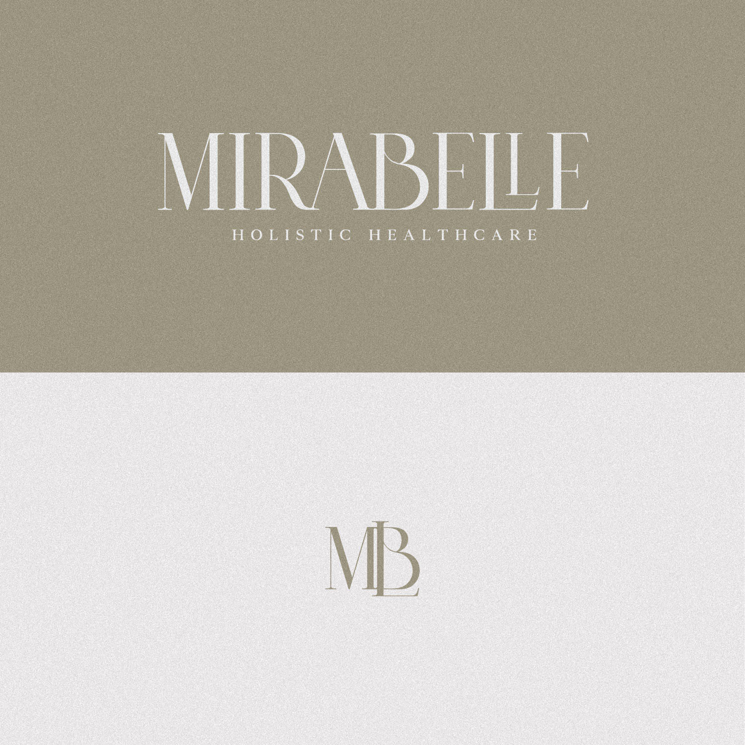
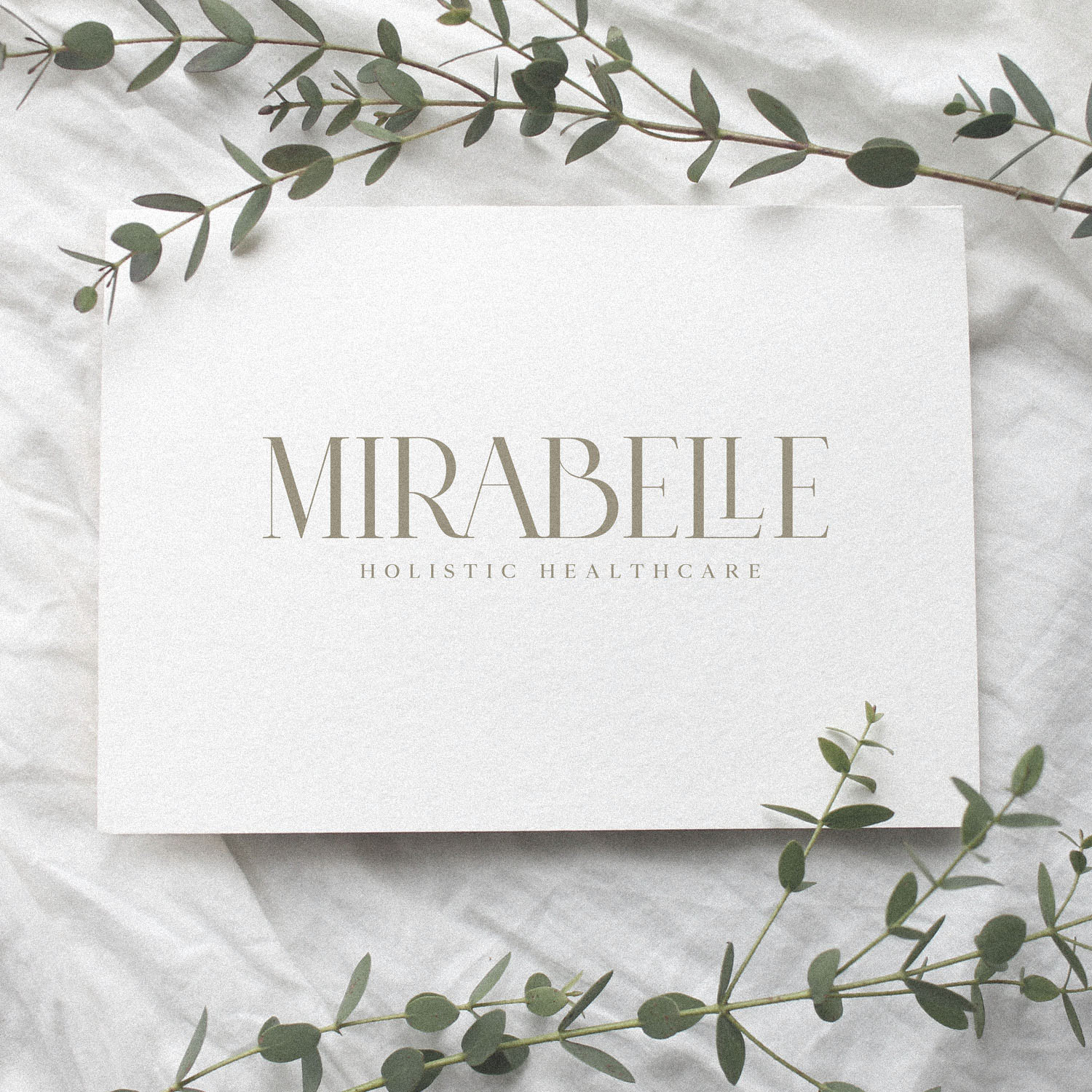
There are some beautiful details in the logotype, the sweeping leg of the ‘R’, the swoosh in the ‘B’, and a customised treatment for the ‘LL’ to nest one letter inside the profile of the other.
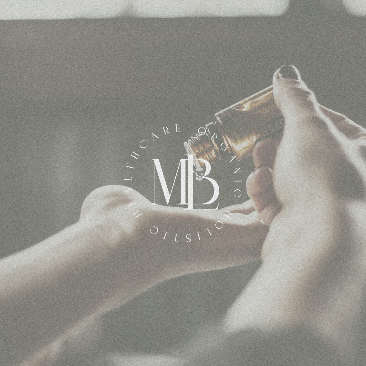
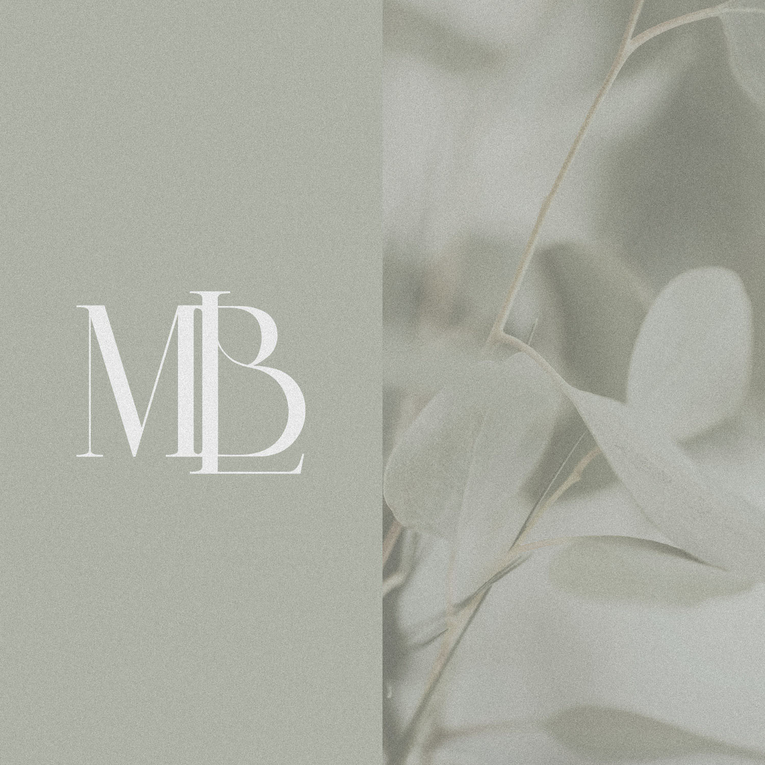
The submark combines key charecters to form an abreviated shortform of the brandname, which works well as the focal point of a badge style submark.
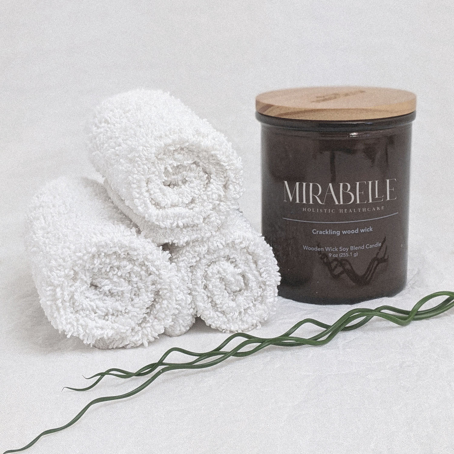
The branding works so well in the context of organic textures, natural shapes and colours – there is a real harmony between these elements which makes the brand feel coherent in a deep, almost ‘hollistic’ sense – which is exactly the result we hoped to achieve.

