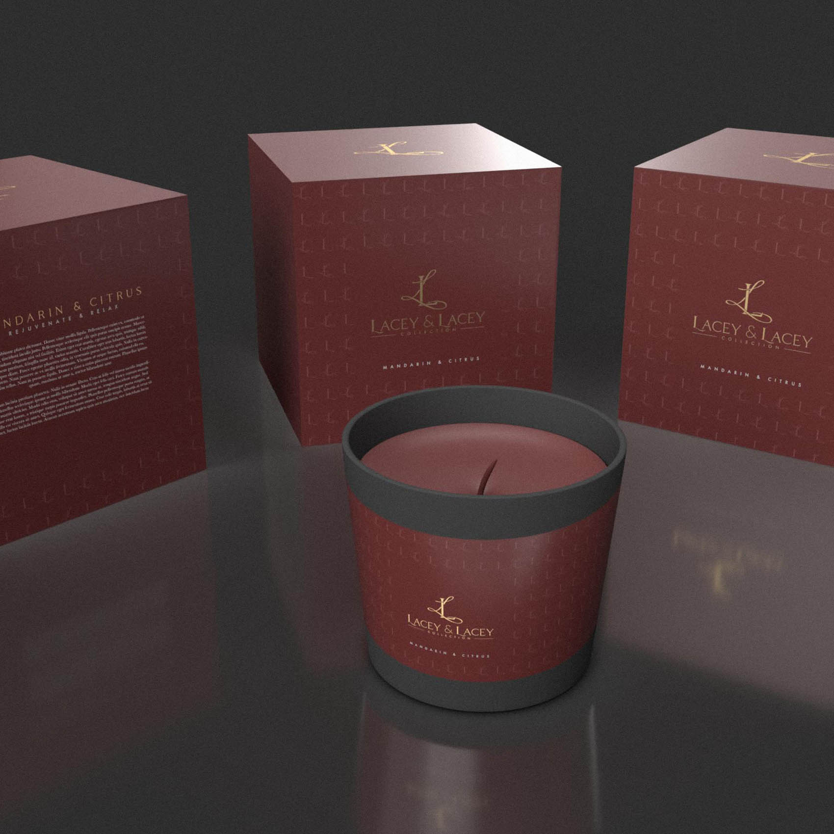
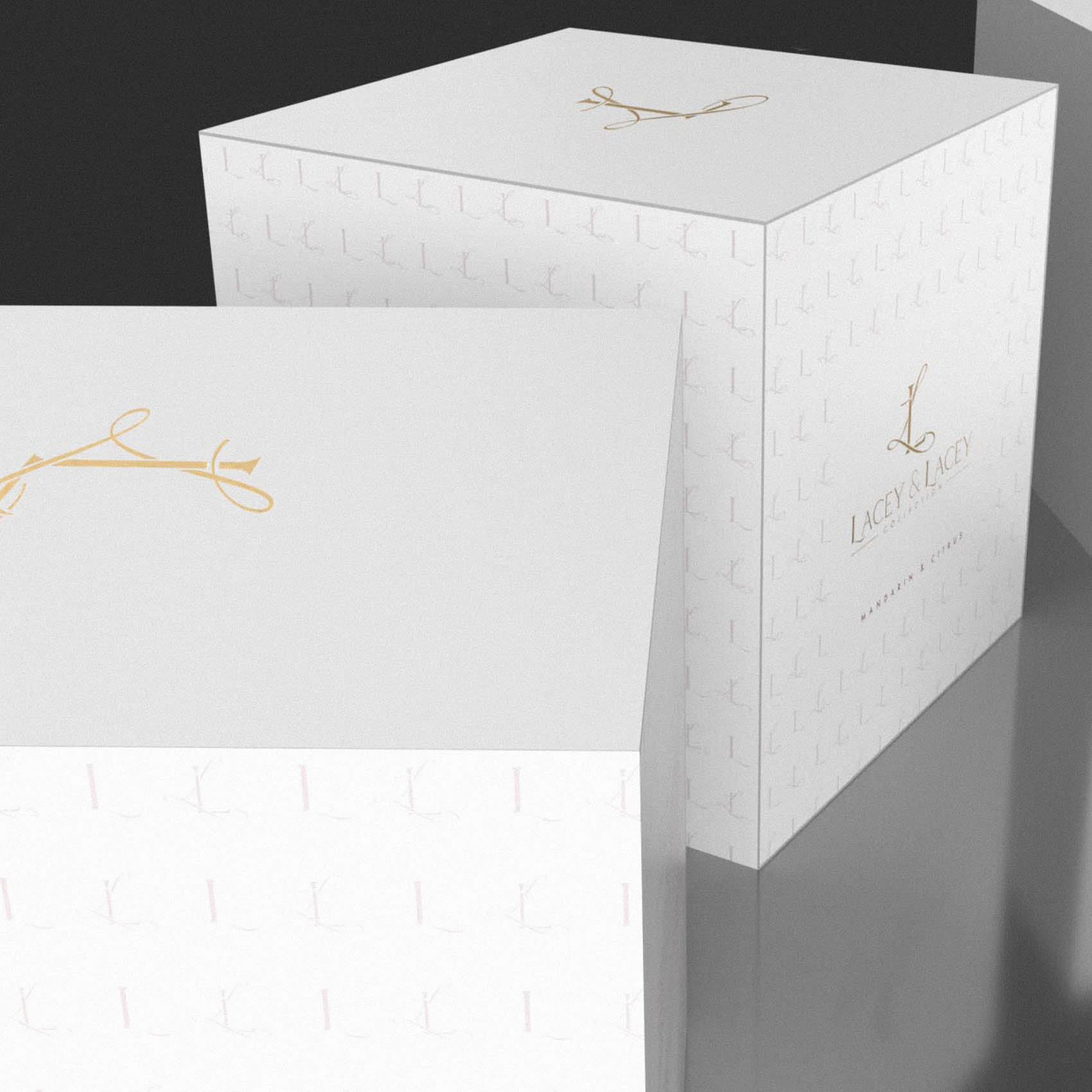
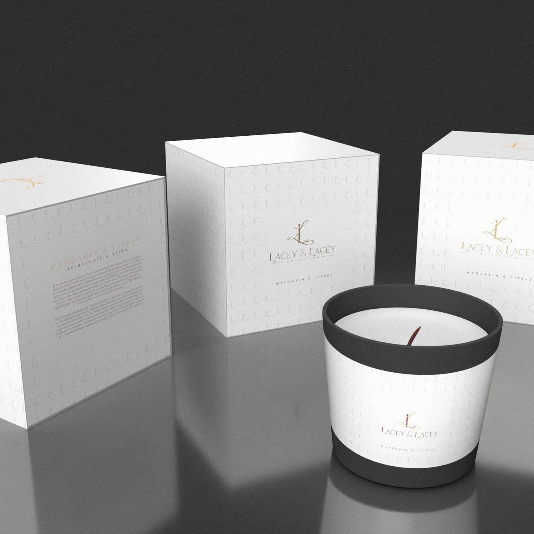
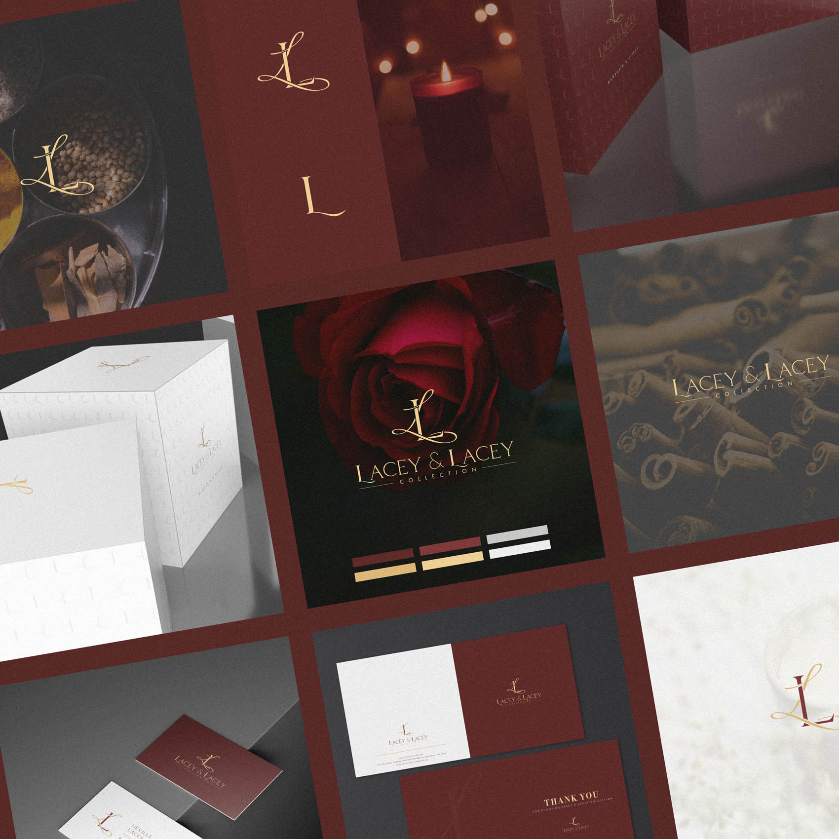
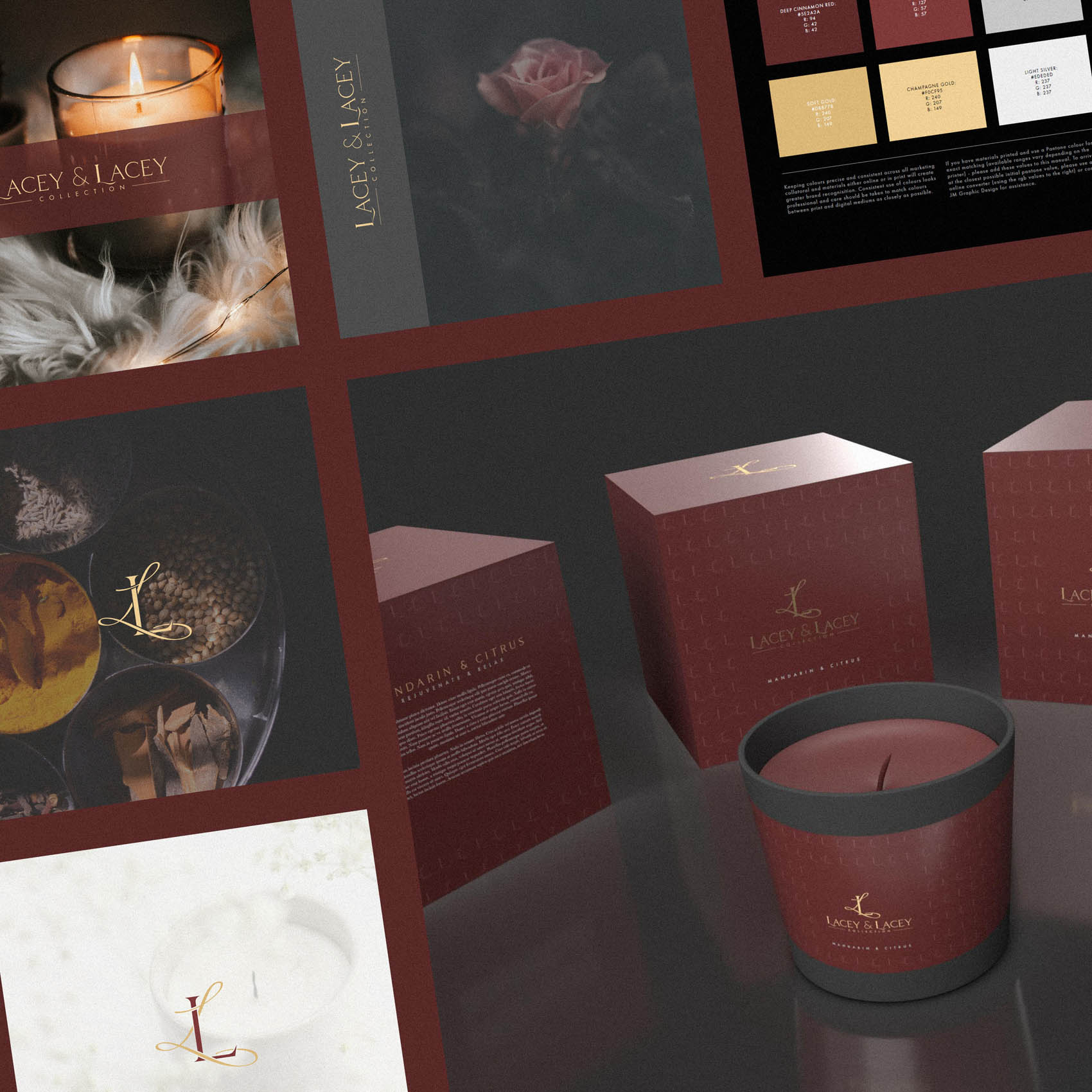
I love the elegance of luxury candles; from the votive to the presentation box, it’s a designers dream to not only conceptualise brand identity, but develop and apply it to such a beautiful packaging application. This was one of those occasions.
Lacey & Lacey is a family business founded in Ohio, United States by Neville and Regina Lacey. They established their luxury fragrance candle company in 2005, and have poured a huge amount of passion into their work. Each candle is an individually hand-poured soy candle, nestled within beautiful, repurposed vessels. Every candle provides an aromatic scent to elevate the atmosphere and is sure to bring luxury and sophistication to set the mood.
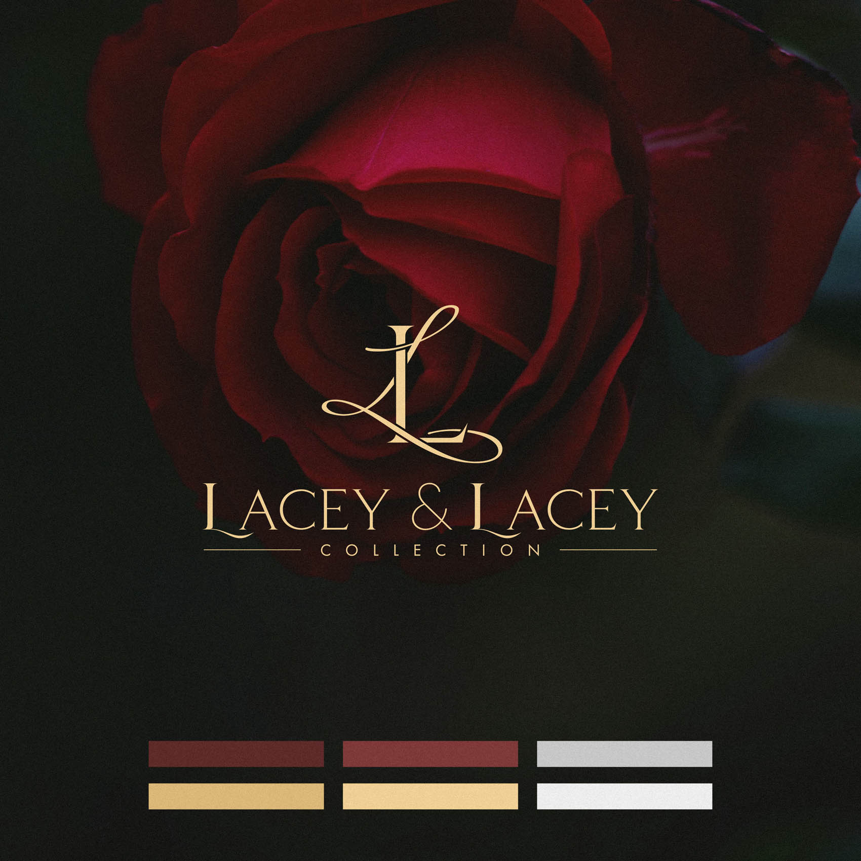
We wanted to convey a sense of passion & romance while also positioning the brand as luxurious and conveying the very high quality of the candles & their eco-friendly, sustainable but stunning luxury presentation.
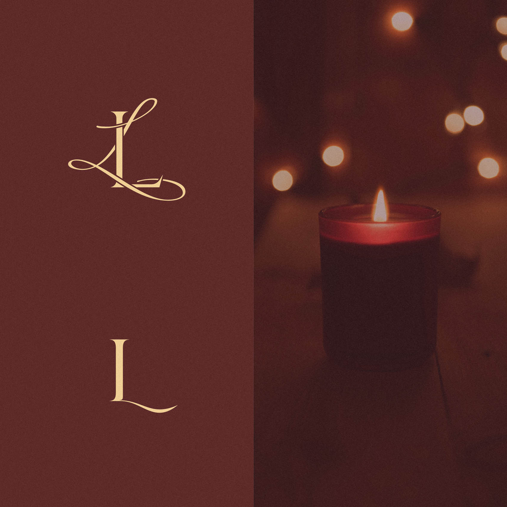
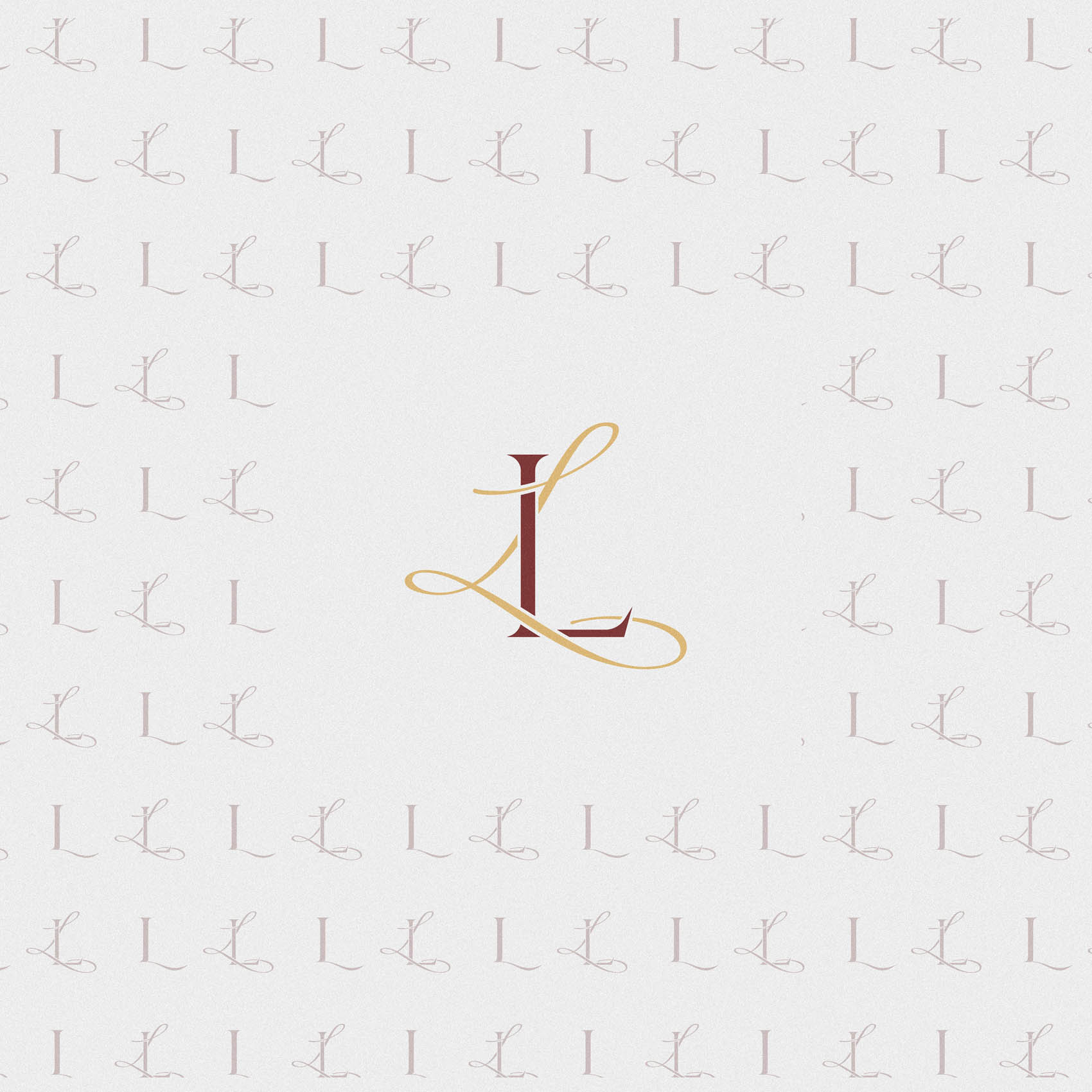
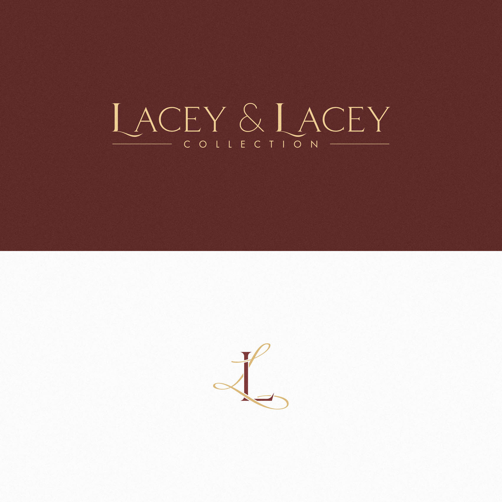
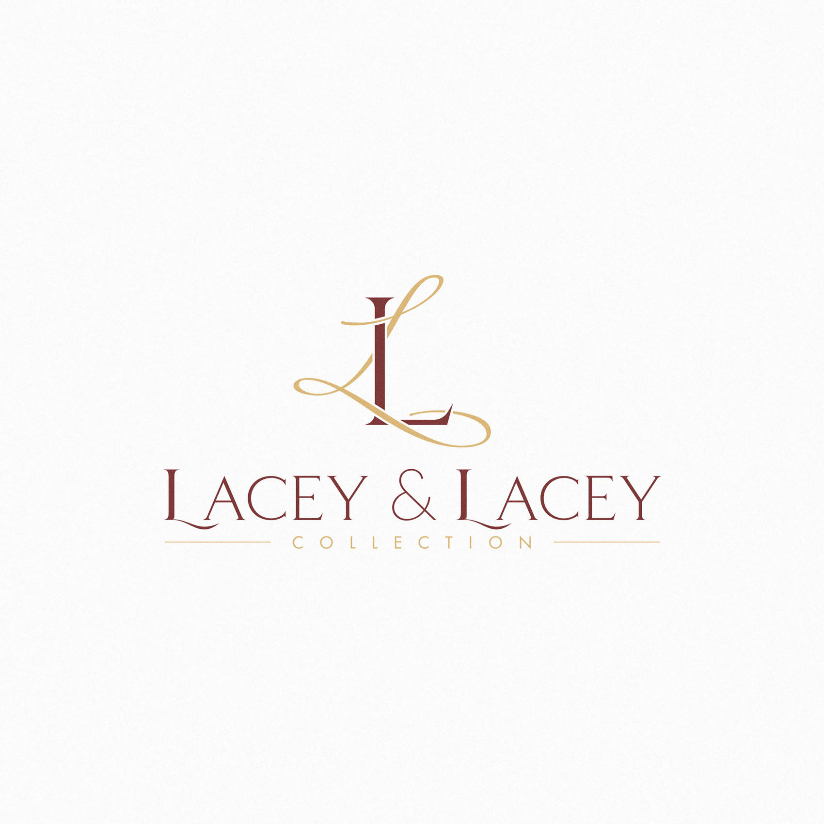
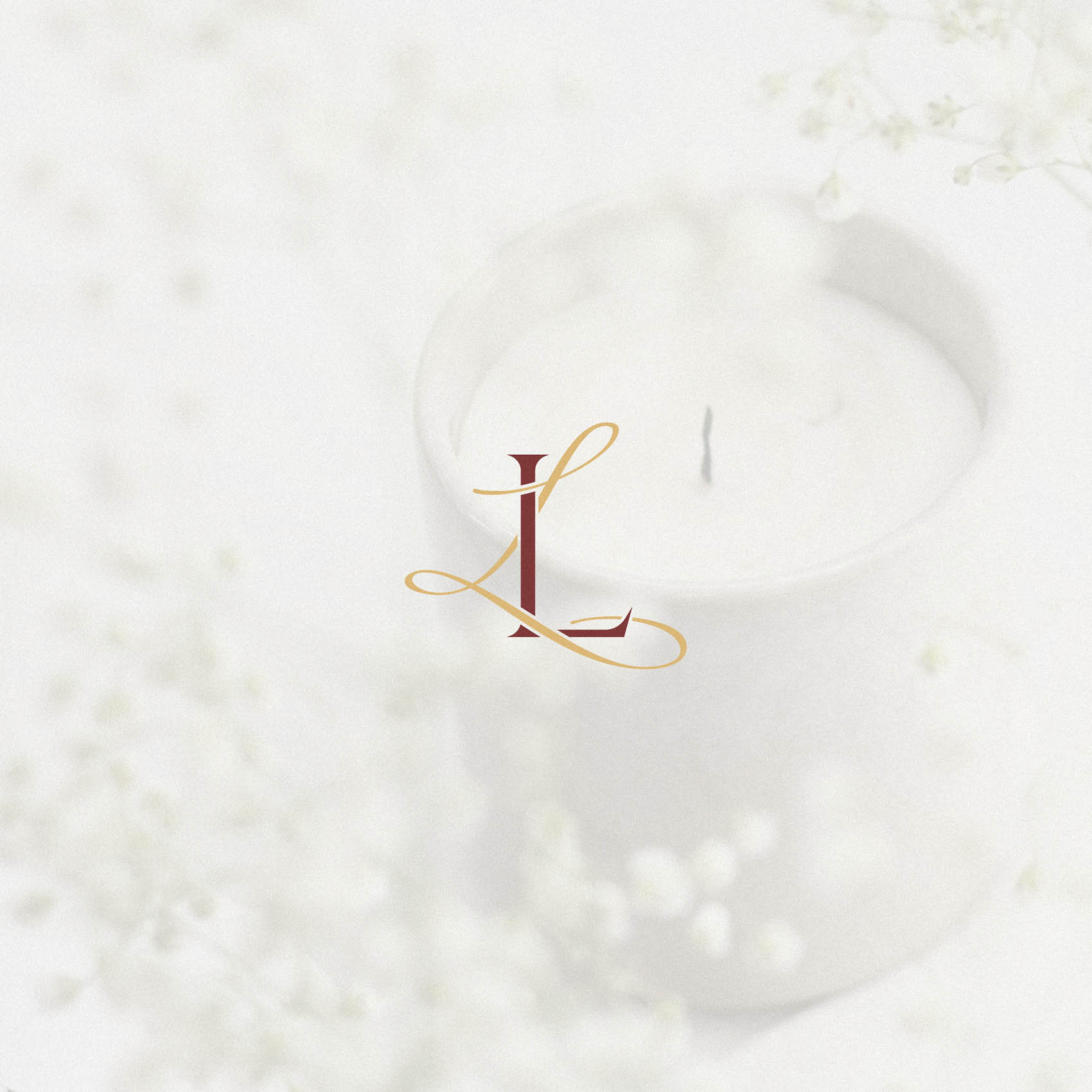
A unique monogram was developed to do just that, featuring a traditional serif L intertwined with a ‘Lacey’ script style ‘L’ – and this evokes an unmistakable sense of luxury, with the lacey ‘L’ hinting at the passionate, romantic nature of the brand.
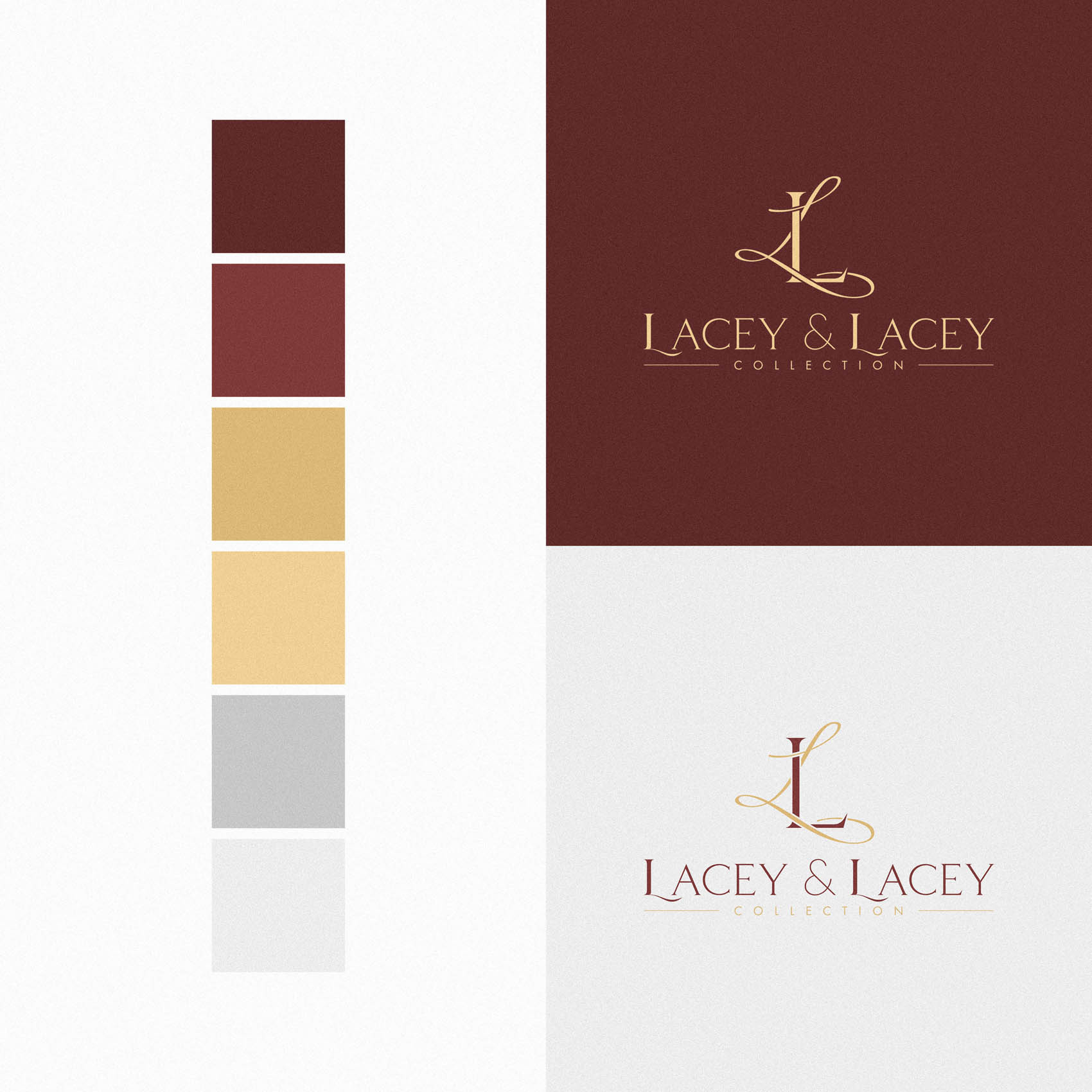
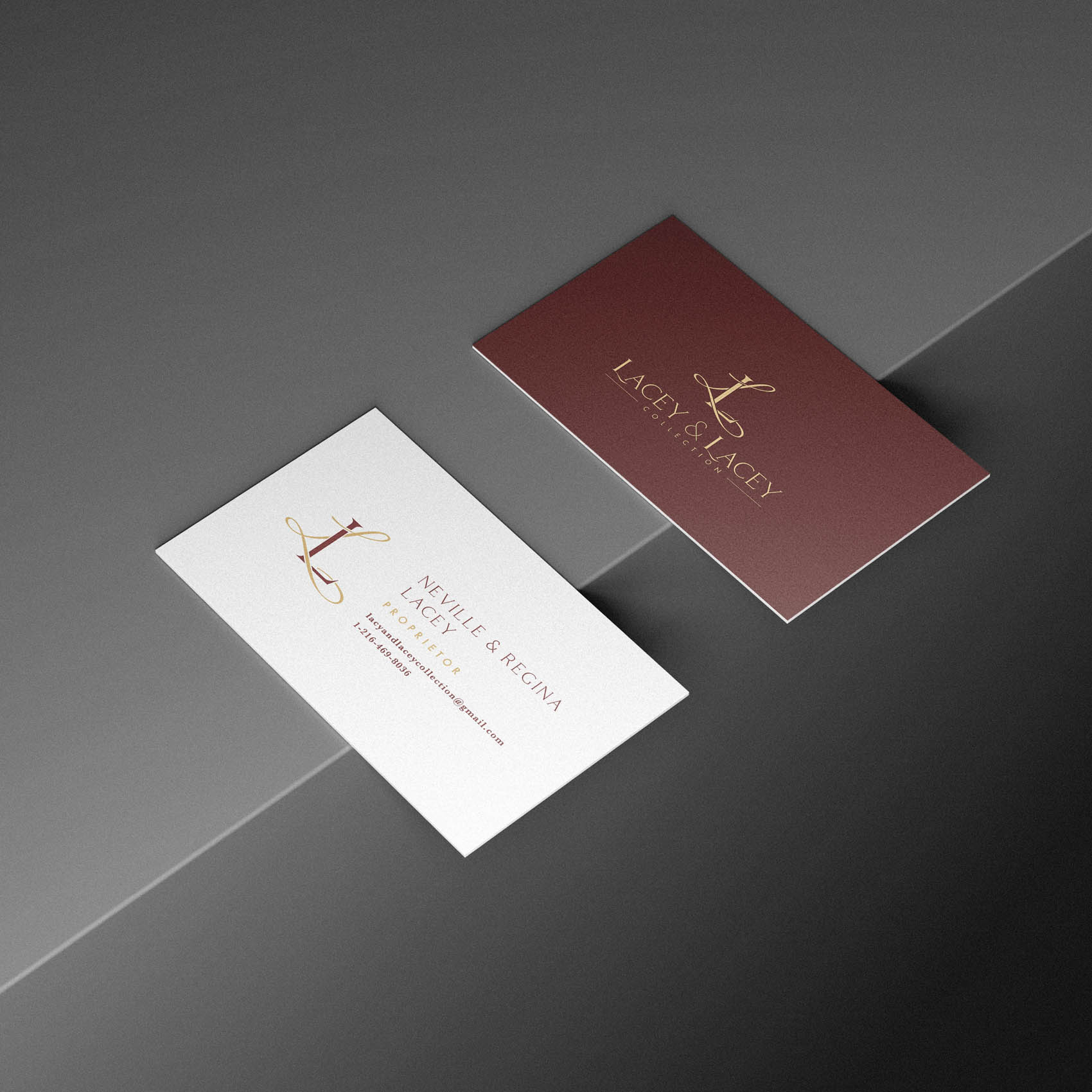
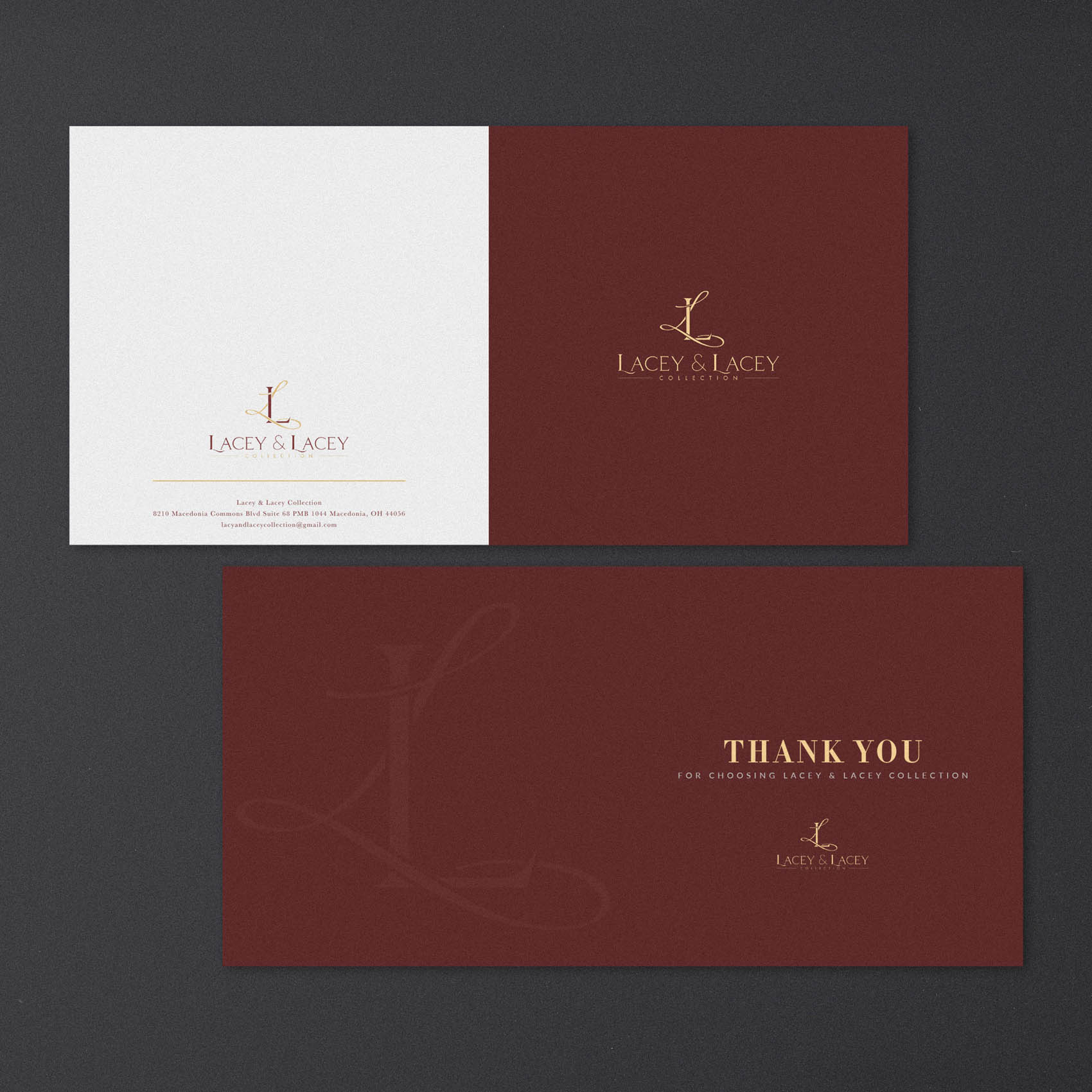
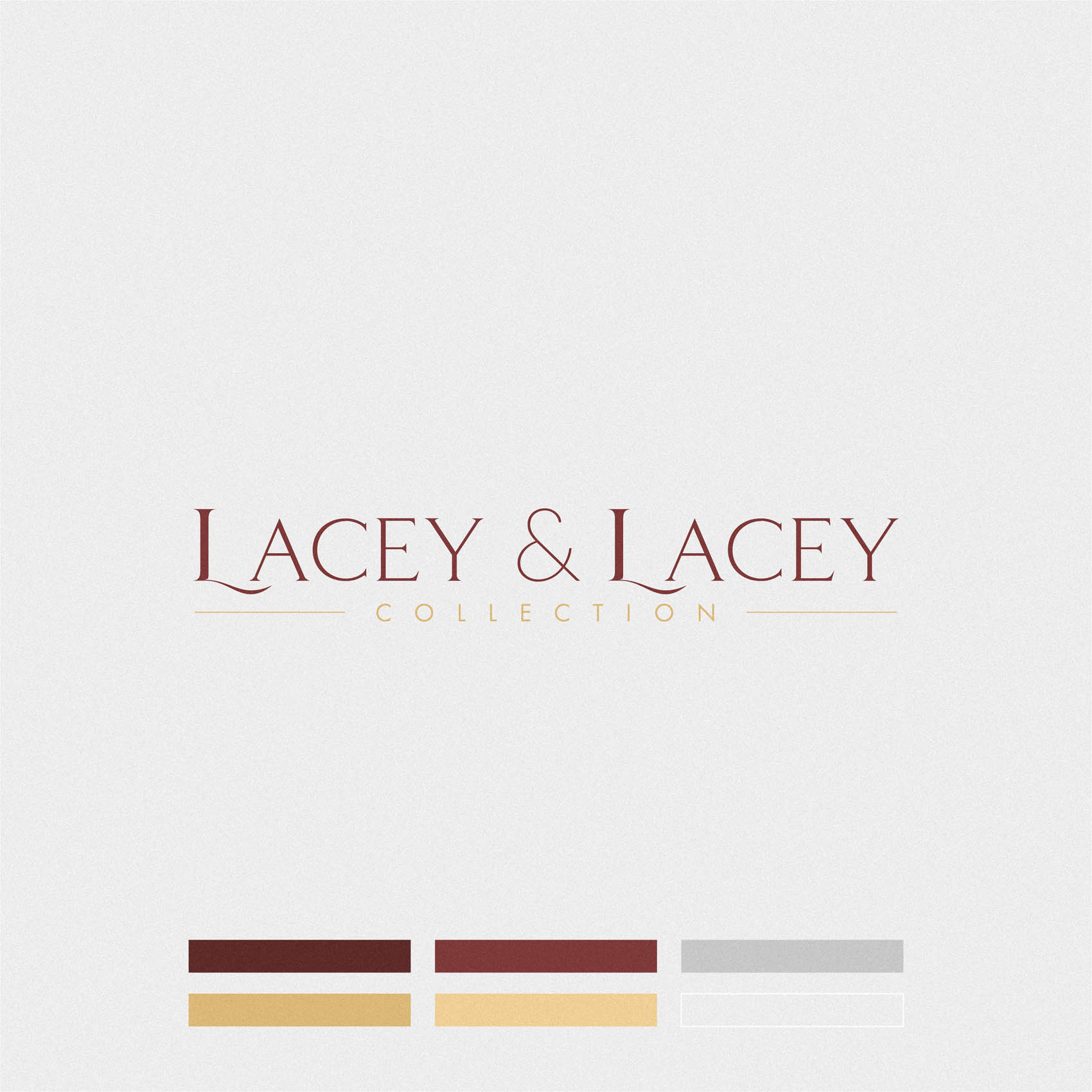
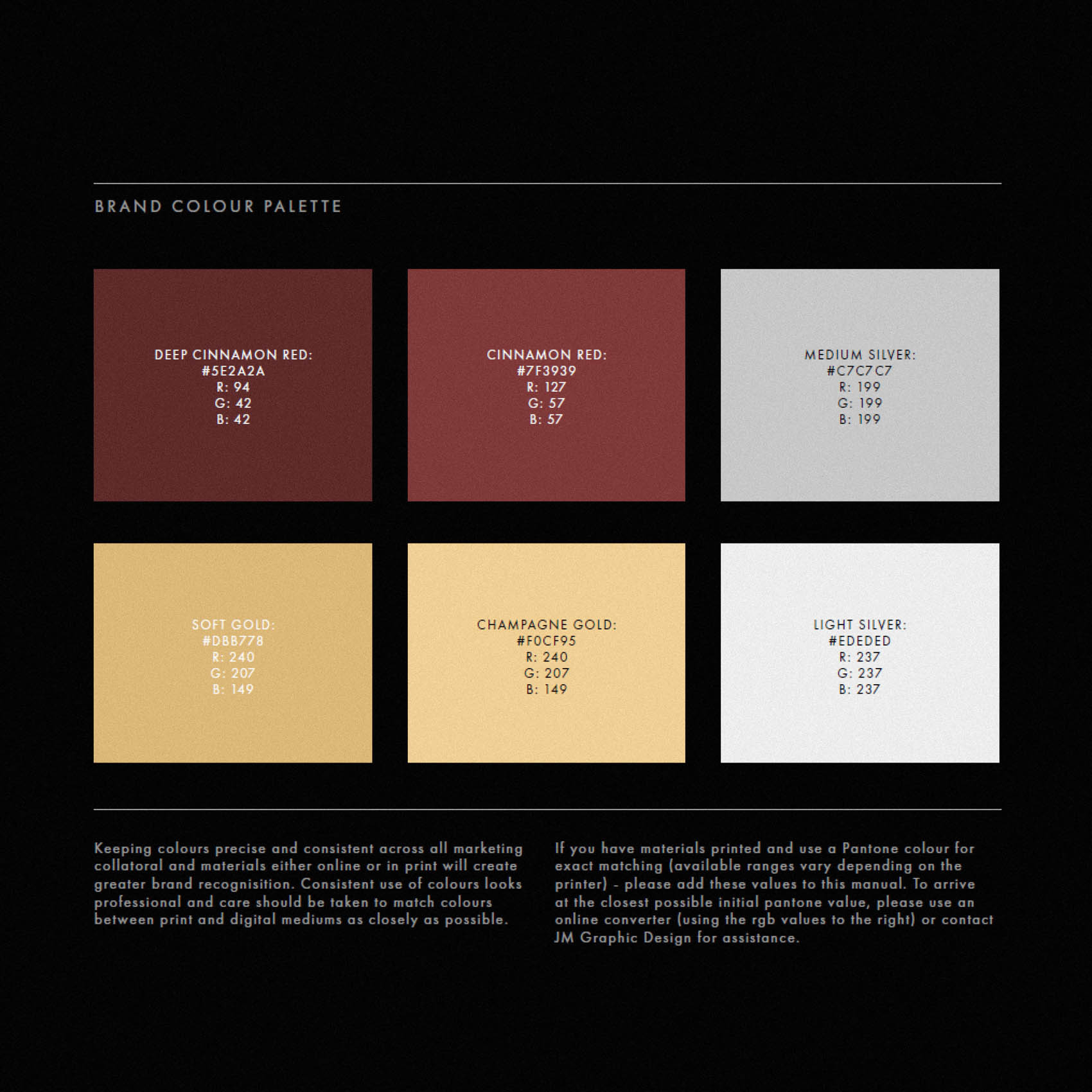
The colour palette brings this home, with a warm, indulgant Cinnamon Red, paired with Soft & Champagne Gold, together with silver.
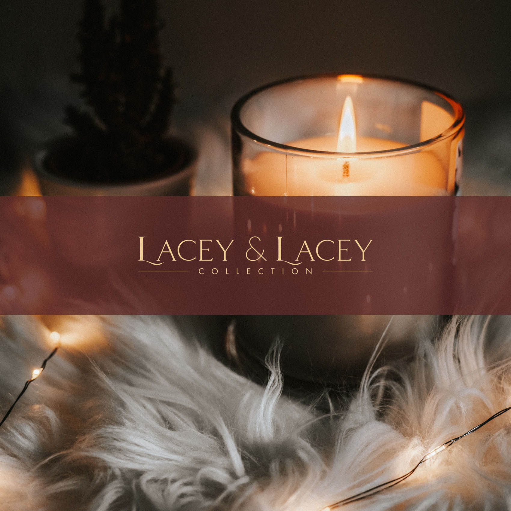
The logotype for ‘Lacey & Lacey’ was customised so that the ‘L’ features a subtle swoosh sweeping under the ‘A’. This ensures the standalone logotype wouldn’t feel detached from the style of the monogram, and conveys a similar aesthetic.
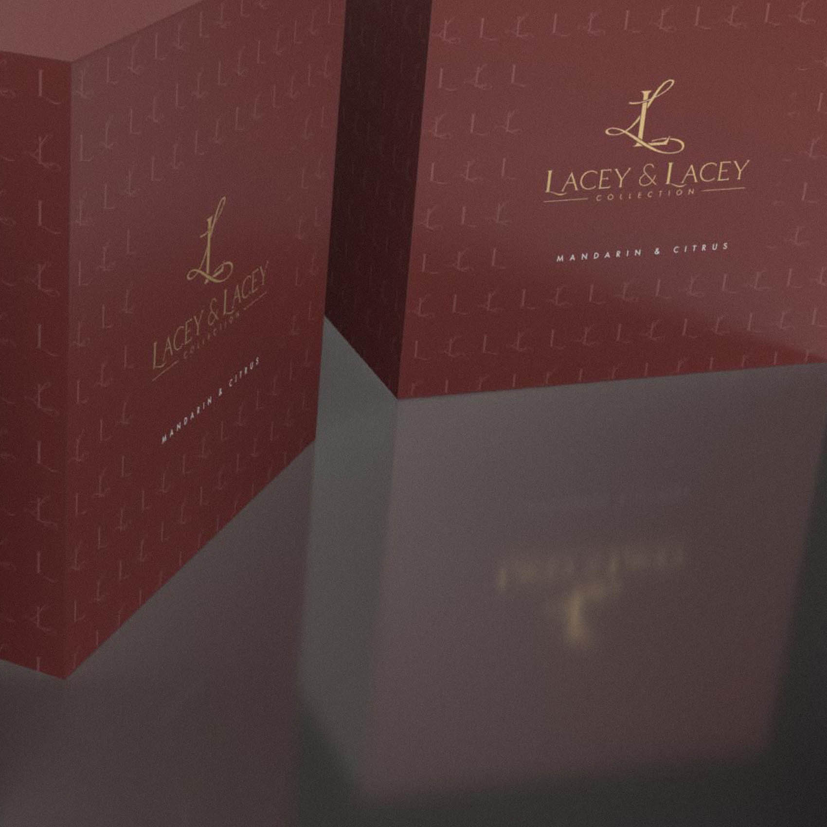
A simple step-and-repeat pattern formed from the ‘L’ in Lacey and the monogram create a very effective design element, which was utilised to great effect on the packaging.


