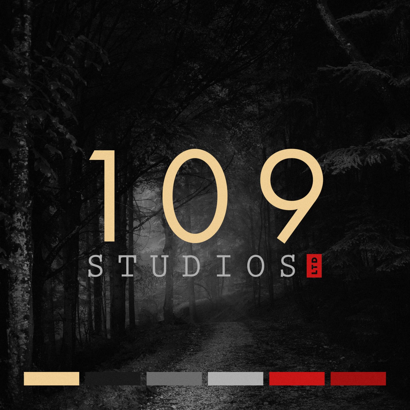
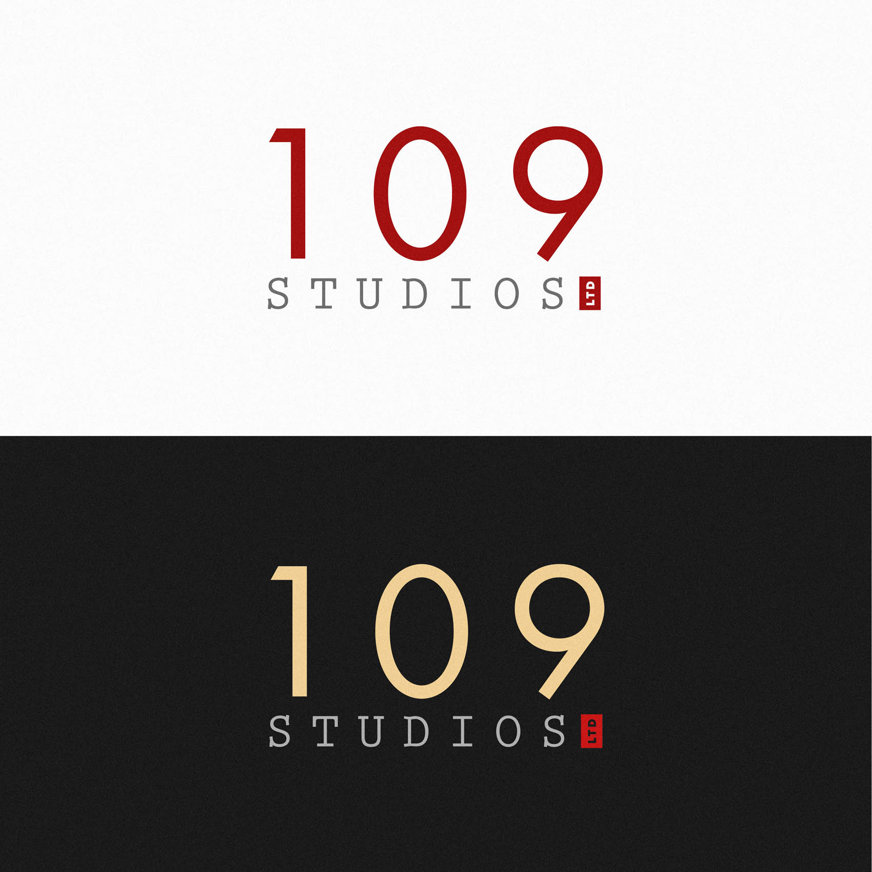
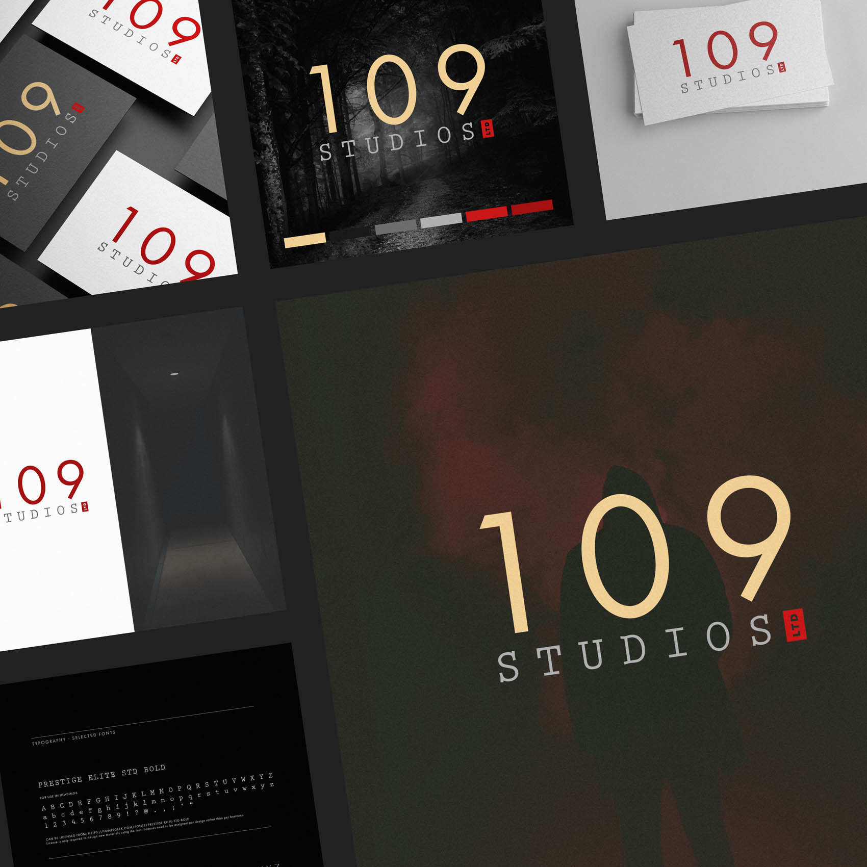
I was commissioned to create brand identity (including a new logo) for 109 Studios, the professional brand of Screenwriter and Novelist Francesca Lin; based in Hong Kong and London. While we wanted the brand to feel versatile enough to suit a broad range of projects, 109 Studios tend to specialise in certain genres; psychological thrillers, suspense and non-gory horror.
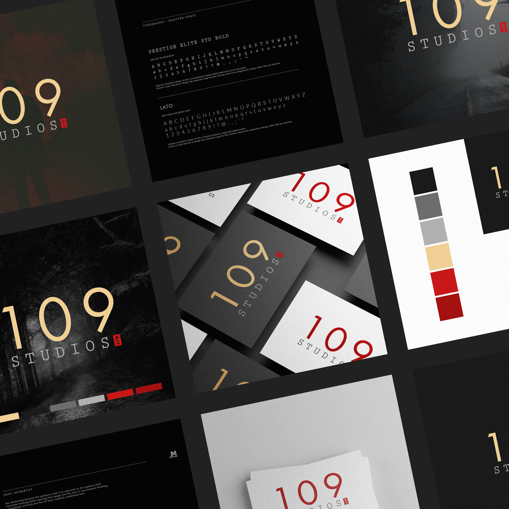
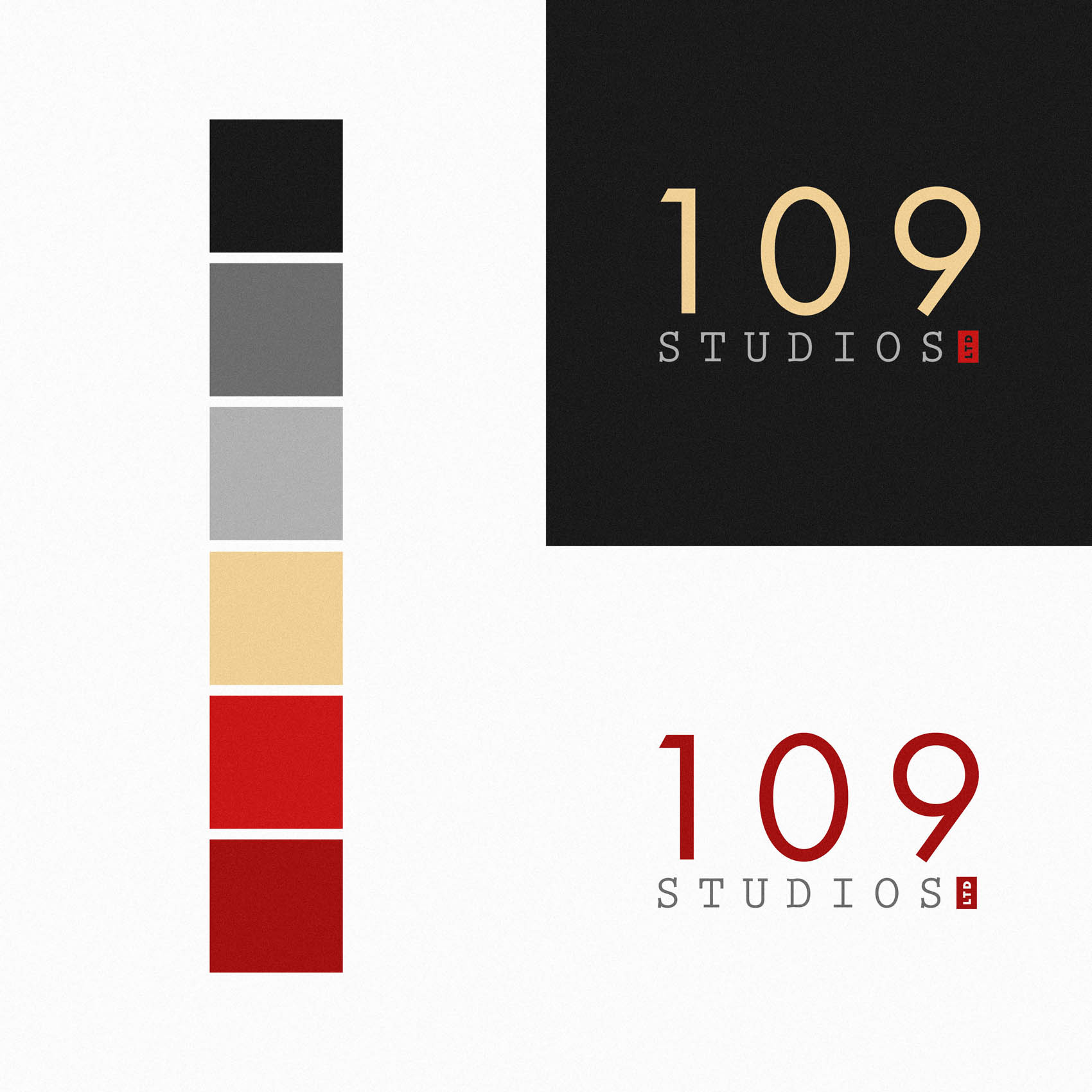
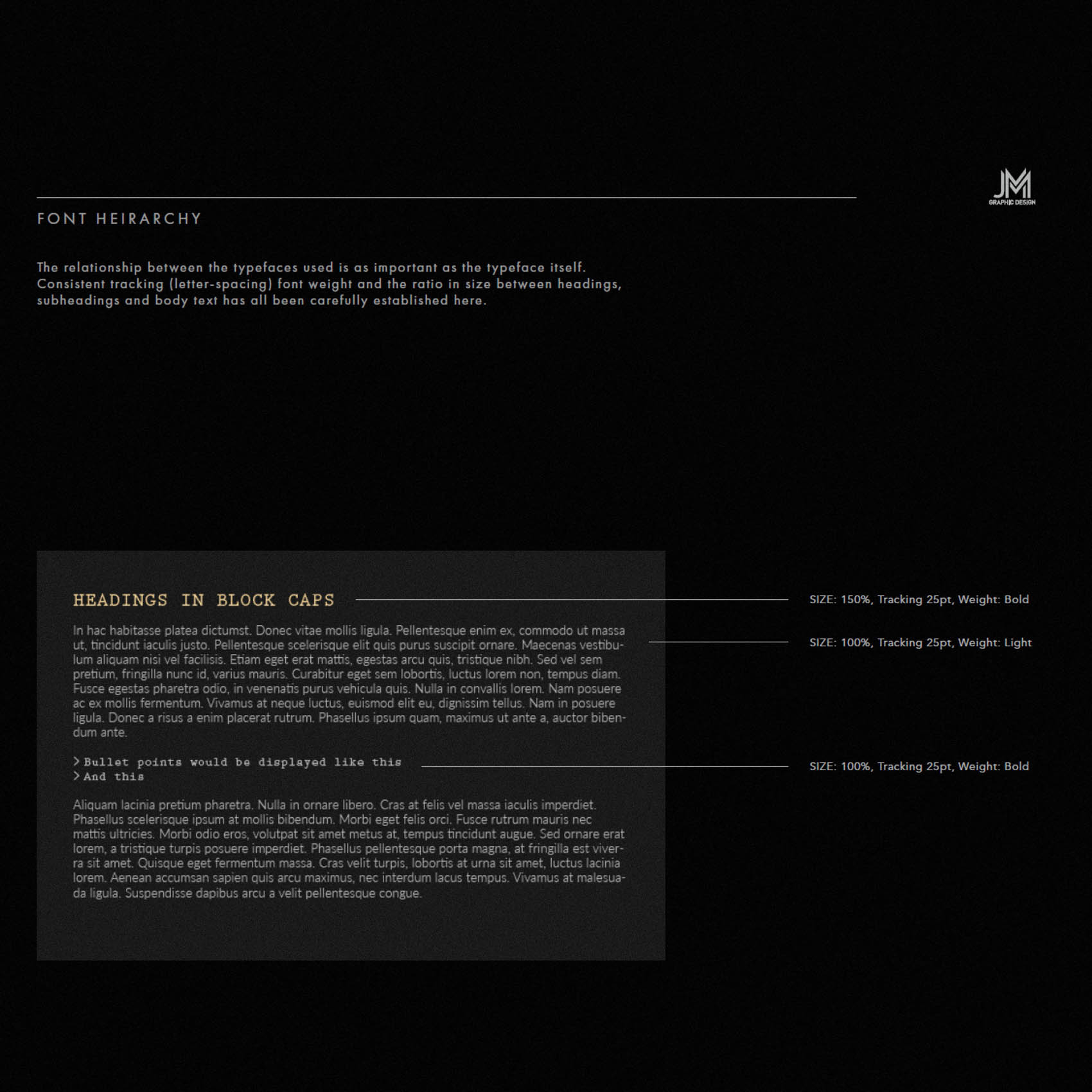
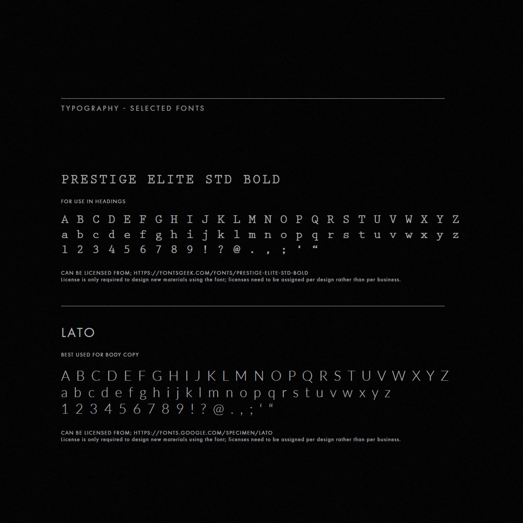
We explored a range of options before falling love with the simple but distinct typographic treatments for the logo. Initially considered treating ‘109’ in a way that evoked a sense of ‘horror’, with distressed lettering, or red paint running – but these all felt too cliché, also potentially limiting the versatility of the brand. Instead, ‘109’ is crisp, modern and professional, with ‘studios’ treated in a font that pays tribute to classic typewriters; and the ‘ltd’ mark is rendered within a red block, a nod to early word processors where a square block would blink to indicate cursor position. (This has since evolved into a thin vertical line, but it started as quite a bold block).
We loved the hidden meaning behind these simple elements – for those in the industry – while aesthetically the tight logo lockup and bold red block both look distinct and draw the eye.
The colour palette includes moody greys and erie reds, while a touch of gold assists in correctly positioning the brand as a boutique, high end studio.

