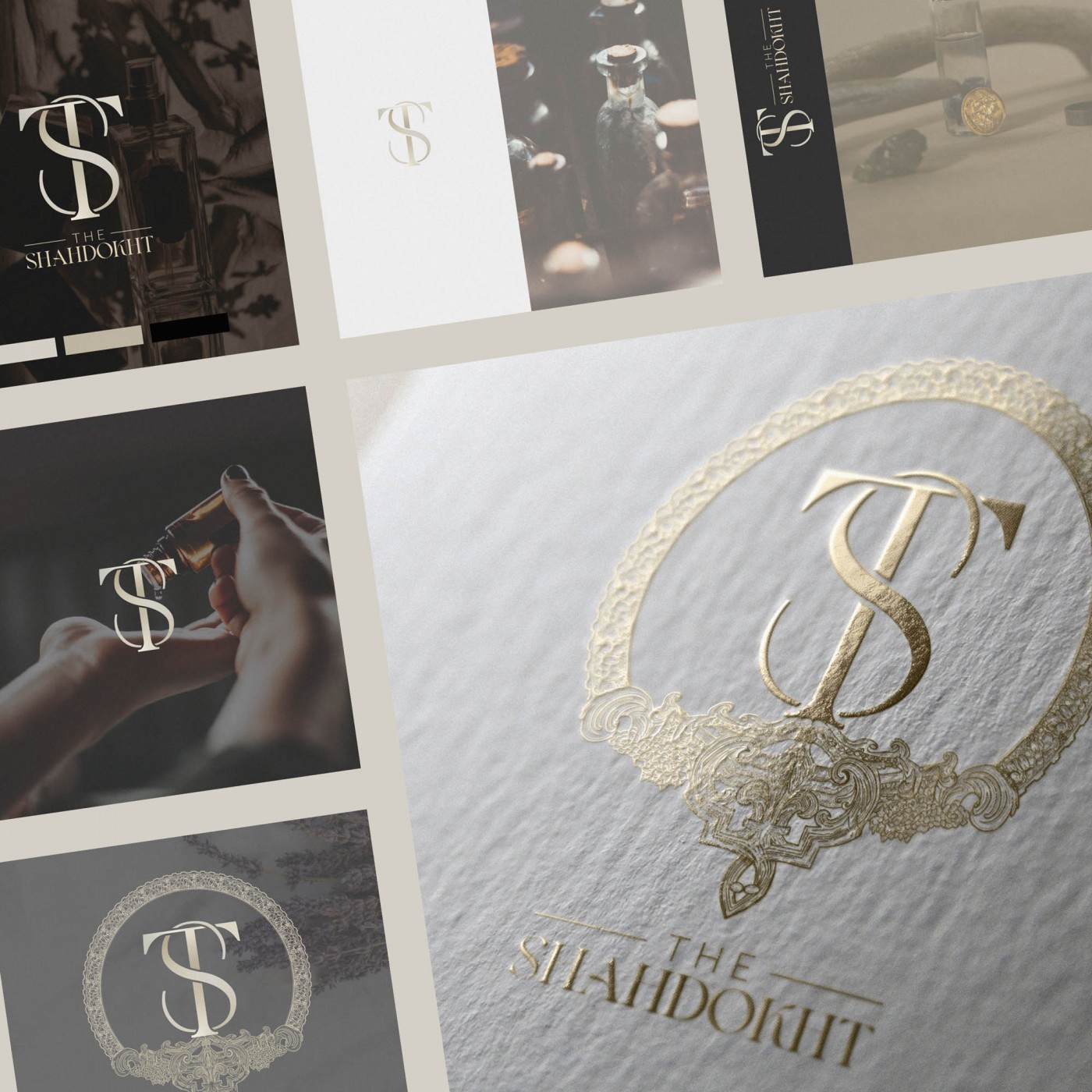
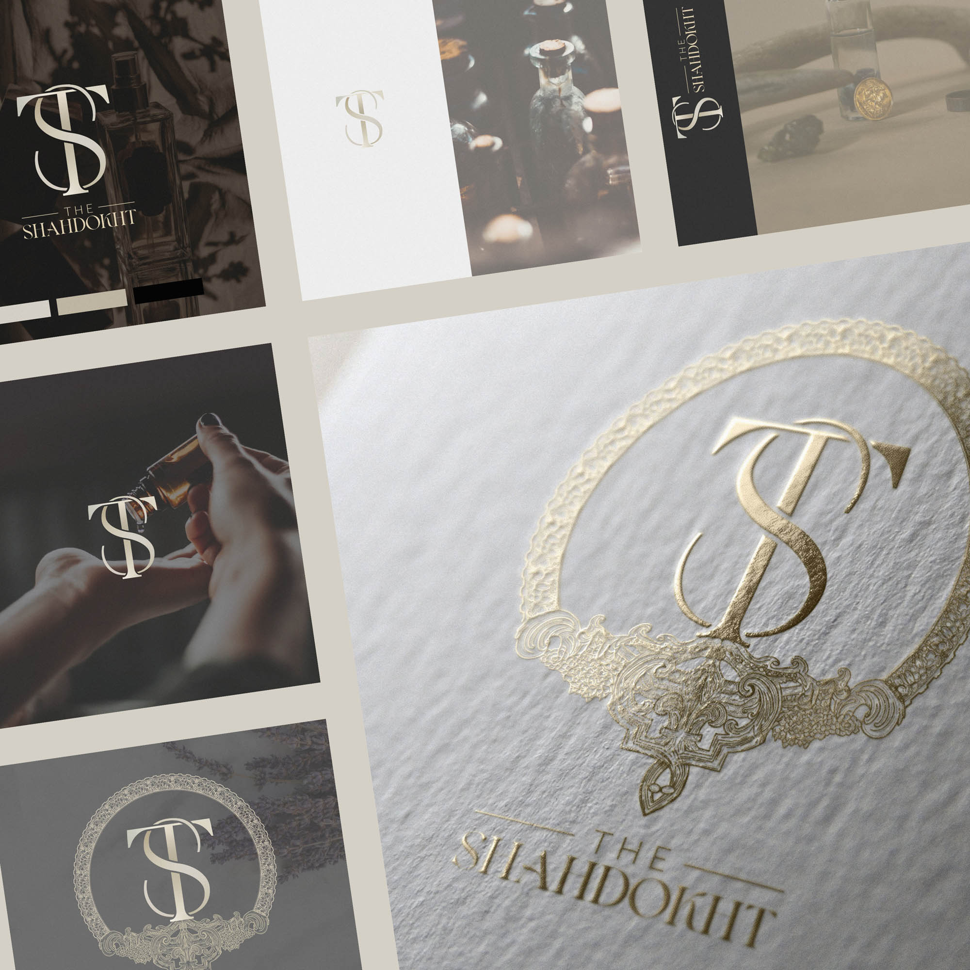
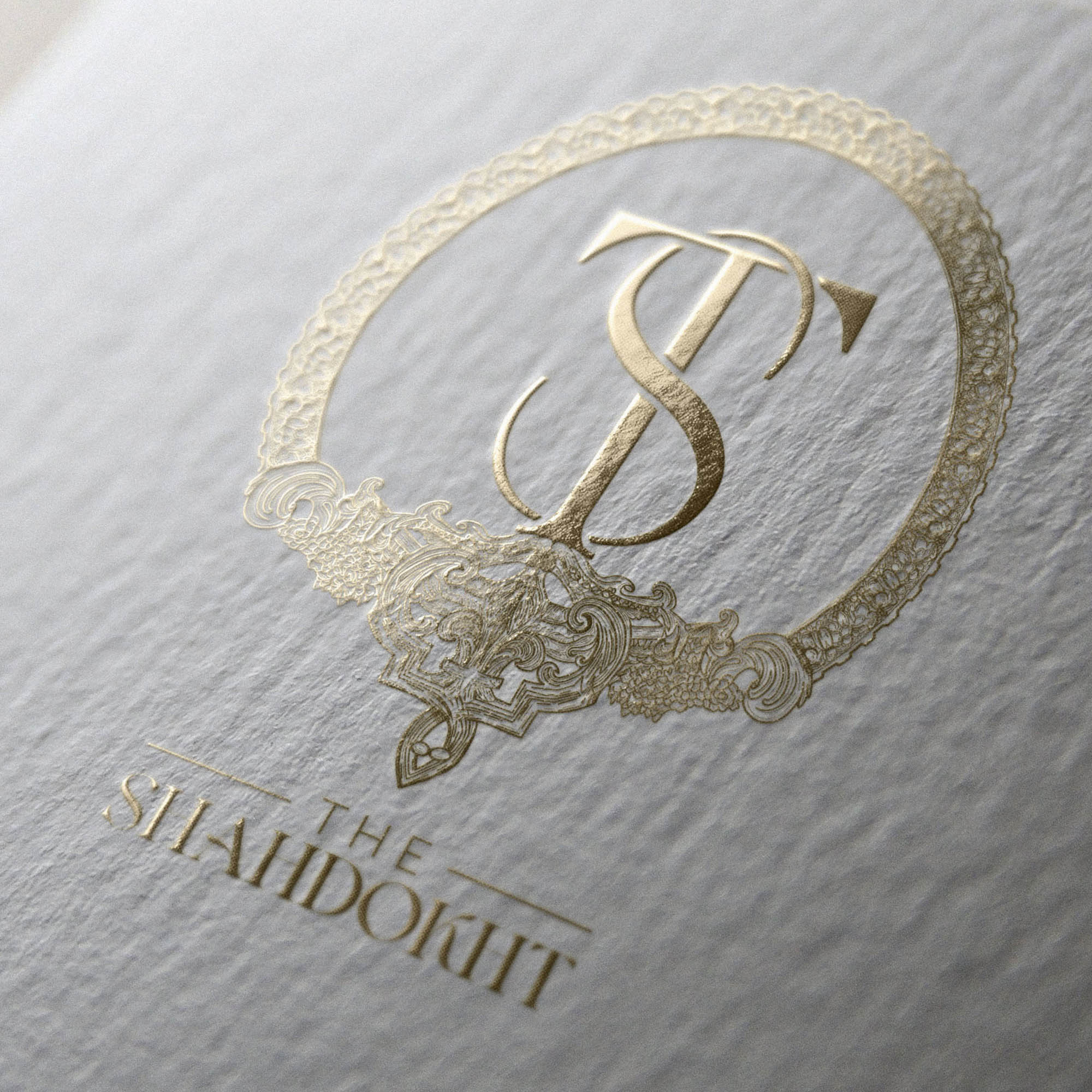
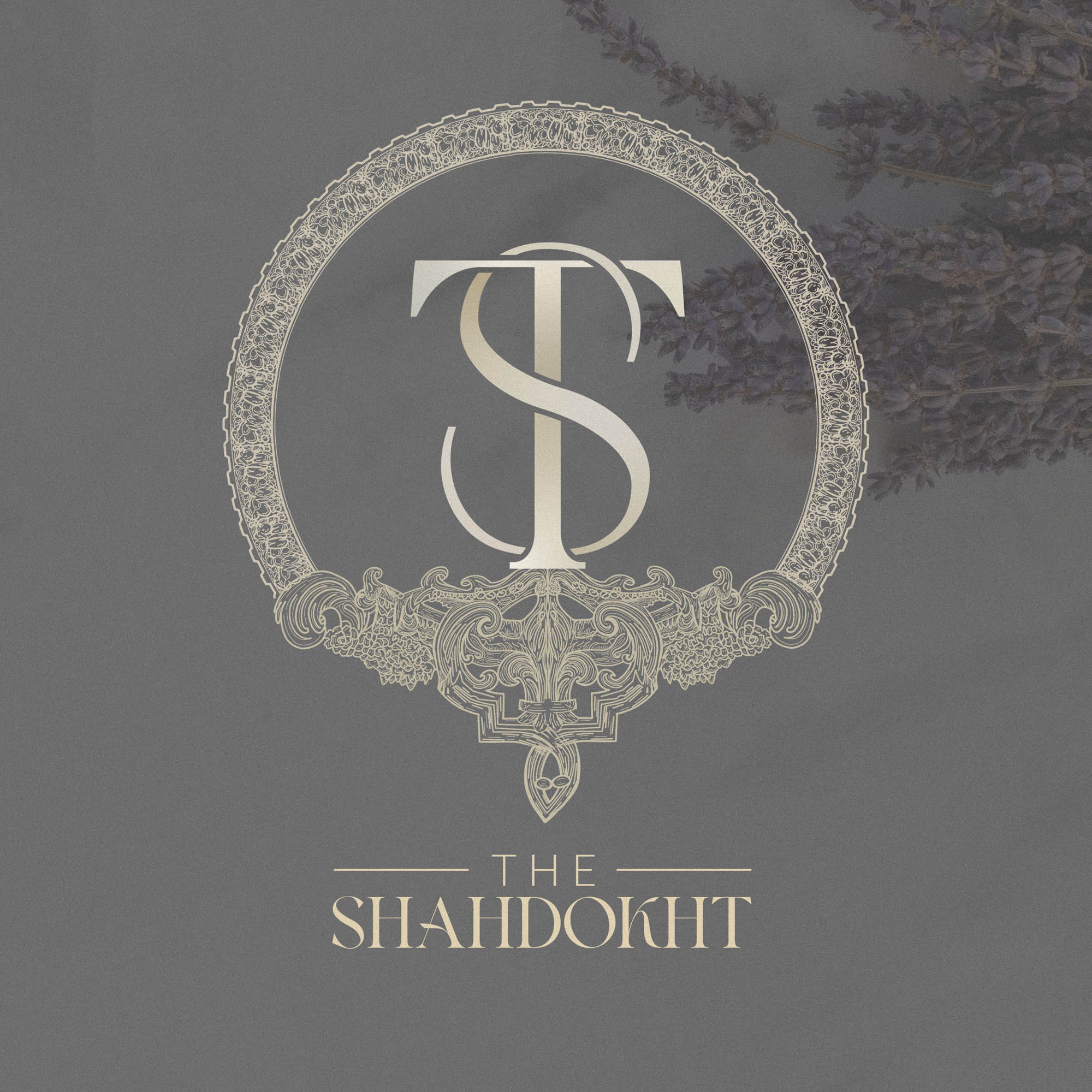
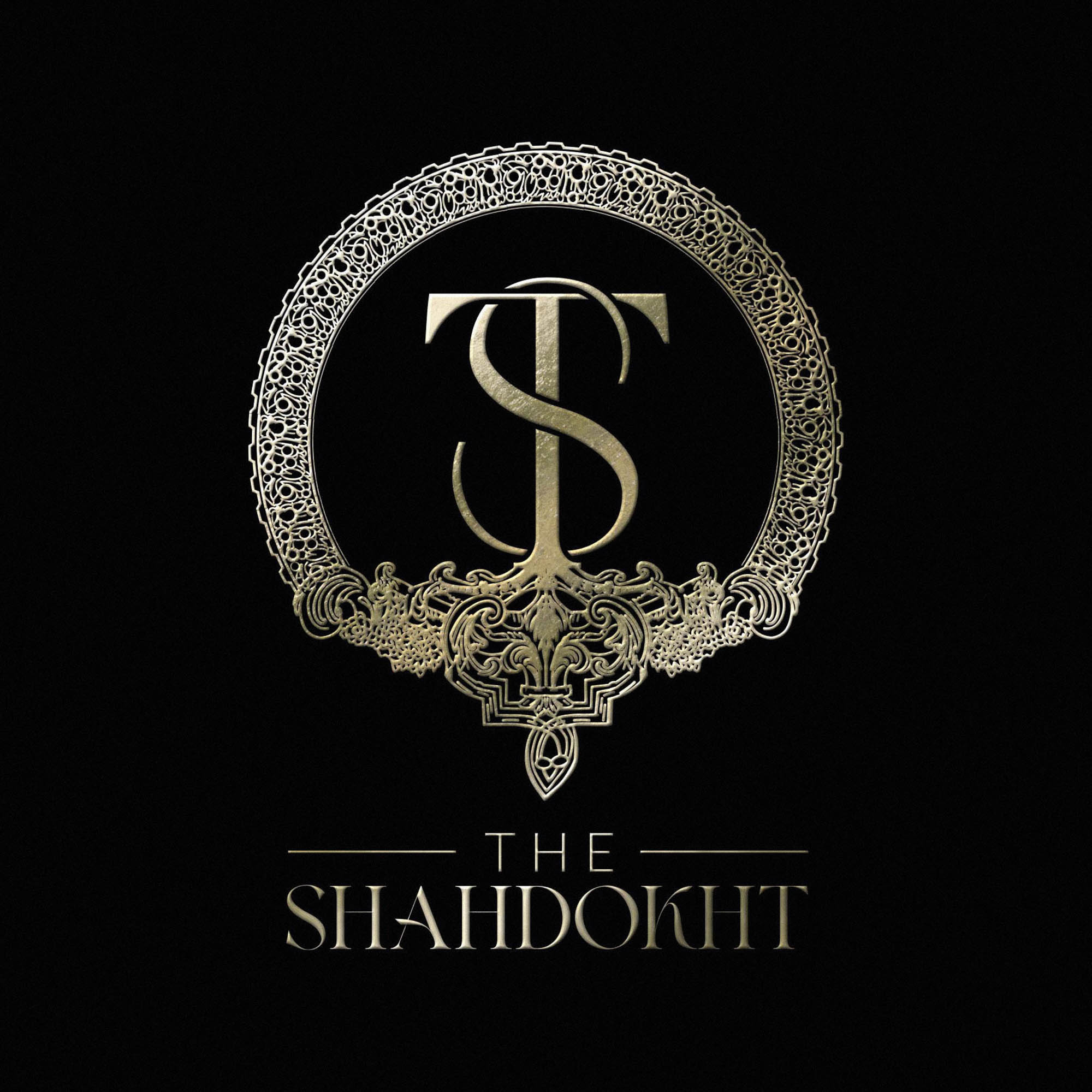
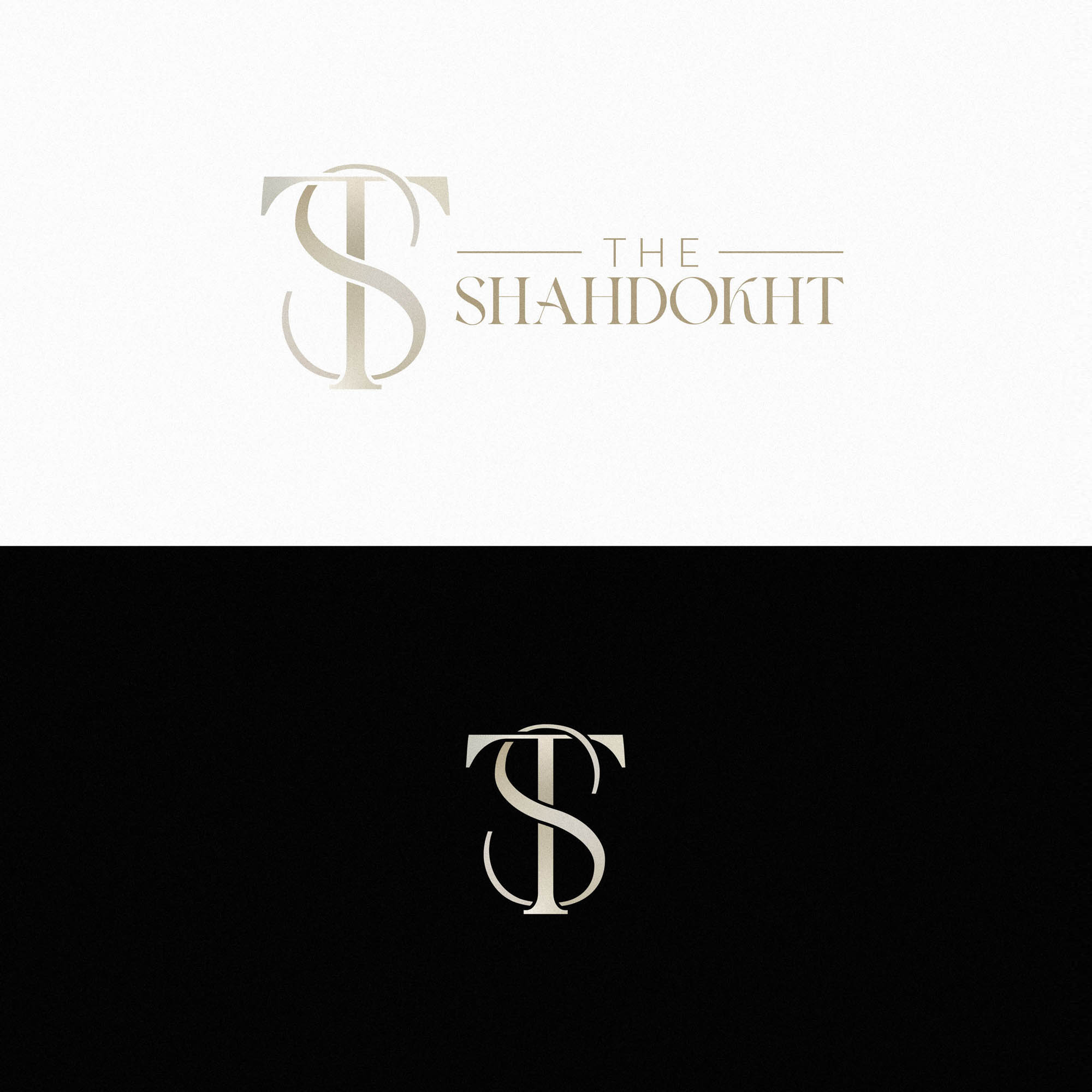
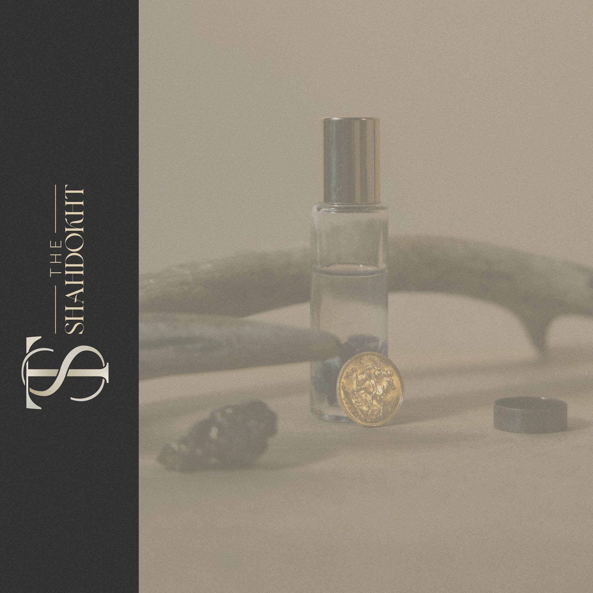
The rich version of the Shahdokht Logo is by far the most detailed, complex logo I’ve ever designed. In fact, it was only possible to even consider such a high level of detail by using a modular approach… The core features of the logo are present in the regular version, with a recognisable monogram as the centerpiece. The added detail in the rich version complement and enhance the core features – so that both are clearly part of the same brand identity.
The Shahdokht produces unique and exclusive purfumes containing rare raw oils and ingredients. The handdrawn artwork for the rich version of the logo was inspired by historical architecture, with several references and an overall concept provided by the client. An initial drawing was created using an iPad pro, digitally refined, and then carefully worked into an overall logo lockup to create a breathtakingly detailed version to be used in certain situations.
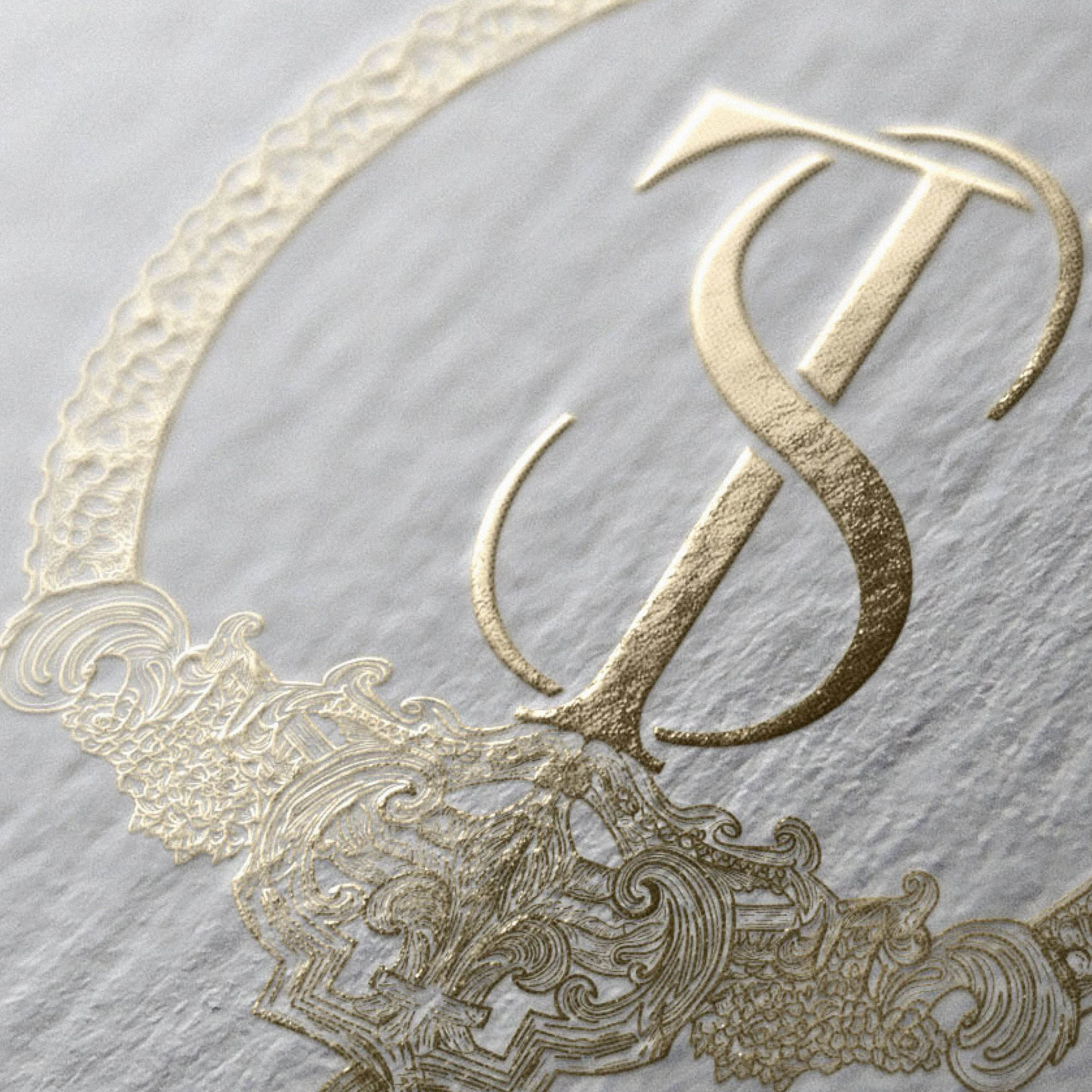
A version with a lower level of detail was also created specifically for gold foiling on business cards – with wider lines and increased gaps to avoid the foil bleeding at such a small size.
This ambitious concept really paid off, and the result is a stunning luxury logo which can be used responsively across a range of situations.

