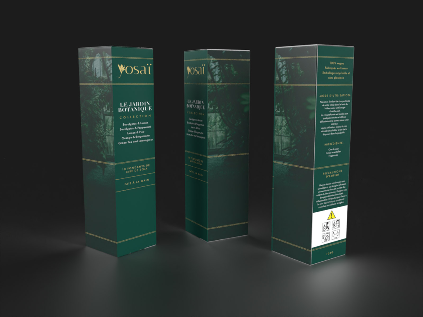
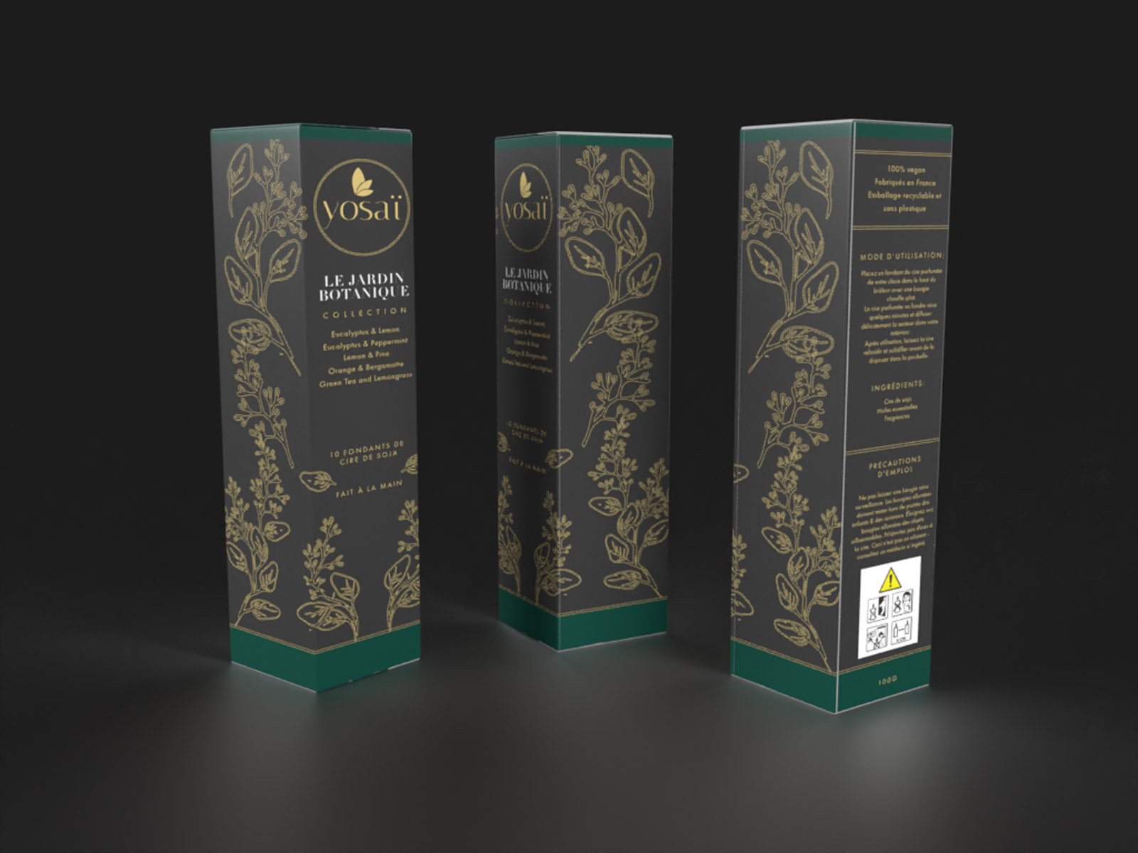
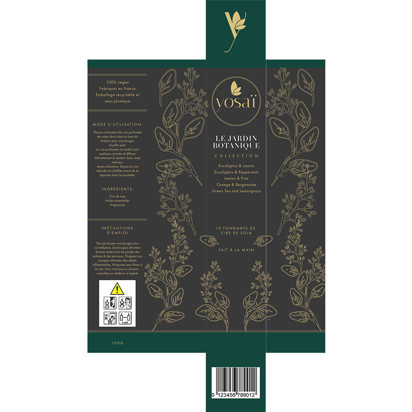
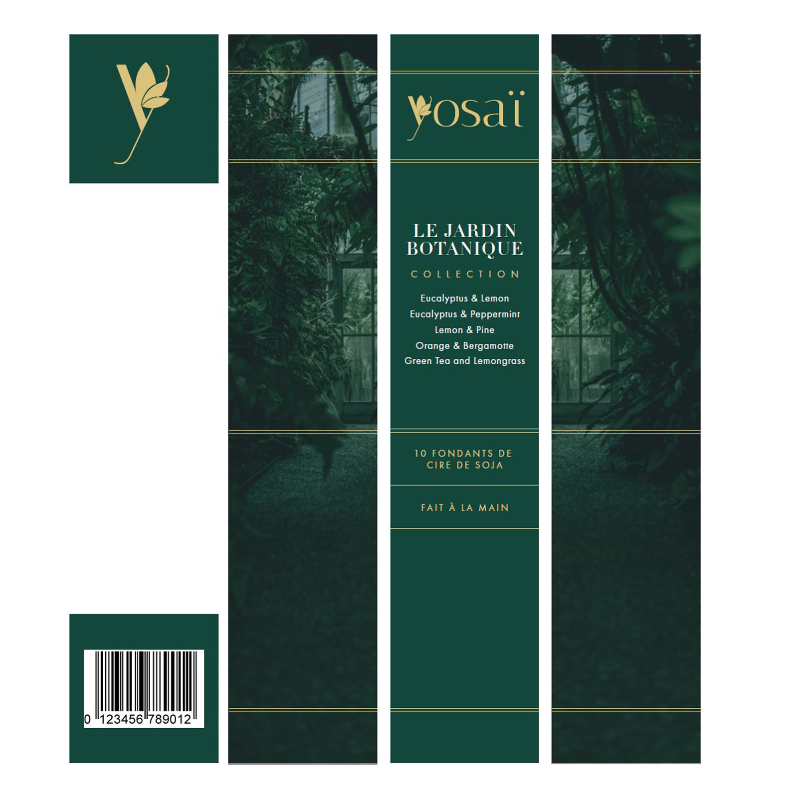
I was commissioned to create luxury packaging for the flagship range of an exciting new brand called Yosai. The initial range comprised a collection of 10 luxury mini candles, to be presented in a long, elegant box. Some initial brand identity had already been created for Yosai, including a logo and brandmark – so my goal was to expand on this starting point, creating additional elements that would harmonise with the existing identity.
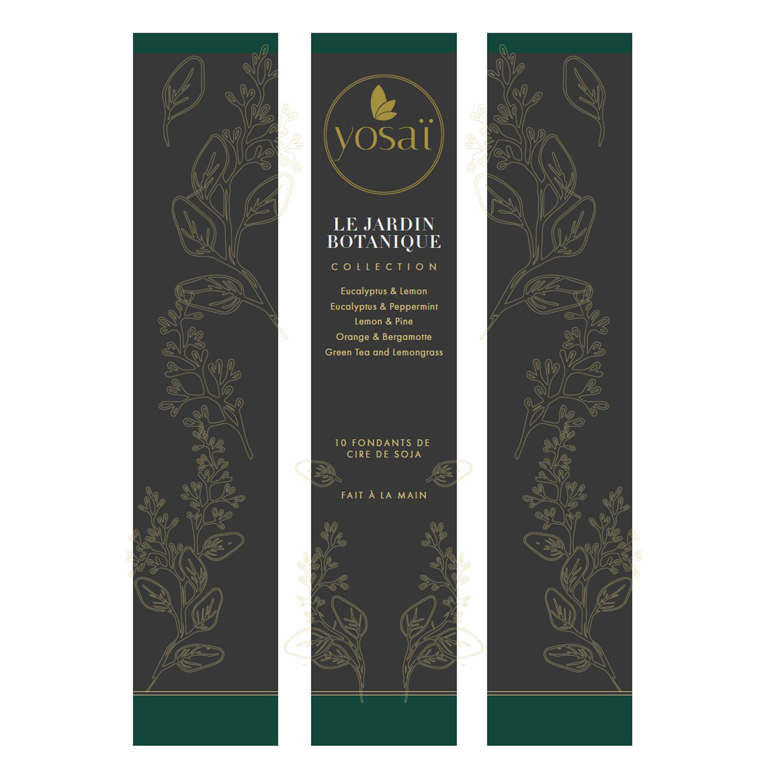
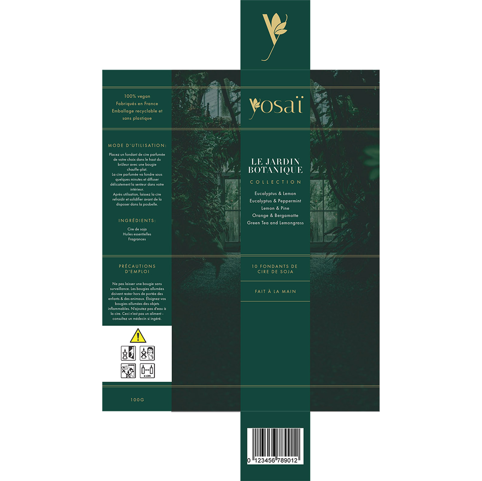
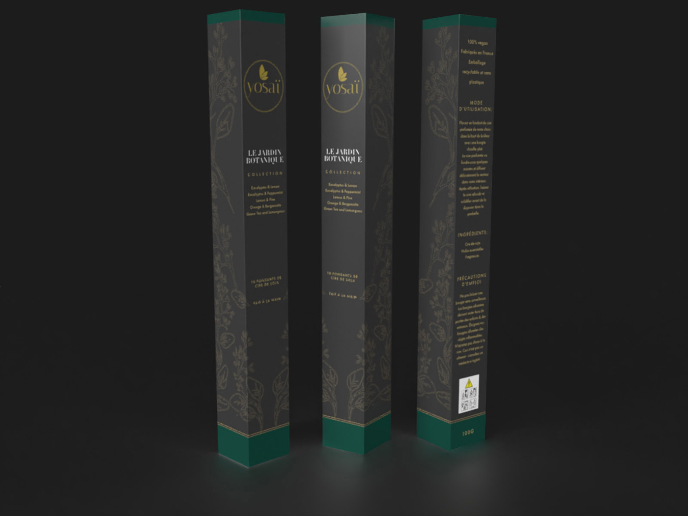
As the first collection of candles were to have a Botanical Garden theme, I sourced inspiration from both photography and illustrations in line with that theme. After using these elements along with text and the existing brand colours (which we adjusted slightly) to create concepts using a dieline, I also rendered these in 3D – which is a powerful and inexpensive way to test your artwork in context… It’s not always easy to tell if the various faces of a box are working together when they are laid flat on a dieline.
We opted to use a unique Botanical themed illustration, outlined in subtle gold, to wrap around the sides and front edges of the packaging – in a manner that felt like a vine creeping along the faces of the box – very fitting for the theme, and the results are stunning.
Yosai will be retailing in France initially. Look out for it at high end hotels and spas!