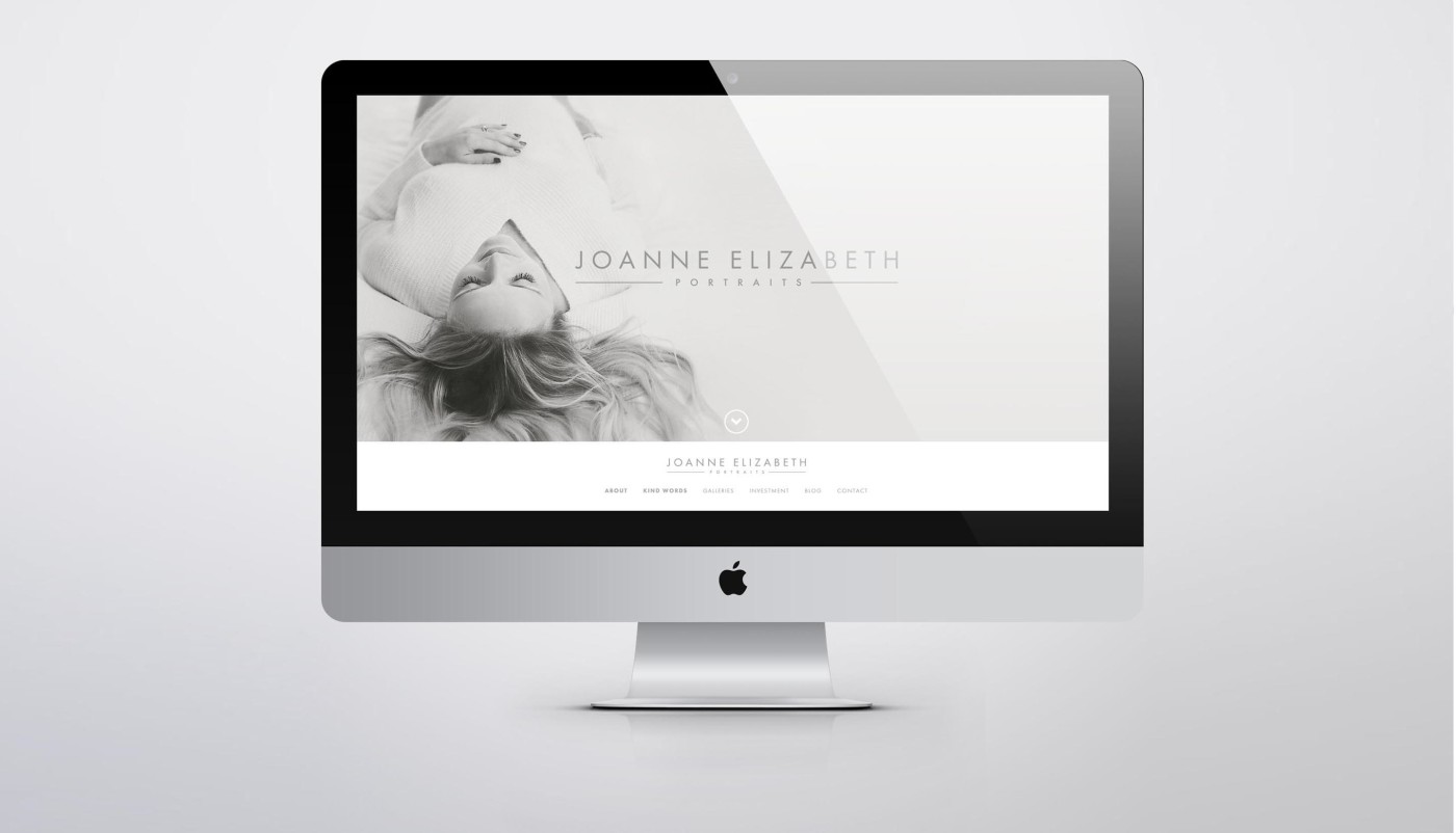
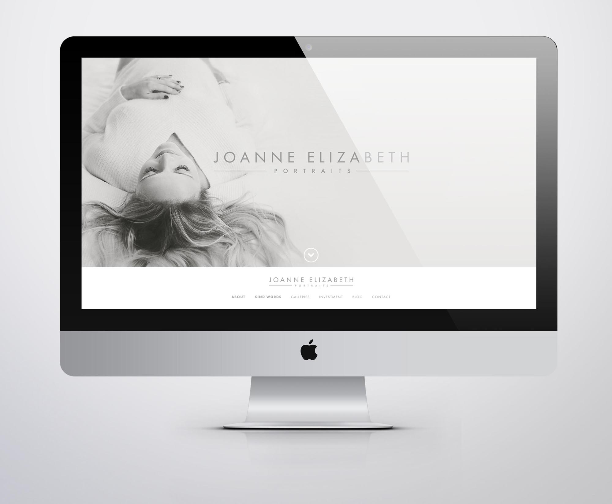
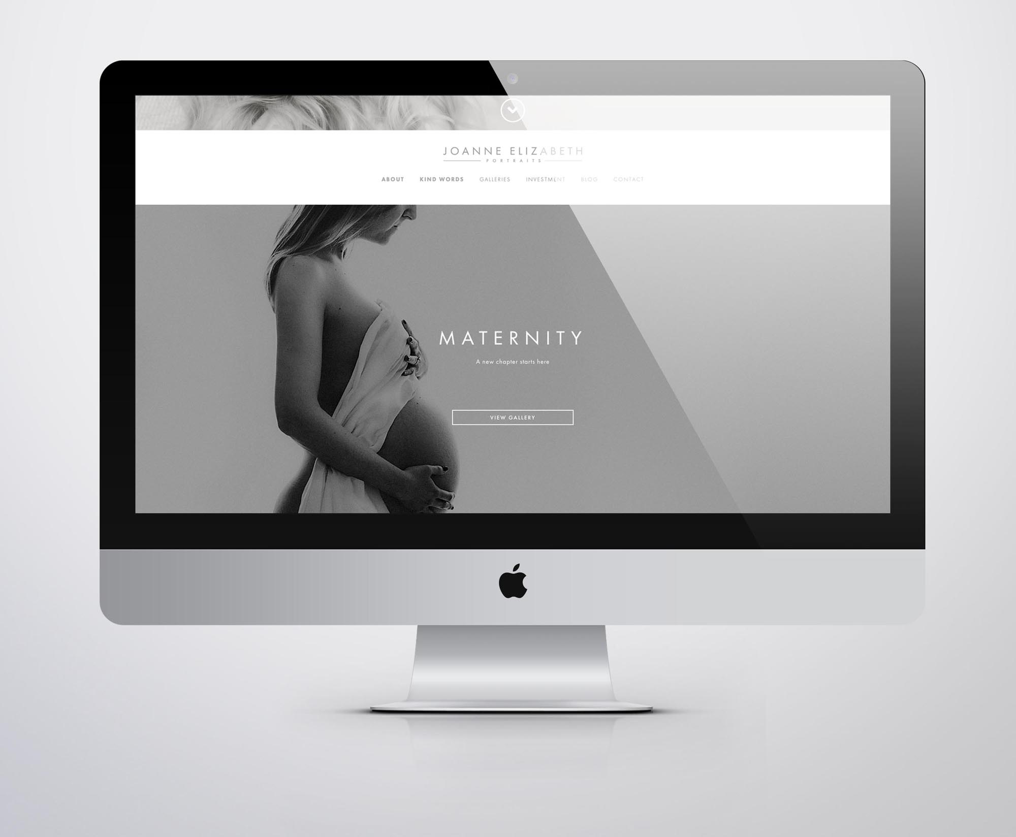
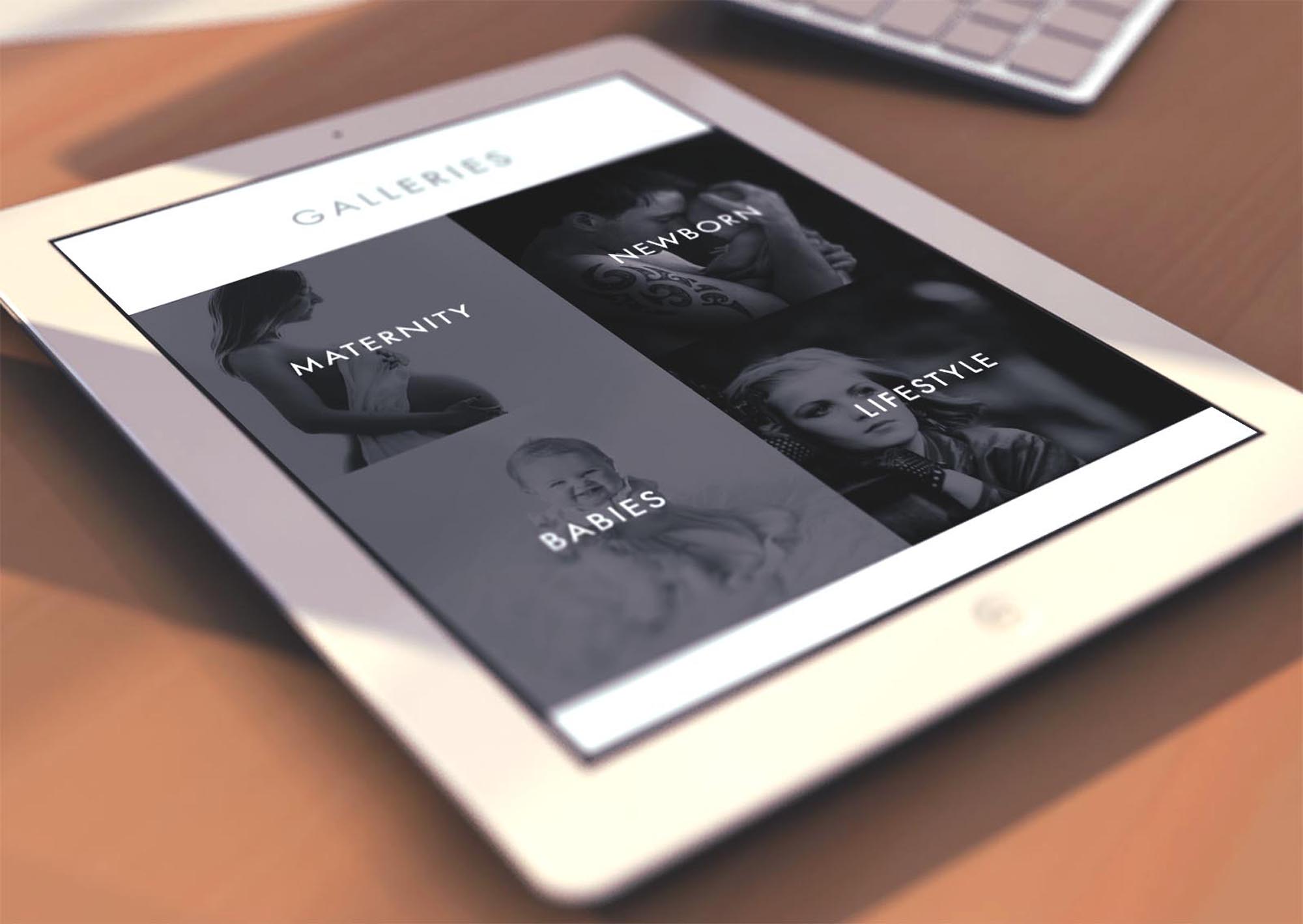
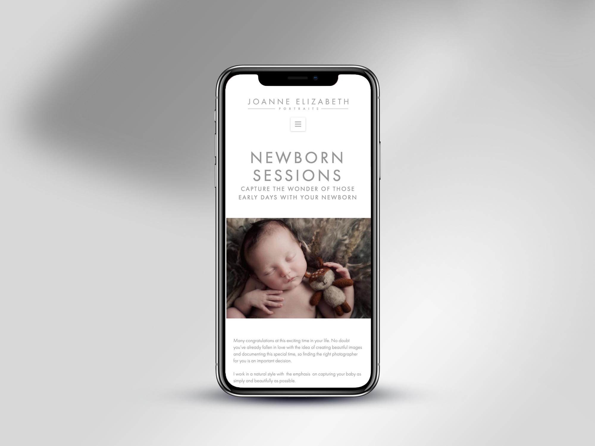
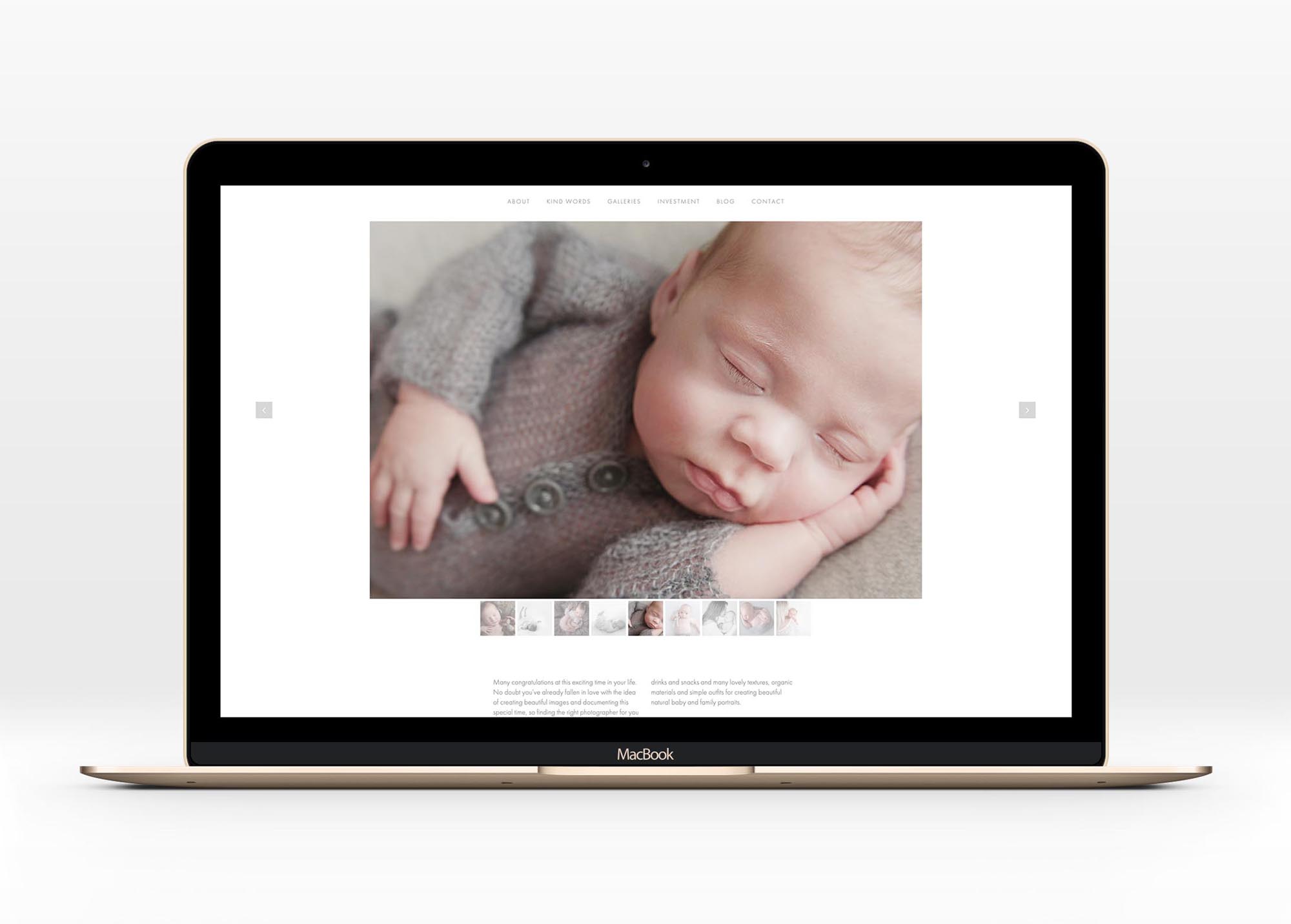
After creating the new brand identity for Joanne Elizabeth Portraits, we set about designing and developing a new website.
The landing page is particularly engaging; it features a slowly panning image (the ken burns effect), dynamic text that gently fades over the top, a navigation menu that sits at the bottom but docks at the top once you scroll past it… We wanted to ensure there was a ‘wow factor’ within the first 10 seconds of visiting the website, and I think we succeeded in creating that. It definitely creates the impression you’ve discovered something special; that this isn’t your average photographer.
See the live site at; http://joanneelizabethportraits.co.uk
I specialise in branding, logo and web design for photographers – see some other projects I’ve worked on in the Photography industry here.

